Hello all, as my post count suggests, im also a newbie here
So far all the articles I've read tell you about how to correct WB so that a white piece of paper still looks white, no matter the real-life lighting conditions. However, I could not find info on whether or not it is sometimes better to leave the "tint/hue" to that which the human eye saw in the scene. In order words dont correct the WB.
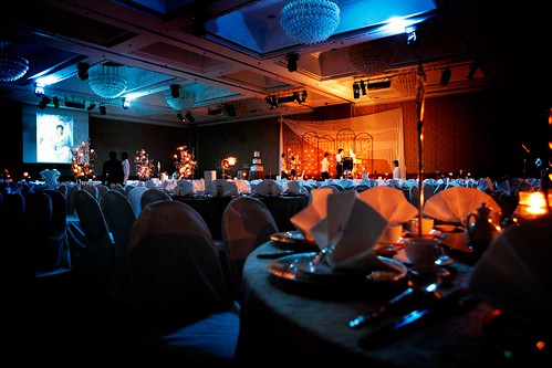
For a more concrete example, here is my novice hands on a 35mm/1.8 lens, D90, 1/40 Speed (Apeture priority), F1.8, Cool-white fluroscent WB setting (!)
#1

During the event, to my human eye, the lighting is quite close to this. Lighting is quite dark and amberish.
#2

This is after some post in PS
This is actually for an event, so all the other photos for the event need to have the same "WB look". Will it be acceptable for photos for an event to look very different (photo #2) compared to real-life (photo #1)? My concern is if the event organizers will be shocked that an amber-lit room becomes whitish. Thanks!
So far all the articles I've read tell you about how to correct WB so that a white piece of paper still looks white, no matter the real-life lighting conditions. However, I could not find info on whether or not it is sometimes better to leave the "tint/hue" to that which the human eye saw in the scene. In order words dont correct the WB.
For a more concrete example, here is my novice hands on a 35mm/1.8 lens, D90, 1/40 Speed (Apeture priority), F1.8, Cool-white fluroscent WB setting (!)
#1
During the event, to my human eye, the lighting is quite close to this. Lighting is quite dark and amberish.
#2
This is after some post in PS
This is actually for an event, so all the other photos for the event need to have the same "WB look". Will it be acceptable for photos for an event to look very different (photo #2) compared to real-life (photo #1)? My concern is if the event organizers will be shocked that an amber-lit room becomes whitish. Thanks!
")