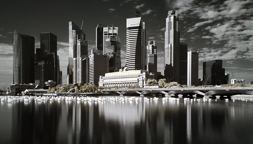
honestly speaking, I like your previous CBD photo posted in the critique sub-forum a lot more than this one. The tone; shadow, midtone and highlight, imho is as good as it can get. Leaving nothing for me to critique the last one.
")
In this photo, the sky and the water in fact look quite good and interesting. However, the balance of midtones, highlights and shadows of the buildings are not there. Generally, too much shadows and not enough of the details are there. Of course, this all depend on how you like to present your photo but personally, I like details and a good balance of these 3 things. I won't comment on how it should be done to balance the exposure on the building and the sky. Not that good at pp.
composition wise; the Marina Bay Financial Centre (MBFC) looks just a tad sticking out and that little bit disjoint with the rest of the CBD. I have seen what others have done with a similar composition and location. MBFC doesn't look it is on its own seperated from the rest of the CBD even though a similar gap like in your photo here is there too.