seek and ye shall find


Status
Not open for further replies.

dreamzcape

New Member
Aug 22, 2007
257
0
0
2344338636_53c826f2c0.jpg

Hi all, virgin post here so please tear it apart, the more brutal the better.

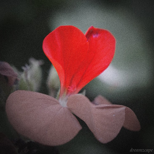
The thought I wanted to convey is that we see what we want to see, just like we hear what we want to hear. It's all about where we look, hence seek and ye shall find. I didn't want to explicitly link it to love as I think it will be too cliché. After all, what one finds will subjectively depend on the viewer. A heart? A petal? A flower? Or just a red splotch?

Inspiration came while from shooting some leftover flowers from Springfest at Sentosa, and the heart-shaped petal from this angle caught my eye.

Give me blood please!
 

nicely seen, good treatment to bring out your idea.. i suggest a square crop. the space on top is not that needed.
i am perturbed at the grain in the picture, if you had pped it in, it is not necessary.. or at least to a lesser extent

p.s. i would imagine that vignetting would work very well in this picture :)

Thanks night86mare for taking the time for the critique. I initally wanted to try a square crop, in fact there was more space on top, but the reason for this crop is as such:

The main 'heart' is centralized but the other desaturated petals more in the lower third. So if i do a square crop, I think it has to be a loose one that introduces more space. If too tight, the red heart is too much to the top.

Grains were indeed pped in...maybe on the larger version the grains didn't look that bad to me, then on the medium version, the grains probably seem more intense and of higher density.

Overall, thanks for the feedback!

oh btw there is vignetting...but i guess not obvious enough haha
 

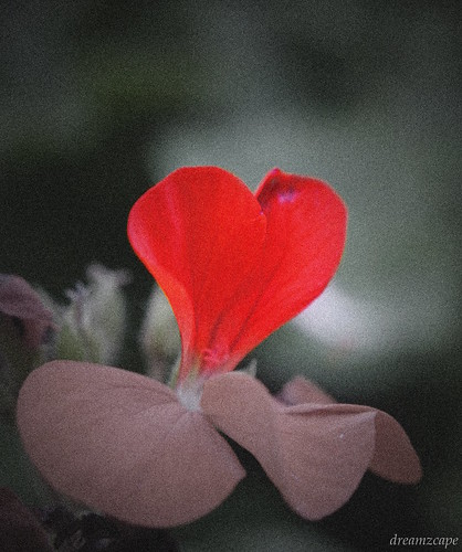
does this seem stronger with the vignetting and square crop?
2345720279_2670f8091e.jpg
 

you are right, you need more space

mainly for heavier and more obvious vignetting :D
 

lol ok...i will try to hoot even more vignetting....
 

hmm....not sure if the added grain improves the photo....can you post the original image, without the added grain? IMHO the grain makes the pic look harsher and also destroys some fine detail.
 

I accidentally just saved over it. doh! self pwned.
 

this is an interesting subject, with the universal symbol of love expressed by the tokens that usually express it. personally, i would prefer less grain in the photo to give it that soft dreamy look to draw attention to the main subject (heart). also to lower the gamma so that the red really stands out from the dark background. running the image through a noise reduction program like noise ninja will help to restore the "bokeh" to the image.

e.g.
2344338636_53c826f2c0_filtered_rev_1.jpg
 

points noted! will keep in mind for simliar shots in the future. thanks zaren!

I added the grain initially to give a raw-er feel to it but perhaps this is overkilling it.
 

this is an interesting subject, with the universal symbol of love expressed by the tokens that usually express it. personally, i would prefer less grain in the photo to give it that soft dreamy look to draw attention to the main subject (heart). also to lower the gamma so that the red really stands out from the dark background. running the image through a noise reduction program like noise ninja will help to restore the "bokeh" to the image.

your edit is superb, a pity that traces of the grain still can be seen

if there was zero grain, and sharpness was retained, i'm sure it would come up nicely! :)
 

lol...my own fault...lazy man work flow....forgot to keep my 'negative'. Lesson learnt. thanks nightmare and zaren!
 

Status
Not open for further replies.