
1. in what area is critique to be sought?
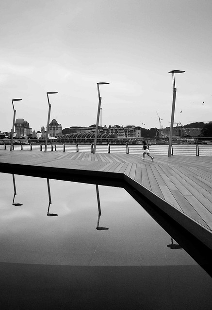
In terms of composition and contrast of B&W that creates the overall feeling in this photo.
2. under what circumstance is the picture taken? (physical conditions/emotions)
This was taken during a photowalk along the Sentosa Boardwalk. It was a relaxing moment and I was trying to capture something with impact within the scenic location. It was pretty tough for me as there was too many distracting buildings of no geometry popping here and there across the sea so I ended the day with this shot being one of the best in my opinion.
3. what the critique seeker personally thinks of the picture?
I think this photo is trying to convey a sense arrangement of the lines and shapes while instilling a touch of a human element which is represented by the girl.
Just a little background, I started my photography journey as a newbie back in late 2008. Learnt the basics the hard way from some of the old birds here when I posted a crappy photo for critique. So, please do provide your best thoughts on other factors that needed to be improved ie. exposure, etc. Wish to gather as much inputs from you guys for me to get a sensing of my photography direction.
Thanks!

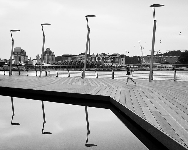
 except that the background kinda messy but lucky still got some symmetric (in a way).