residential estate


merriman

Member
Apr 25, 2010
47
0
6
DSC_0415_1-Copy.jpg


1. In what area is critique to be sought?
Composition

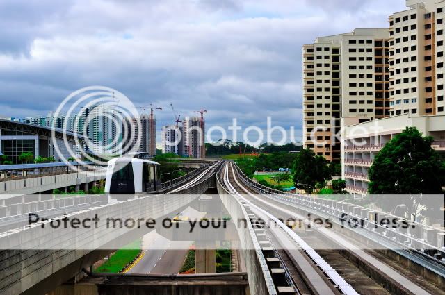
2. What one hopes to achieve with the piece of work?
An attempt to potray a typical view of a residential estate

3. Under what circumstance is the picture taken? (physical conditions/emotions)
Bright sunny afternoon

4. What the critique seeker personally thinks of the picture?
I think the photo is cluttered with a handful of distracting elements

My first ever time posting in clubsnap!!!so excited!haha

Anw,I hope to hear comments about the photo (good & bad,more on the bad pls!) so I can learn more =).still vv new in photography..hoping to learn more from the experienced Bros here =).
thanks!
 

Can someone comment if the composition is heavier to the right side? feels something to the left will balance the picture
 

My opinion..

1. Nice colors, clarity and exposure.
2. However, the chunk of HDB flats on the right can do without. Crop it off...the impact would be different...
3. If you can just capture the rail leading towards the HDB construction area, it would improve your composition - ' The Rail to Development"

Thanks.

Jon
 

Last edited:
in my opinion, i think you're trying to showcase what existed (the LRT and current HDB apartments) and the upcoming HDB apartments right?

perhaps you want to shoot from a different angle. because if you cropped off the buildings on the right, you're left with the rails leading off to the sky in the background, not really the development.

furthermore, there is no composition, and no clear subject : HDB apartment blocks chopped in half, building on the left chopped in half, half the constructed buildings chopped in half by the building chopped in half on the left... and lines leading not exactly anywhere.

if you want to showcase all these things, i would suggest a different location where you can fit the amenities/dwellings/construction into the frame nicely without chopping anything off half-way or blocking anything. and if you are using lines, don't lead them ending in a plain background with nothing.
 

I think the focus here seems to be more on the track than the residential estates.
Perhaps you might want to adjust the composition (maybe to the right?)
Exposure wise okay - no blown highlights.
 

Under most circumstances, lines (i.e. the track) in the photo are supposed to lead the eye to something, i.e. the main subject. But the the lines in this photos lead my eyes to... infinity? Hehe... Just my 2 cents. Like the colours and saturation in the photo though~ Buildings in the distance is quite sharp. You used a really small aperture?
 

I think you overdid the contrast a little as the grass looks unnatural. And yes the way you shot it, people would focus on the tracks first, and that leads them to empty land, not any development. Try a different angle :)
 

My opinion..

1. Nice colors, clarity and exposure.
2. However, the chunk of HDB flats on the right can do without. Crop it off...the impact would be different...
3. If you can just capture the rail leading towards the HDB construction area, it would improve your composition - ' The Rail to Development"

Thanks.

Jon

cropping of the chunk of HDB flats will make it look very weird. i will try another angle, capturing the rail leading to the construction site. the lrt platform where i am standing is very tight and constricted!.haha

thanks for your comments!!!appereciate it! =)
 

Feels like I can't decide which one is the subject. LRT, Railway, Flats still under-development in the background or the flats on right side? Buildings on both sides are cropped in a very abrupt manner and yes, the right side seemed heavier.... my humble opinions...
 

in my opinion, i think you're trying to showcase what existed (the LRT and current HDB apartments) and the upcoming HDB apartments right?

perhaps you want to shoot from a different angle. because if you cropped off the buildings on the right, you're left with the rails leading off to the sky in the background, not really the development.

furthermore, there is no composition, and no clear subject : HDB apartment blocks chopped in half, building on the left chopped in half, half the constructed buildings chopped in half by the building chopped in half on the left... and lines leading not exactly anywhere.

if you want to showcase all these things, i would suggest a different location where you can fit the amenities/dwellings/construction into the frame nicely without chopping anything off half-way or blocking anything. and if you are using lines, don't lead them ending in a plain background with nothing.


yup i tried to showcase the current HDB flats and LRT transport,and upcoming flats.i even waited for the LRT to be at 1/3 of the pict then i snapped.haha.if i use UWA lens,will it be better,so as not to chop of the left and right buildings?will have to try another angle so the rails leads to something (though the platform I am standing is realy very squeezy).
thanks for your comments and advice!!!! =)
 

i think if you rotated yourself more to the left, to include that big building (sports hall?) and exclude the HDB flats on the right, that would be better. Then wait for 2 trains to be on the tracks (on either side) and capture them. Might help to make the composition more interesting.
I'm just hypothesizing here.... there could be something else really ugly on the left.
 

Hi there,

For a newbie shot, it is decent albeit uninteresting.

Composition-wise, I feel that the blocks on the right actually set as a nice anchor to the pic. However, there are too many vanishing lines within the frame: LRT rails; road markings below; overhead bridge on the left... (more is less).

And perhaps you can go easy on the saturation, notch up brightness, and tone down contrast too...

Cheers
 

Under most circumstances, lines (i.e. the track) in the photo are supposed to lead the eye to something, i.e. the main subject. But the the lines in this photos lead my eyes to... infinity? Hehe... Just my 2 cents. Like the colours and saturation in the photo though~ Buildings in the distance is quite sharp. You used a really small aperture?


used f10 =).
 

i think if you rotated yourself more to the left, to include that big building (sports hall?) and exclude the HDB flats on the right, that would be better. Then wait for 2 trains to be on the tracks (on either side) and capture them. Might help to make the composition more interesting.
I'm just hypothesizing here.... there could be something else really ugly on the left.


hi there!actually the big building on the left is an LRT depot.what if I shoot it in potrait orientation,and just include the track,LRT & construction site?You mean 2 trains on the same side,or 1 train on each side?thx for ur advice!
 

hi there!actually the big building on the left is an LRT depot.what if I shoot it in potrait orientation,and just include the track,LRT & construction site?You mean 2 trains on the same side,or 1 train on each side?thx for ur advice!
if 2 trains on 1 side you'd better run away coz accident about to happen :)

no la, 1 train on each track.


portrait orientation might work... just be careful of where the leading lines lead to :)
 

and if you are using lines, don't lead them ending in a plain background with nothing.
But the the lines in this photos lead my eyes to... infinity?
And yes the way you shot it, people would focus on the tracks first, and that leads them to empty land, not any development. Try a different angle
However, there are too many vanishing lines within the frame: LRT rails; road markings below; overhead bridge on the left... (more is less).


yeap point noted on utilising lines,leading to the main subject...will practise more on it!


guess i will have to shoot more and visualise a better scene,selecting the appropriate elements/subject before capturing.thx guys!!!!
 

Hi there,

For a newbie shot, it is decent albeit uninteresting.

Composition-wise, I feel that the blocks on the right actually set as a nice anchor to the pic. However, there are too many vanishing lines within the frame: LRT rails; road markings below; overhead bridge on the left... (more is less).

And perhaps you can go easy on the saturation, notch up brightness, and tone down contrast too...

Cheers

Yes. Agree. Exposure look ok, sharpness ok. Just that composition doesn't look like it is working here, as already been mentioned many times. Why not try cropping away the whole left side including the hdb flat still under construction in the distance.
 

Last edited:
yeap point noted on utilising lines,leading to the main subject...will practise more on it!


guess i will have to shoot more and visualise a better scene,selecting the appropriate elements/subject before capturing.thx guys!!!!

HAHA! why not go out on some outings with the rest of the bros here? i'm sure they could show you their techniques :D