Reflections of Osaka


Status
Not open for further replies.

vyeow

New Member
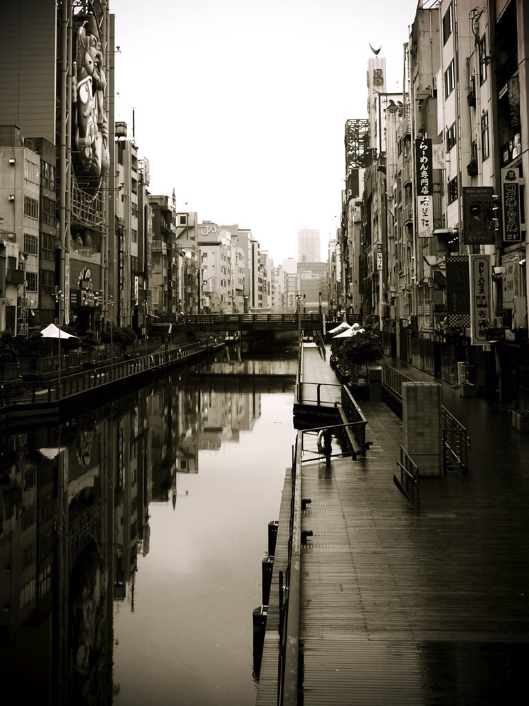
Hi All, just wanting some of your feedback on my shot taken in Dotonbori - Osaka.
The original shot was much larger but after countless hours cropping, i think i found the right balance.
Osaka seems to always be a busy city so i wanted this shot to try and capture something totally opposite, the quiet and isolated side.
Please let me know what you think of the composition and if you think i achieved the feeling of isolation and stillness in the shot. Cheers!!
Scroll down the page for a larger version..

3557386975_2969953639.jpg
 

Last edited:
I like the mood of the photograph. Well, IMHO i think you've quite achieved the feeling of isolation, through the use of monochromatic colours and lack of human subjects.
 

Maybe if you had shown more of the side walk on the right... and maybe from a lower angle, would give more impact? Think you nailed the colours. Thanks for sharing. :)
 

I love the reflections, the emptiness despite the modernization. Your choice of a warmer monotone also accentuate the entire feeling of a sense of irony of modernization with the accompanying decrease in human touch.

Great shot! THanks for sharing and keep it up!
 

Thanks for the comments, i would have liked to take the photo from a lower angle. I also used a Japanese program called Toycamera plugin to darken the edges and enhance the colours.
 

Really like it!! only that the triangular tent on the left & its reflections really drew my eyes to it perhaps unnecessary? The lines are great, shd look really lovely in bigger size..kudos
 

i like it, especially the placement of the bridge at the middle of the photo.
 

Really like it!! only that the triangular tent on the left & its reflections really drew my eyes to it perhaps unnecessary? The lines are great, shd look really lovely in bigger size..kudos

Oh yeah, i see what you mean. It really does stand out, will watch more carefully next time when composing
 

this is good, with the black and white conversion being outstanding to fit in with the mood.the verticals are also nicely handled here.

good work :thumbsup: the only quarrel i might have with this is that i wish it were slightly bigger. some of the details are not viewable at such a small size, and might spoil it for some viewers.

Thanks for the comments, here's a larger version:
3557386975_2969953639_b.jpg
 

Maybe if you had shown more of the side walk on the right... and maybe from a lower angle, would give more impact? Think you nailed the colours. Thanks for sharing. :)

love the feel your photo gives out. also agree with 2evans that maybe showing more of the side walk will be better, i.e 1/3 skyline...just a thought :)
 

Status
Not open for further replies.