Reflection in water


joeltan111

Member
Dec 27, 2009
83
0
6
Serangoon
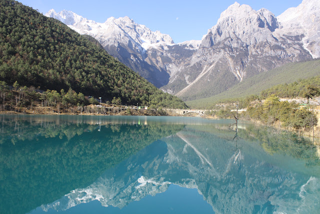
Would like some feedback on the general composition of this Image.
It was taken in Yunnan, China Last December.
I would like to know if there are any post-processing that i can do to improve this image, and is there anything that I should or should have not done when I took this image.
This picture was taken due to the symmetry that was found in the scene.

Settings were F/8 Aperture, 1/125s shutter, ISO 200.
Taken using a Canon EOS 1000D with kit lens (18-55mm IS)

IMG_8758.JPG


Thanks a lot.
 

Last edited:
i like it, nothing to critic on the compo, just the PP, i've taken liberty to work on it..here is what i did in adobe photoshop:

1) overall levels adjustments to set the black/white points

2) using mask to selectively enhance reflection

3) multiply layer while masking the forest on the left

4) some vibrance, saturation, brightness/contrast and gradient tool as finishing touches

5) noise reduction to smooth out the grain in the sky

IMG_8758.jpg
 

If I'm right I believe your horizon is tilted.
Mildly distracting.
 

Hi I am a beginner in DSLR but would like to share my 2 cents' worth opinion since I am also interested in landscape photography.

1. PP done by elavan was great, it significantly enhace the pics, making it more colourful and vibrant.
2. Pic was a bit tight in composition, in my humble opinion. Would be better to have a bit more sky and the full reflection of the mountains in the water.
 

elavan has done a great job...TS should try it at home too...overall, the horizon and it wud be really good if could see more reflection like photoeye mentioned.
 

prefer the original too, more of a scenery-telling picture,
thats not so say pp-ed is not good, but it's more like a postcard material..

and yes, horizon is tilted and u should rotate it at least..
 

Original photo was slightly overexposed and tilted. It didn't help that the lighting was rather flat. If only the mountains were more strongly lit, it'd make a great scene. Can't rush nature! :)

I didn't like the PP-ed scene... too unnatural.
 

I like the original photo too. My opinions are the pic is too tight as mentioned and tilted horizon. :)
 

prefer the original like the rest amid colors a little dull and flat + reflection cut off which doesnt quite appeal to me. :)
 

IMG_8758.jpg


maybe this is a little better? i did some simple lighting adjustments and rotated it..
 

which part is still overexposed?
i wanna brush up my pp skills too