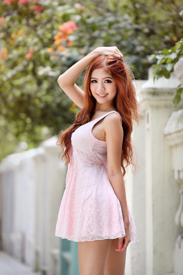
#2 and #7 are my personal favourites, especially the latter. The composition is dynamic (split into three diagonal sections) and the colour contrast is striking. The only little niggle is that her black bra strap is showing - if only it were transparent or hidden.
#3 would've been better if you showed more to the left of the frame, i.e. put the model at approx the right 1/3 line. But you might have some limitations (e.g. distracting elements you want to leave out). Overall a good shoot, and a good model, too.


")