Perfect Storm


Status
Not open for further replies.

Janrac

New Member
Jul 25, 2009
24
0
0
P1014223-1.jpg


1. in what area is critique to be sought?
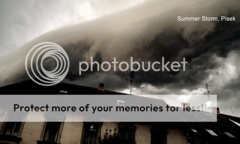
How to improve Post Processing + Colour Impact.


2. what one hopes to achieve with the piece of work?
To show the impact and the severity of the storm cloud.

3. under what circumstance is the picture taken? (physical conditions/emotions)
Captured it as natural phenomenon.

4. what the critique seeker personally thinks of the picture
The cloud element is present but impact is not there.
Wondering how to improve the picture.

Thanks.
 

Last edited:
Hi, Anyone willing to help?
 

Hi there, I'm new here so I'm in the learning stage too :)
not sure about the rest, but in my opinion, the tilt of the picture doesn't work for me.
I like the colour and whole (gloomy) feel of the picture though! ;)
 

ok..ok... i go first, die ma die loh...lol

i'm no sifu/pro..just say what my mind tells me.

personally, you may be overwhelmed by presence of the dark cloud at tht time, but in the photo... I couldnt work out if it was a cloud/thick fog, perhaps not the best capture on yr part.
i hav never seen a brown cloud b4, have u? I will definitely convert everything into pure b/w to show the impact as during a dark lighting, all colours will lose its impact, so me think ah..b/w is better. here, by darkening the cloud, u hav lost all details on the roof, just be wary.

nevertheless,

I do like the angle, a tilted angle will add a bit drama and I dun mind abt the cropping also since the subject is the cloud.

all in all... i think there are better stormy clouds and good effort on yr part.
 

I'm not good at taking photo myself... but I don't feel there is a storm there, just very cloudy. If the picture contain some tress that is blown to one side or the other, the impact of storm may be more realistic. In the photo, I can see the trees are still and upright. Also, I was expecting to see some lightning when I read the title.:)
 

Wow amazing clouds..!

I have a quick suggestion.
Using ur posted jpg, go to image size in PS, unclick 'constrain proportion' and then change its height to 1200 pixels, c if u prefer it that way.. I dont mean the stretching but personally I like the composition better.

Because the house in front is very dark and looks 'solid', I feel it reduces the strength and 'weight' of the storm clouds? Perhaps can reverse and let e the clouds be the heavier parts instead? my 2cts,hih:)
 

I thank Hui Xian, Tiger Canon, CK Chng and Red Moonsoon for your comments.

I have attached the original picture, please feel free to PP and make it better.
Thanks.

P1014223.jpg
 

hello.
i too feel that this photo would work well in black and white.
you've said that the cloud is not prominant. i feel that your composition has the house taking some of the attention away from the clouds. converting it to black and white lets the two harmonize together (or so I believe).

here's my opinion on a take you could approach for pp.
i've added some adjustment layers to create a stronger contrast especially in the area of the clouds. also used the dodge and burn tool and added a little grain to give it an old, gloomy feeling.
clouds.jpg


hope to see what others have done!
 

Hello Jo Jo:

Very nice.. Yes, hope others skillfull people would show me the rope.
I am using Picasa, learning very basic tools now.

This picture is interesting to me becasue at that instant, the cloud looks a like a huge sea wave washing down on the house.
I am hoping the picture could show that kind of impact.
 

Last edited:
never mind about what to do to the picture.

just think of the composition here, examine it in your mind: yes, the clouds very dramatic. but look at the bottom, what do you feel about it?

for me, i see a slashing diagonal. my eyes are caught by it, and they follow it out of the picture. humans tend to react the same ways to every picture.

diagonals can be very useful for composition, but not when they slash across the picture and cut it into pieces, this has a jarring effect and should be avoided at all costs.
 

I don't know if this works for you but here is goes:

The coloured version of the re-interpretation:

temp1p.jpg


The black and white version of the re-interpretation:

temp2j.jpg


Let me know what you think.
 

Hee, just playing ard, a different, scaled up vertically, version.:)lol
P1014223.jpg


Version2..., might as well..lol
A high contrast poster-look.
P1014223_B.jpg
 

Last edited:
:thumbsup: Excellent stuff.


Hee, just playing ard, a different, scaled up vertically, version.:)lol
P1014223.jpg


Version2..., might as well..lol
A high contrast poster-look.
P1014223_B.jpg
 

Thank you guys. Very nice.

I don't know if this works for you but here is goes:

The coloured version of the re-interpretation:

temp1p.jpg


The black and white version of the re-interpretation:

temp2j.jpg


Let me know what you think.
 

Hee, just playing ard, a different, scaled up vertically, version.:)lol
P1014223.jpg


Version2..., might as well..lol
A high contrast poster-look.
P1014223_B.jpg

Quality. Glad u darkened down the satellite dish as well. :thumbsup:
 

Here's my 5 minute Photoshop-the-heck-out-of-it version:

p10142231.jpg


And slightly toned down:
p10142232.jpg
 

Looks like tsunami approaching instead.
 

Hee, just playing ard, a different, scaled up vertically, version.:)lol
P1014223.jpg


Version2..., might as well..lol
A high contrast poster-look.
P1014223_B.jpg

wow... i like the lady alot, she really bring impact to the storm... niceeeeee;)
 

Status
Not open for further replies.