Guys,
Dry Fit Polo Tee
Description: Short Sleeve Men's Dry Fit Polo T-shirt
with self fabric collar, 2 Printing (One Color - White) on front,
1printing (one color - White) on back.
Minimum order : 30pcs @ SGD$18/pc

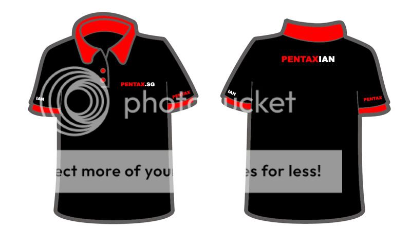
Design wise, I quite like the focus ring on the right chest. For the back, I'd prefer "Proud to be a Pentaxian" with bold font and the red square Pentax logo.
Guys. pls chip in the price you have found. I've also asked other printers, hope to get a few prices to compare.
Other design to share?
Dry Fit Polo Tee
Description: Short Sleeve Men's Dry Fit Polo T-shirt
with self fabric collar, 2 Printing (One Color - White) on front,
1printing (one color - White) on back.
Minimum order : 30pcs @ SGD$18/pc
Design wise, I quite like the focus ring on the right chest. For the back, I'd prefer "Proud to be a Pentaxian" with bold font and the red square Pentax logo.
Guys. pls chip in the price you have found. I've also asked other printers, hope to get a few prices to compare.
Other design to share?
")