
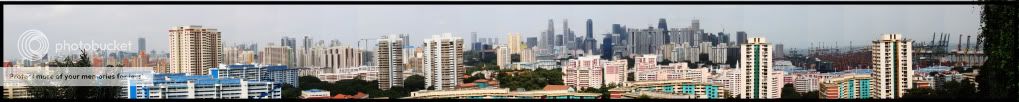
Panoramic View @ Faber Point
1. in what area is critique to be sought?
I have patch up and enhance the contrast of the photo
2. what one hopes to achieve with the piece of work?
I want to show a nice panoramic view of the cityscape architecture @ the top of faber point.
3. under what circumstance is the picture taken? (physical conditions/emotions)
Out with some friends chilli out @ faber point and happen to come across the beautiful architecture cityscape and decided to captuer the moment in a panoramic pespective
4. what the critique seeker personally thinks of the picture
The picture can be better in terms of compositions and color.
I welcome all feedbacks as i am still new in photography. Thanks
")