Out Of Bounds


Status
Not open for further replies.

pplneedthelord

Senior Member
Sep 18, 2007
2,185
0
36
serangoon
2923723699_2e4ff9b172.jpg


hi all,

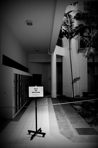
the above picture was taken in school 2 days back on wednesday. since it was the 3rd last day of my school education before taking my O level examinations i thought of just taking some snapshots of around the school. the reason for the sign and the rope blocking people from entering is due to the upcoming O level Science Practicals which my school is having next thursday.

i would like to have comments on whether i potrayed the image well enough? does the sign Stand-Out and capture the viewer's attention the very first moment he/she sees the image? would it be a better idea if i shot in landscape instead of potrait? and how can i better the shot?


thank you and regards
 

- Do you NEED the surrounding features to be included?
- Would have preferred to have taken JUST the signboard with a blurred long row of corridor behind it. The signboard here is too small to be standing out. The column in the background caught me first cos the beam up there and the floor edge leads me to it.
 

Last edited:
The sign did catch my eye first, it being the brightest thing in the frame. However, it is also not exactly the biggest thing, though it is supposed to be a significant element of your image, as it is the thing that keeps the image coherent to the title.
 

- Do you NEED the surrounding features to be included?
- Would have preferred to have taken JUST the signboard with a blurred long row of corridor behind it. The signboard here is too small to be standing out. The column in the background caught me first cos the beam up there and the floor edge leads me to it.

-well i thought it will be a little too boring a shot to leave the surroundings.


The sign did catch my eye first, it being the brightest thing in the frame. However, it is also not exactly the biggest thing, though it is supposed to be a significant element of your image, as it is the thing that keeps the image coherent to the title.


hmm well okay maybe i should have stood a little closer to the sigh board since i wanted to keep my focal length of 17mm.
 

...
hmm well okay maybe i should have stood a little closer to the sigh board since i wanted to keep my focal length of 17mm.

That's actually quite a good idea. Using a short focal length exaggerates foreground subjects, while "pushing back" elements in the background, thus giving a great sense of depth. Quite dramatic actually.

Though I must say, this corridor isn't exactly a very long one, so the dramatising effect is reduced.

Additional note;
It might still turn out well, or good enough with a good bokeh, although the corridor isnt ling enough, but at a good angle, with the locker doors fading away into the darkness.
 

i think the right side is rather distracting

yea well, like i said earlier on.i wanted to keep the 17mm and the 3:2 ratio as well. if i had taken the picture a little to the left-side... it would lead to another wall which isn't needed.

thats my reason for including the 'right side'
 

That's actually quite a good idea. Using a short focal length exaggerates foreground subjects, while "pushing back" elements in the background, thus giving a great sense of depth. Quite dramatic actually.

Though I must say, this corridor isn't exactly a very long one, so the dramatising effect is reduced.

yea.. the arrangement of science labs in my school is a little weird. i guess its trying to be a little different from other schools.

Additional note;
It might still turn out well, or good enough with a good bokeh, although the corridor isnt ling enough, but at a good angle, with the locker doors fading away into the darkness.

actually in the shot from the camera the lockers didn't have any fade.it was while post-processing i darkened the background in order to let the sign board stand out.
 

i think it needs to be tighter to get more attention on the sign itself.
 

cant really show any thing in the pix...

what I would suggest is...

may be you can shot it while there are ppl walking pass there and using a low shutter speed.
to create the ppl with a blur blur effect.. but just focus on the sign itself and more close to the sign.

like that I think would be better...

Just my ¥1 suggestion...
 

the sign is significant, though the bg can certainly be distracting. if the rope was meant to bring out the idea of 'out of bounds' too, then i believe it might be too small to notice at first glance

also, the area on the right is open - it would have been better if it was closed off and entry was restricted by the rope and the sign completely

but overall i think the shadows arent too bad
 

heh it looks rather familiar. Thats acs barker and im from there quite sometime ago.

Well, i imo i think the picture itself doesnt really send a strong signal for your title. The subject itself doesnt give much impact from the picture above.
The fonts on the sign are tad small(relative to the picture) and doesnt seem to give a strong message.

As for whether or not it was better to be portrait or landscape, i think portrait would be better in this case as the depth of the corridoor leading towards the sci room seems to help bring out/isolate the sign board alittle. Landscape probaly would not have the same effect, and if i rem correct, towards the left are just empty walls and right are just vegetation, which are just unnecessary distractions.

Perhaps a better title would be " Exams in progress" and it will make abit more sense that pple might be able to relate to.

All the best and just my 2 cents!
 

the sign is significant, though the bg can certainly be distracting. if the rope was meant to bring out the idea of 'out of bounds' too, then i believe it might be too small to notice at first glance

also, the area on the right is open - it would have been better if it was closed off and entry was restricted by the rope and the sign completely

but overall i think the shadows arent too bad

yea i edited it to make the sign stand out.

heh it looks rather familiar. Thats acs barker and im from there quite sometime ago.

Well, i imo i think the picture itself doesnt really send a strong signal for your title. The subject itself doesnt give much impact from the picture above.
The fonts on the sign are tad small(relative to the picture) and doesnt seem to give a strong message.

As for whether or not it was better to be portrait or landscape, i think portrait would be better in this case as the depth of the corridoor leading towards the sci room seems to help bring out/isolate the sign board alittle. Landscape probaly would not have the same effect, and if i rem correct, towards the left are just empty walls and right are just vegetation, which are just unnecessary distractions.

Perhaps a better title would be " Exams in progress" and it will make abit more sense that pple might be able to relate to.

All the best and just my 2 cents!

hmm which year were you from?

yea perhaps:)
 

2003 graduation =)
 

Status
Not open for further replies.