On the Bridge


Lekech

Member
Jul 13, 2005
203
0
16
5495949361_e8756726a0_b.jpg


1. in what area is critique to be sought?
Composition and overall treatment of the photo.

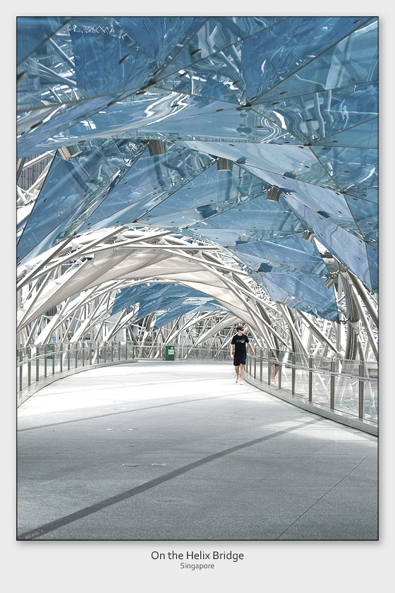
2. what one hopes to achieve with the piece of work?
A symmetry (of the bridge structure) amid the seemingly chaotic frame.

3. under what circumstance is the picture taken? (physical conditions/emotions)
A slightly overcast afternoon.

4. what the critique seeker personally thinks of the picture
I like the rich and anomalous details presented in the reflections, in particular, that of the boy and the dustbin.

What do you think?
 

Nice shot.
Love the treatment that brings out the colour of the glass. Can't see much of the reflections of the dustbin like you say though. But I do agree that the split reflections of the person are quite abstractly nice. Maybe its just me but I think the pic is slightly slanted downwards to the right. Good effort I must say. Keep it up! Cheers.

Yes, the pic does seem a little slanted. Thanks for pointing that out.

Regrettably, the reflections of the dustbin aren't obvious given the size of this post.

Other comments, folks?
 

Maybe you can try to increase the contrast? (I'm a newbie, hope you don't mind on the comments)
 

Interesting shot. Try removing the garbage bins, I personally find them quite an eyesore in the sea of blue and white. :bsmilie:
 

Yeah... Do agree that the dustbin should be remove... an eyesore...But i like the composition of this photo... Nice color
 

Maybe you can try to increase the contrast? (I'm a newbie, hope you don't mind on the comments)

Thanks for your comment (why would I mind?). In fact, I played with the contrast during the processing but opted against a more conntrasty version coz:
- that would make the visual chaos even more unmanageable (more stressful for the eyes to comprehend the structure); and
- create a deeper shade of blue (for the fibre glass) that deviates from the actual.

hope you see my points...
 

Yeah... Do agree that the dustbin should be remove... an eyesore...But i like the composition of this photo... Nice color

Interesting shot. Try removing the garbage bins, I personally find them quite an eyesore in the sea of blue and white. :bsmilie:

Haha... Thanks for sharing your thoughts... I was half-expecting this comment when I posted the picture. In fact, that was the very 1st point brought up by my wife when I showed her the photo.

Hmmm... I think I will stick with the bin coz I feel it is a strong anchor to the integrity of the frame, without which, the blue top will be overpowering.... Really appreciate your comments though!