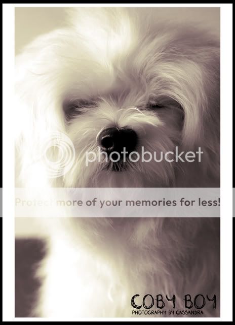
Took this shot of my dog recently. Would like some critique on the colour and overall look of it. Thanks! = )
Wanted it to look a little warm and sepia feeling but not too much of it so i twiged the colour slightly.
Hmm I think the sepia treatment dosent really do much for this pic, a plain b/w would have worked better IMO. I like the framing and expression here though the blown bits on the left are kinda wierd.
You can have contrast without blowing out the highlights. In this case, it gets distracting, as the blown out highlights take up a good two-fifths of the frame at least.