My Granny


Status
Not open for further replies.

dingzyangz

Senior Member
May 8, 2008
2,034
0
0
Hi guys,

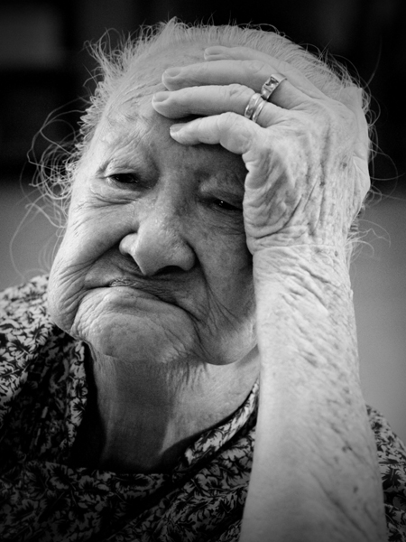
Back for critique again. Visited my granny a few months back. Took a few pictures of her. Re-processed this picture and switched in to b/w and added vignetting.

She is 90++ years and definitely has plenty to share about her history. But she seldom does that and always seems to be reminded of her past. For someone who has toiled 80 over years, I hope I did here to protray her.

Of cos, I did not ask her to pose for the cam. She was just there in a penny of thought so I snapped.

Looking forward to ur comments. Thanks for viewing. :)

3002991262_15068b4011_o.jpg
 

i like the way that she isn't looking at the camera but away. lose the vignetting or that processing, her arms looked like contrast has been reduced significantly. alittle more contrast might be punchy but b careful not to overly darken the shadows already on her face. :thumbsup:
 

yep.. agree. but dunno how to. :confused:
limited PP skills.

basically what i did was to use gradient map to convert it to b/w and added vignetting. had tried to increase the contrast more but seems like couldnt achieve what i wanted as it accentuates the shadows on the face as well as the highlight on the arms. >.<

i like the way that she isn't looking at the camera but away. lose the vignetting or that processing, her arms looked like contrast has been reduced significantly. alittle more contrast might be punchy but b careful not to overly darken the shadows already on her face. :thumbsup:
 

i like her expression, i personally have a soft spot for our golden aged people.

may i seek your permission to like edit this a little since I see a potential here? :D
 

Hi dingzyanz,

I feel that this is a good shot. The proportion fits the frame perfectly.

Alternatively, you might like to lower the camera slightly in the sout-west direction such that your grandma's head and hands "move into" the top and right frame (but do include her ring in the shot). This will align your grandma's head with the top frame and her left hand with the right frame, giving the photo a more artistic feel.
 

The vignetting is too heavy; its radius is too large, thus leaving a relatively small circle untouched in the center of the image. This leads to a perceived loss in contrast, which I find to be counter-productive to the image.
 

no prob... you can place a link to the edited shot. :)
there should be another original version in my flickr without the vignetting.
i like her expression, i personally have a soft spot for our golden aged people.

may i seek your permission to like edit this a little since I see a potential here? :D

thanks patrick... pt taken. :)
Hi dingzyanz,

I feel that this is a good shot. The proportion fits the frame perfectly.

Alternatively, you might like to lower the camera slightly in the sout-west direction such that your grandma's head and hands "move into" the top and right frame (but do include her ring in the shot). This will align your grandma's head with the top frame and her left hand with the right frame, giving the photo a more artistic feel.

agree... that's quite true. thanks for pointing out. :)
The vignetting is too heavy; its radius is too large, thus leaving a relatively small circle untouched in the center of the image. This leads to a perceived loss in contrast, which I find to be counter-productive to the image.
 

OMG

Ok coming from some1 who's new to this... you may correct me if i'm wrong.

Lol but I think velasco's version is a bit too much detail.. think a softer look works... cos now she looks like she's been carved out of tree bark... sorry...

i like the one in the 1st post... hunting for the original now, so can compare! :)

nice one, dingzyangz!

you guys can detect the PP and radius of vignetting?!? :eek:
 

thanks simplequirk. :)

for vignetting, you can actually see from the darken corners to roughly guage how much it is. a few more look at the picture, i found the vignetting is rather heavy too. :bsmilie:

OMG

Ok coming from some1 who's new to this... you may correct me if i'm wrong.

Lol but I think velasco's version is a bit too much detail.. think a softer look works... cos now she looks like she's been carved out of tree bark... sorry...

i like the one in the 1st post... hunting for the original now, so can compare! :)

nice one, dingzyangz!

you guys can detect the PP and radius of vignetting?!? :eek:
 

kind of heavy for my liking. :D

you mind changing the pic to a link? ;)
thanks.

here ya go, tell me if you want this removed ;p
thought i'll play around with textures and contrasts
 

Last edited:
Status
Not open for further replies.