
my first B&W, portrait
- Thread starter wind30
- Start date
You are using an out of date browser. It may not display this or other websites correctly.
You should upgrade or use an alternative browser.
You should upgrade or use an alternative browser.
- Status
- Not open for further replies.

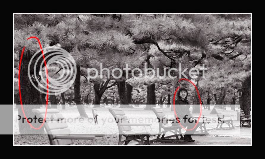
it will probably work if your wonderful wife aint in the picture, make it a landscape shot more than a portrait.
however, if you really want to include her,i guess it would have been better if she's sitting on the bench nearest to you in the frame.
also, the B&W looks a bit flat.
no offence intended.just my 0.1c.
however, if you really want to include her,i guess it would have been better if she's sitting on the bench nearest to you in the frame.
also, the B&W looks a bit flat.
no offence intended.just my 0.1c.
nice. good choice for B&W. but this is not a portrait: the viewer dont see her as a person but just a human being to complement the scene.
ok but now cannot change title
")
it will probably work if your wonderful wife aint in the picture, make it a landscape shot more than a portrait.
however, if you really want to include her,i guess it would have been better if she's sitting on the bench nearest to you in the frame.
also, the B&W looks a bit flat.
no offence intended.just my 0.1c.
no problem. Thanks for the comments. I chose the bench due to the overhanging branch above that bench. The idea was to have a thinner DOF, but I was using a tamron 28-75mm f2.8 at that time. Shot at 75mm f3.3 but still the DOF turns out the be way too deep.
Anyway here is the color version

The color version looks better huh. I was inspired by some very nice B&W shot in the Landscape forum so thinking of trying out. Maybe this shot is too messy?
have you tried other ways of cropping this?
yup cropped to the best of my abiity
But I am always open for new ways of seeing it.looking at this as a portrait, here are some of the traditional ways of composing the
human subject


if you're looking at capturing your human subject with a wide perspective of the
environment, another angle would be better. i would actually consider shooting directly from the front of the benches.
also, the bluish grey tones actually give the picture a rather cold atmosphere, i would recommend a slight sepia tint to it

human subject
if you're looking at capturing your human subject with a wide perspective of the
environment, another angle would be better. i would actually consider shooting directly from the front of the benches.
also, the bluish grey tones actually give the picture a rather cold atmosphere, i would recommend a slight sepia tint to it
you are right about the blue tone. I was copying I think wil's spain B&W photos he used blue tone so I also use blue tone....
another take.
I took a closer crop so that my wife looks bigger. The tone used is a bit warmer, but not sepia kind of look.

This crop does looks better than the first.
he used blue tone so I also use blue tone....another take.
I took a closer crop so that my wife looks bigger. The tone used is a bit warmer, but not sepia kind of look.
This crop does looks better than the first.
i think you're trying to force 2 elements into an unbalanced frame.
the problem is that there's this huge chunk of space between the 2 elements that tears up the frame. there's no communication between the 2 elements and the space in between to make a legible image.
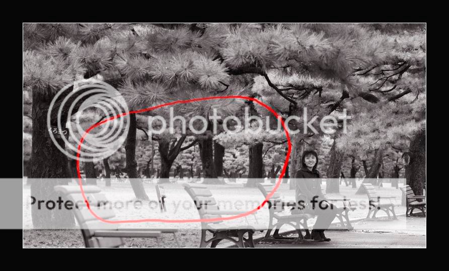
moreover the tree being partially covered by the out of focussed chair infront is somewhat making it neither important nor unimportant. neither here nor there.
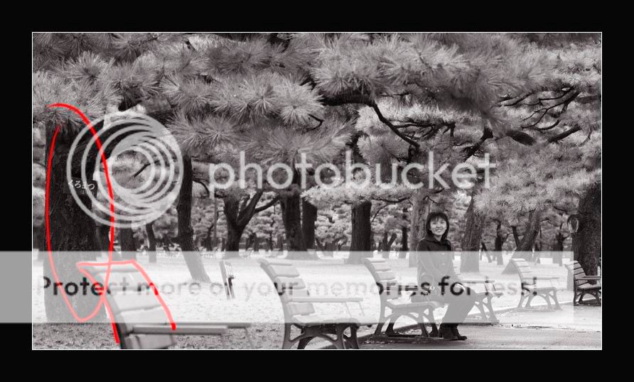
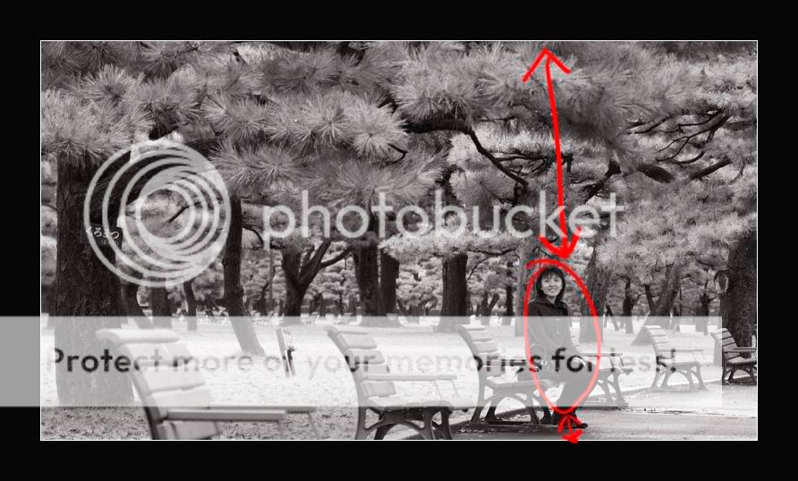
and vertically the space:subject:space proportion in this conservative portrait upsets the visual importance of your human subject as well, like she's being forced downward to the edge of the frame.
the problem is that there's this huge chunk of space between the 2 elements that tears up the frame. there's no communication between the 2 elements and the space in between to make a legible image.
moreover the tree being partially covered by the out of focussed chair infront is somewhat making it neither important nor unimportant. neither here nor there.
and vertically the space:subject:space proportion in this conservative portrait upsets the visual importance of your human subject as well, like she's being forced downward to the edge of the frame.
the color version

i think if you include the legs of the bench nearest to you will be best as the 'curvature' of the benches placed leads the eye to your wife.
i think you're trying to force 2 elements into an unbalanced frame.
the problem is that there's this huge chunk of space between the 2 elements that tears up the frame. there's no communication between the 2 elements and the space in between to make a legible image.
moreover the tree being partially covered by the out of focussed chair infront is somewhat making it neither important nor unimportant. neither here nor there.
and vertically the space:subject:space proportion in this conservative portrait upsets the visual importance of your human subject as well, like she's being forced downward to the edge of the frame.
:thumbsup: SOLID!
thanks.
for all the tips. Agreed that my wife is too low in the picture.
new version

I never intend the trunk as an impt element in the picure. It is more of a frame for my wife. I wanted to keep the trunk in place so that the overhang branches doesn't look like floating. The chair blocking the trunk is bad but nothing I can do about it now, other than PS it away
for all the tips. Agreed that my wife is too low in the picture.
new version
I never intend the trunk as an impt element in the picure. It is more of a frame for my wife. I wanted to keep the trunk in place so that the overhang branches doesn't look like floating. The chair blocking the trunk is bad but nothing I can do about it now, other than PS it away

:think: i would suggest reading up on photography books/magazines/publications on how placement of elements within the frame affects the visual order.
any recommendations? I got like a lot of books on photography already :embrass:
not really ... maybe you want to check out with riceball? i think the library has some good books too. look up on other visual arts too, fundamental compositional rules are pretty much the same across all visual arts.
your original B&W conversion looks dull, lack of contrast, sharpness...
try use channel mixer, and some USM.


try use channel mixer, and some USM.
Scott Kelby's PS CS2 book suggests several ways of achieving high contrast B&W pictures. Then again, that's just the color management part. I think it is the composition that has to be improved.
Keep trying!
Keep trying!
- Status
- Not open for further replies.
Similar threads
- Replies
- 0
- Views
- 179
- Replies
- 0
- Views
- 139
- Replies
- 0
- Views
- 186
- Replies
- 0
- Views
- 148
- Replies
- 0
- Views
- 171