Moment


Status
Not open for further replies.

m3rcury747

New Member
Jun 26, 2007
36
0
0
Hi,
This is the first time that I am shooting portrait and I hope to get pointers for improvement.
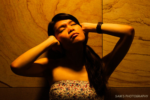
4342898441_bd91e98a40.jpg

The photo page for larger viewing purpose

1. in what area is critique to be sought?
The pose - Is there a better way to place the hand or is there a better way to pose? I have no idea how to pose her and she came up with this.

I only requested for her to look up in order to get her face lit, but is it recommended to place a reflector at the bottom in order to remove the shadow or it will just make it worst?

PP - Nothing is done to this picture other than my watermark. Would a touch of softness make this a better picture?

2. what one hopes to achieve with the piece of work?
Actually I didn't thought of that when I took this picture:sweat:

3. under what circumstance is the picture taken? (physical conditions/emotions)
I personally wanted to try something like strobe but making use of whatever that is available. I happen to notice this ambient lighting and it is made possible due to the height of the ceiling.

4. what the critique seeker personally thinks of the picture
If only I could change the background, I feel that the pattern on those wood is nice but I think one without those break line would be better.

Canon 500D with EF 50mmf1.8
ISO 400
Shutter 1/100
F2.8
Auto WB
Spot metering

Thank you.
 

mask the lines in your back ground.. experiment more on your post processing to make the images snap and compel. nice emotion in the pic.. its too yellowy or my taste.. i like sepia better in this pic.. and also do not place your subject dead center.. make it asymmetrical.

this is my own personal opinion. :)

Hi,

Thanks for your comment, but doesn't masking the lines makes the background too fake? as in the breaking of the patterns on the wood.

The light source is this colour so I'm thinking of retaining it.

If you're saying asymmetrical, isn't the head, both hand and body asymmetrical?
There isn't much space and quite a number of distraction around the subject at that location for different angle. Now thinking back, I should have tried high angle too but sadly, I didn't. :(

And looking at the photo now, I wish I had asked her to remove her watch...;p
 

hi ts, honestly, her face expression doesnt really show any moment of peaceful imo.. hmm
 

if i am the one shooting i will shoot a bit from below or even ask her to sit.

NO - masking the lines will not make it too fake.. this will depend on your post processing skills.

if you have a small room for different angles try tilting the camera to make it asymmetrical


Hi,

Thanks for your comment, but doesn't masking the lines makes the background too fake? as in the breaking of the patterns on the wood.


The light source is this colour so I'm thinking of retaining it.

If you're saying asymmetrical, isn't the head, both hand and body asymmetrical?
There isn't much space and quite a number of distraction around the subject at that location for different angle. Now thinking back, I should have tried high angle too but sadly, I didn't. :(

And looking at the photo now, I wish I had asked her to remove her watch...;p
 

if i am the one shooting i will shoot a bit from below or even ask her to sit.

NO - masking the lines will not make it too fake.. this will depend on your post processing skills.

if you have a small room for different angles try tilting the camera to make it asymmetrical

My post processing skills isn't that good yet...;p

Thanks for the knowledge, will try that when I've got another chance...:)
 

i don't mean to be mean, but here is the first thought when i saw this:

oh, a person trying to break her own neck.

perhaps that would give you a clue as to what is going on here when people look at the photograph.
 

Hi,
This is the first time that I am shooting portrait and I hope to get pointers for improvement.

4342898441_bd91e98a40.jpg

The photo page for larger viewing purpose

1. in what area is critique to be sought?
The pose - Is there a better way to place the hand or is there a better way to pose? I have no idea how to pose her and she came up with this.

::

Thank you.

i don't mean to be mean, but here is the first thought when i saw this:

oh, a person trying to break her own neck.

perhaps that would give you a clue as to what is going on here when people look at the photograph.

Actually I only wanted to say that the photo seems under exposed. Now that night86mare said it, I couldn't help but burst laughing out loud...:bsmilie:


i don't mean to be mean, but here is the first thought when i saw this:

oh, a person trying to break her own neck.

perhaps that would give you a clue as to what is going on here when people look at the photograph.

Hmm, in that case, would it make a better pose if the subject's elbow is pointing downwards, arm closer to the body and palm covering the ear?
 

Hmm, in that case, would it make a better pose if the subject's elbow is pointing downwards, arm closer to the body and palm covering the ear?

not with that expression.

the lighting also, ends up with her head floating on shadow, giving a rather spooky effect.
 

The goat is evil with his mouth, but the shadow does makes her head looks like floating without a neck.
My advice is either use a flash or don't post this during hungry ghost festival
 

my comments minus her trying to break her own neck.

1. the flesh between the shadow on the neck and bust line is very unflattering. somehow it accentuates an even low bustline.
2. on the shadows - light from top to bottom is not flattering for portrait shots. in this case her neck and arms have disappeared in the shadows. try lighting from the side. her hair didn't help either.
3. if you are trying to take portrait, try not to take against a wall (unless it is an interesting wall). instead look for a nice background to give an interesting bokeh.
4. the pic is too warm for my liking.
5. also try shooting portrait instead of landscape. the crop at her bustline is not very flattering.
 

As mentioned earlier, it could be better if you shoot it at an angle with lines of the backgrounds leading towards the model. I find it underexposed and the white balance is off the mark.
 

It be good if one can see the neck. Too dark on the neck area.
 

Looks a little like a horror movie poster, there are too much shadows and the pose is a little awkward, perhaps using the popup flash as a fill flash would be better in this situation rather than having her tilt her head at such an awkward angle and casting shadows everywhere. The lines in the background can easily be removed with some post processing, not much to worry there. Even if you don't have the skills now, you will pick them up eventually if you keep trying.
 

Status
Not open for further replies.