Merlion


nitewalk

Senior Member
May 31, 2010
4,612
35
48
Singapore
5287486801_9cfda17698_z.jpg

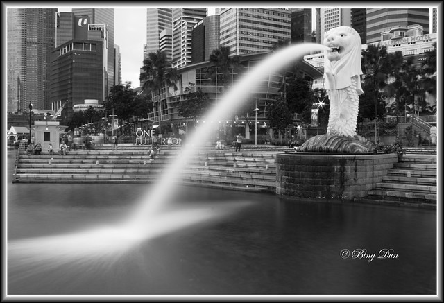
1. in what area is critique to be sought?
composition and the black and white treatment. did some changes to highlights and shadows but not really sure what i was doing, just changed till i find it comfortable. Also if there are any distortion or technical mistakes, please advise. thanks.

2. what one hopes to achieve with the piece of work?
Mainly the water landing part. i saw some shoot long exposure with this similar scene and i thought hey thats cool, the blurred landing and since i was there so i thought of doing a long exposure for this.

3. under what circumstance is the picture taken? (physical conditions/emotions)
ND8 used. Shot at M-mode, f/22, 21mm on a ef-s 18-55mm IS (IS turned off), ISO 100. Shutter speed 17sec.

4. what the critique seeker personally thinks of the picture
I'm unsure with the black and white treatment. Although comparing the coloured and bnw ones, i prefer it in bnw, I want to know if the overall treatment of the bnw is alright in the context of landscape shots.

Thanks in advance for viewing!
 

Composition is fine and yes I like the silky water display.
 

Thank you KT for viewing and commenting. :)
 

one of the hardest things i find abt shooting the CBD is that just a slight shift in framing, everythign can look messy/chopped off. it is a challenging place to shoot and i applaud u for your courage.

my personal preference would be to avoid having any builds chopped off. while the merlion is ur anchor, i find it too close to the top, very little breathing space. chopped off buildings dun seek to help either.

also, the distance between the buildings beside the NTUC has left a white patch which is awkwardly distracting.

my suggestion would be u can try shifting ur perspective so that u can kick the ntuc out of the picture, while ensuring merlion remains roughly same place...

just my thoughts

u can take a look at how kit frames it

http://www.clubsnap.com/forums/showthread.php?t=819866&page=5

and mine is there too. i personally find mine too tight though:)
and its a very good attempt. like the bnw. maybe a stronger contrast?
 

Last edited:
Thanks allen for your honest feedback.

For the contrast if i recall correctly, i pushed it quite high as i usually would for bnw, unless it look quite funny if push any higher.

I get what u mean. My bad to overlook the cut off buildings. I was too zealous to get the silky effect and forget the basics. Thanks for pointing that out.

I shifted around and got a couple of shots but they had buildings cut off to. I think i need to recee again for a better spot. All in all, thanks! :)