Meeting of Sun and Moon at Artscience Museum


durianshells

New Member
Jan 11, 2007
220
0
0
36
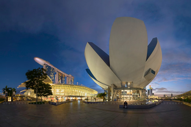
View attachment 12653

1. in what area is critique to be sought? Composition, Lighting and Editing
2. what one hopes to achieve with the piece of work? Show the beauty of MBS Area and the sun and moon together.
3. under what circumstance is the picture taken? (physical conditions/emotions) Sunset Timing
4. what the critique seeker personally thinks of the picture? Seeking comments so i can improve on composition or others.
 

Feels under exposed.
I would up the exposure by maybe 2/3 - 1 stop and Maybe lift up the shadow of the museum abit.
Also the guy in beige in the foreground and the female in beige at the left corner quote very distracting. Either crop a it off the bottom or maybe clone them out.
 

Last edited:
Feels under exposed.
I would up the exposure by maybe 2/3 - 1 stop and Maybe lift up the shadow of the museum abit.
Also the guy in beige in the foreground and the female in beige at the left corner quote very distracting. Either crop a it off the bottom or maybe clone them out.

It feels underexposed because clubsnap web page is predominatly white and light grey,plus ambient light in room is bright.If you view photo with black background you will realise the exposure is just right. I should know because even opening 1/3 stop looks like a sunrise scene rather than original sunset...haha. If 2/3 -1 stop more will look overexposed or like midday with desaturated colours.

As far as photographer is concerned he has achieved what he envisioned.:thumbsup:Composition wise there is an imaginary oval surrounding science museum by elements on both sides.Leading lines on floor to sunset and left side.If you superimpose the rule of thirds grid on photo you will see the four strongest points or intersections occupied by science museum which makes it dominant.Cropping will look odd.Given the use of UWA lens perhaps composition can be better if viewpoint is pulled further back of science museum to have more foregropund.A matter of proportion.Wide angle lens pushes objects far away so need foreground to anchor viewer interest (bigger/more details).


$smgrid.jpg
 

Last edited:
Exposure looks good to me. It is an interesting idea to try to get the sun the moon and mbs and ASM all in. Personally, i feel there are too many distracting elements. Many people, the lines on the right. It's not easy to compose with fisheye. In fact, this is a very challenging place to compose if you want all things to be in. I can give you an alternative, that is to use multirow pano, like this which i did a long time ago:

16463407251_eb706c0b5c_z.jpg


But even so, I am critical about the amount of distortion i get from the pano so to me I felt i failed. It distorted the structures too much and the curvy lines were distracting.

Sometimes, perhaps an easier way to compose is to select the right spot to shoot from or simply to exclude things. I do understand that you see the sun, the moon and then there is mbs and ASM, put all in, wow it is something which people don't really have. In the end, we take a step back, looking at the picture, how significant was the sun and moon? They were two small light spots in opposing corners of the frame. In the process of using fisheye to include everything, you also get all the compositional distractions.
 

Last edited:
ok my bad ... was viewing on my ipad ..
review the pic on a calibrated screen ... the exposure is fine.
 

Thanks so much for all the valuable comments. Will take note in the future!