Meditation Ground


MGohzxc

Senior Member
Jun 12, 2010
2,353
25
48
Singapore
5142686720_60049cdd33_b_d.jpg


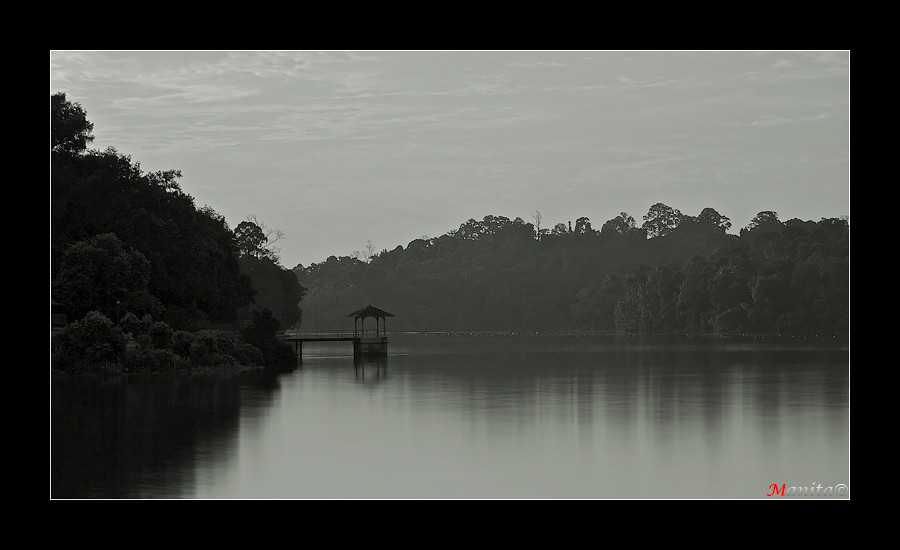
1. In which area is critique or feedback to be given?
Composition and B&W and Exposure balance

2. What were you hoping to achieve with this image?
That this photo have the feeling of serenity, peace and tranquility, etc.

3. Under what circumstance was the picture taken? (physical conditions/emotions)
The picture was taken during sunset at about 6:12PM. Using long exposure with a ND110.

4. Thread-starter's personal thoughts about the image.
I feel that this picture has a good feeling of peace.​
 

can't think of anything to comment to help you improve.
Maybe...it may need just a tad of highlight in the photo for the bnw photo to work well.

This is basically a very well taken photograph. :thumbsup:
 

can't think of anything to comment to help you improve.
Maybe...it may need just a tad of highlight in the photo for the bnw photo to work well.

This is basically a very well taken photograph. :thumbsup:

Hello Uncle CT, thanks for the C&C. Will take note.:)
 

Good take!!!
 

:thumbsup::thumbsup:

kind of agree with UNCLE CT, need a bit of highlights

overall, i still love it, a place i wld go to meditate if i need to...;)
 

:thumbsup::thumbsup:

kind of agree with UNCLE CT, need a bit of highlights

overall, i still love it, a place i wld go to meditate if i need to...;)
Hi Akerue, Thanks for the C&C. Will also take note.:)
 

Can feel the peace when looking at the pic and definitely a good place for meditation. :thumbsup::thumbsup::thumbsup:
 

Just a quick question? Did you shoot in the camera's b&w setting? Most camera's b&w setting produce pictured that are very grey and lacking in definition of b&w pictures. Personally, I like a little more contrast in b&w. Cheers!
 

Is it tilted slightly to the left?

I don't know the pic is technically good but I don't feel the emotional connection.
Either that or I'm a cold-hearted *******. :sweat:
 

So peaceful.... But the left side seems a little too dark to me...
 

Can feel the peace when looking at the pic and definitely a good place for meditation. :
Hi, Thanks
Just a quick question? Did you shoot in the camera's b&w setting? Most camera's b&w setting produce pictured that are very grey and lacking in definition of b&w pictures. Personally, I like a little more contrast in b&w. Cheers!
Hi, it was shot in color but it took me quite awhile to choose to do it in B&W for some reasons. Contrast noted.

Is it tilted slightly to the left?

I don't know the pic is technically good but I don't feel the emotional connection.
Either that or I'm a cold-hearted *******. :sweat:
Hi, if you look at the "jetty", is tilted but look at the horizon is actually straight. Have also check before PP. Is ok, everyone have different view. Thanks

WHAT YOU WANT US TO CRITIQUE ABOUT!!!!!!! (Joking only). Such a good take, Thumbs up for you
Hi , Thanks, glad you like it.
Good picture. Very swee...:thumbsup::thumbsup::thumbsup:
Hi Thanks.:)
 

So peaceful.... But the left side seems a little too dark to me...

Hi Smiles88,
Yes, the contrast is very great from the left to the right side. The sun is behind the left shinning to the right through the centre horizon. So is natural for the left to have more shadow and darker in contrast. But your C&C is noted. Thanks:)
 

Looks good in all areas. But I wished the water was completely smooth to bring out the extreme calmness. Two thumbs up!
 

Looks good in all areas. But I wished the water was completely smooth to bring out the extreme calmness. Two thumbs up!

Hi Derrickder, thanks for the C&C and noted on the water.:)
 

Hi Manita.

Sorry haven't been able to give to too much feedback recently. Very busy recently.

This is a very nice piece of work. I like the layers of the scene here. from dark to brighter... and the picture looks very 3D to me with lots of depth. Well done.

One thing you can try doing is to push contrast a little more. But you need to push it with more fill light in the left shadow section... If you are using lightroom, I would push fill-light more, and at the same time, balance it back by also pushing blacks. This will give you more contrast, but also allow you to push up the lights in the darker areas. After that, I would push mid-high tones and highlights a little more.

But seriously, it is more personal preference. Another thing to note is when you are printing your pictures. This picture will print out quite a bit darker. So it helps to push it a little more when doing actual printing to photo paper.

Hope this helps you. Very well done!
 

i think it should have a "like" button in here haha. i like this photo! really looks peaceful and quiet for meditation
 

not a bad composition, maybe crop some of the left off?

i would not present it in bnw this way, something with more contrast would be my preference.