macritchie


Status
Not open for further replies.

siimplicity

New Member
Jul 2, 2009
19
0
0
singapore
Untitled2-1.jpg


hi first time posting a pic up. i am learning on editing n phototaking skills. hope to get some comments.

1. in what area is critique to be sought?
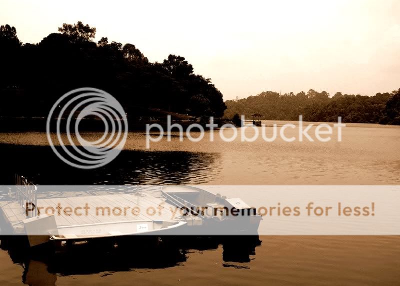
i believe i have much to improve on with regards to my phototaking, photo editing skills. and also the composure of the photo.

2. what one hopes to achieve with the piece of work?
i want to give this pic a very peaceful feel while at the same time, bringing out the small boat on the vast water. also by using sepia, i hope to make it like a memory and sth away from the bustling city.

3. under what circumstance is the picture taken? (physical conditions/emotions)
this picture is taken during the bright early afternoon at macritchie when i was there alone to take pics of the surroundings.

4. what the critique seeker personally thinks of the picture
i kinda like this pic and the feel that it gives me. though i think the contrast may be a little too much.

hope to learn from u guys. thanks! =)
 

too much contrast...lost of details in the tree
oh ya and why in sepia mode?
simply put...i dun know what you are trying to shoot or what you are trying to bring out in this photo
 

maybe you can also try a HDR if you've shot in RAW?
also, horizon is tilted.
composition wise, I would say it's kinda weak.

that's just me.
 

You have placed the floating platform and boat in a rule of thirds position. That is good.

However, you can also place or crop the horizon using rule of thirds as well. Try cropping off most of the empty sky.

Using a low shutter speed to calm the waters might be a good idea to give a sense of peace.

The boats look too far. Go in close with a wide angle or a telephoto. Go at a lower angle. Make it seem as if its the platform or boat that is looking out to the reservoir.
 

Horizon is tilted badly, sky is way blown. The part on the water's edge is too dark. What you need to do is to find another time of day to shoot shoot this view. And please watch the horizon the next time round. It is inexcusable now in the digital age, since you can easily fix it in PP.
 

1. tilted horizon

2. be careful of playing too much with contrast, usually in landscapes unless there is a reason, you want to keep details in all areas as far as possible. the exception perhaps is when you want to go for a certain kind of mood, in which case, i do not know what it is here, which means your mood isn't clear.

3. the composition is weighted too heavily on the left.

4. blown skies are not always a no-no, but they are pretty distracting here.
 

THANKS ALL FOR YOUR COMMENTS!! i'll keep improving. thanks alot! =))
 

Status
Not open for further replies.