
Hello all!
Just posting a few pieces of works for comments and advices for improvement! Technical info as follows: Nikon D80, Focal Length: 32, F14, Exposure: 1/800. No post processing done. Cheers!
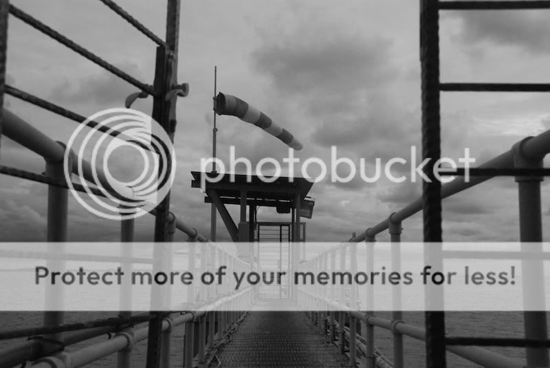
1. in what area is critique to be sought?
I'm looking at the overall art direction and the framing of the shot.
2. what one hopes to achieve with the piece of work?
A very abstract yet inspiring picture that shows that nothing in life is too mundane to be overlooked.
3. under what circumstance is the picture taken? (physical conditions/emotions)
mid day, slight over cast skies
4. what the critique seeker personally thinks of the picture
I think that the picture has areas for improvement for toning of the various levels of the greys and blacks.
Just posting a few pieces of works for comments and advices for improvement! Technical info as follows: Nikon D80, Focal Length: 32, F14, Exposure: 1/800. No post processing done. Cheers!
1. in what area is critique to be sought?
I'm looking at the overall art direction and the framing of the shot.
2. what one hopes to achieve with the piece of work?
A very abstract yet inspiring picture that shows that nothing in life is too mundane to be overlooked.
3. under what circumstance is the picture taken? (physical conditions/emotions)
mid day, slight over cast skies
4. what the critique seeker personally thinks of the picture
I think that the picture has areas for improvement for toning of the various levels of the greys and blacks.
Last edited:
")
