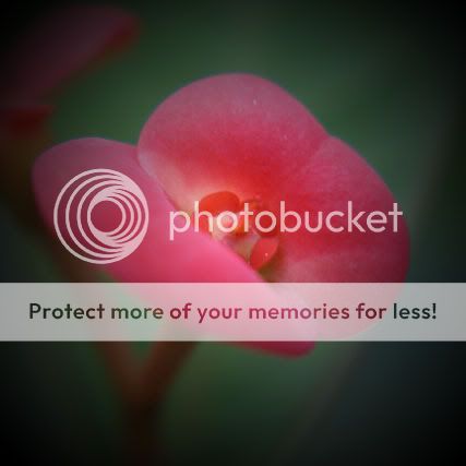
as of the space, i kindda like it that it looks like water color painting, but thats my own perception...
i'll like to quickly illustrate how the space you're referring to might not be working the
way you wanted it.
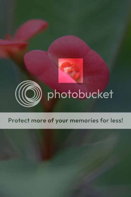
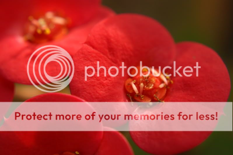
Proportion
proportioning is an important component of composition. in pictures where
the focused area is small and out of focused area is large, it becomes
especially apparent.
as shown above, the focused area is rather lost in a sea of out of focused area.
i'm not saying that such a proportioning is always bad, it doesn't contribute here
because the out of focused area contains complicated details such as contrasting
colours and complex arrangement of lines, which fights with the focussed area for
attention.
as such you might want to recrop the image for an easier proportion for the subject.
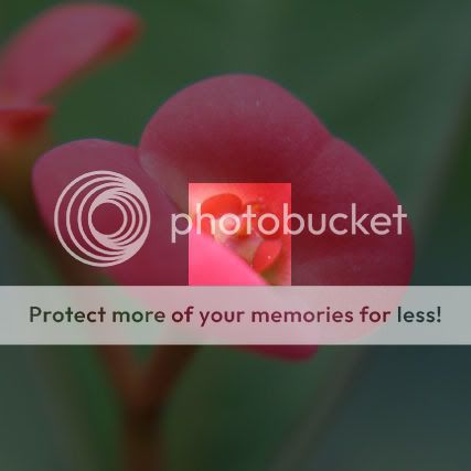
Colour
next you might want to consider the frame in terms of the colours.
obviously the red out of focused petal on the upper left is stealing attention,
here you might want to consider using a method such as circular gradient in
photo editing software to create a vignetting effect around the frame so as to
cut down the influence from the 'extra' red petal.
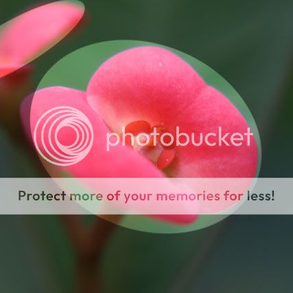
by no means are these absolute truths, this is just one way out of thousands to
reconsider your pictures.


")