Lights!
- Thread starter chuaboonkiat
- Start date
You are using an out of date browser. It may not display this or other websites correctly.
You should upgrade or use an alternative browser.
You should upgrade or use an alternative browser.
- Status
- Not open for further replies.
what are you trying to show here?
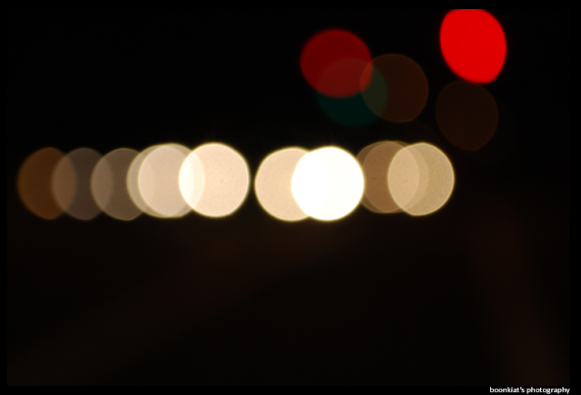
1) no colourful and no many
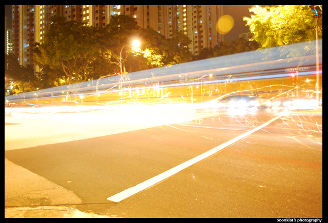
2) messy
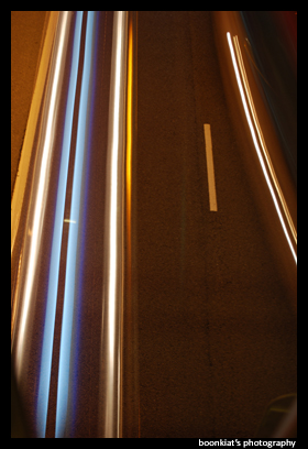
3) abit ok but the bottom left and right have something which looks very irritating, noisy also.
1) no colourful and no many
2) messy
3) abit ok but the bottom left and right have something which looks very irritating, noisy also.
what are you trying to show here?
1) no colourful and no many
2) messy
3) abit ok but the bottom left and right have something which looks very irritating, noisy also.
1) I juz testing, too many and too colorful look more ugly. dont believe? try urself and see.
2) messy is what i want
3) Noisy? dun think so, my ISO is kept at 100
i think u juz dunno how to think
1) I juz testing, too many and too colorful look more ugly. dont believe? try urself and see.
2) messy is what i want
3) Noisy? dun think so, my ISO is kept at 100
i think u juz dunno how to think
young boy, why you get so aggitated here, dont you asking for C & C ?
don't ask for C & C if you'll get irritated by what people will say... just post the pics, don't ask for any comments and suggestions... then everything will be nice...
noise could be due to long exposure , even if your iso is at 100.
and though you might have wanted messy , it just doesn't appeal to most.
we're all trying to get better. getting angry won't help anyone.
i quite like your third shot though. although like ggodetucsamoht said , the bottom left hand corner is quite distracting. probably cropping it off would be better.
nvm, continue C & C, i re-do it tml
which body are you using btw? nikon d60?
#1 has some potential
#2 is just a mess, full stop. WB too warm, composition is a mess and highlights blown.
#3 - you could have fixed the 2 bottom corners in your post processing. WB also a bit warm here.
If you are going to redo this, do take note of the points brought up by the various people.
#2 is just a mess, full stop. WB too warm, composition is a mess and highlights blown.
#3 - you could have fixed the 2 bottom corners in your post processing. WB also a bit warm here.
If you are going to redo this, do take note of the points brought up by the various people.
LOL i like the last one...see you on 20 bring tripod we do HDR and long shutter time on planes haha even more imba
LOL i like the last one...see you on 20 bring tripod we do HDR and long shutter time on planes haha even more imba
faint. long exposure on plane
1) I juz testing, too many and too colorful look more ugly. dont believe? try urself and see.
2) messy is what i want
3) Noisy? dun think so, my ISO is kept at 100
i think u juz dunno how to think
If this is the kind of attitude you are giving after asking for C&C, then I think you better just show your photos to your good buddies and friends.
For pic1, many does not mean ugly. Just take a look at the first photo in this post by a fellow CSer. Your response is uncalled for.
http://www.clubsnap.com/forums/showthread.php?t=516096
Pic2 is messy cause of the stray strands of light especially on the right. If this is intended by you, then fine.
Pic3, bottom does indeed look noisy, but I think that's just the effect from the tarmac road material.
Take it easy bro :cheers:
Last edited:
Personally, I feel the last photo has the most potential. The steaks of coloured lights of blue and yellow attracts me. Who cares if its noisy? :bsmilie:
For number 1, it's just normal bokeh. Nothing special really.
For number 2, messy is what you want. Fine. But it can be messy in the nice way. Far too overexposed to be nice IMO. And I would find a better spot for this photo too. I would rather see more colours (traffic lights) rather than all yellow.
:bsmilie: Take it easy. Like my teacher always tell me, the truth always hurts. :bsmilie:
If you can't take C&C, don't post.
Do retake and see how the shots can be improved!
i am going to say that i like nothing here.
#1 - just bokeh, nothing very special to it, think of something new to do, how to make the bokeh work for you, instead of just shooting for the sake of having a go. there are loads of interesting examples out there, you only have to search.
for example:
link1
link2
even something like this
link4
#2 - too much going on, simplify, cut down. unless you can somehow find the order in the mess, which is not easy:
link1
link2
link3
#3 - what do you think people will think when they see the picture? does it make them think more? is it your intention to make them think more, or just present a few strands of light? most people will demand that you make them think more.
Last edited:
- Status
- Not open for further replies.
Similar threads
- Replies
- 0
- Views
- 64
- Replies
- 1
- Views
- 308
- Replies
- 0
- Views
- 73
- Replies
- 0
- Views
- 288
- Replies
- 0
- Views
- 110


