
hi guys,
went to Old Changi Hospital recently and snapped a few shots. think i took this on the second floor. anyway, got the photo and did some pp on it. adjusted the contrast, brightness and saturation, thats all. personally, i quite like this photo. Its actually a much bigger photo with more leaves, but because theres a flare on top so i cropped it away. just want to get some comments on the picture, whether the composition is good? whether the pp is too much or too little? or is there anything i can add into the photo to make it better? please comment!
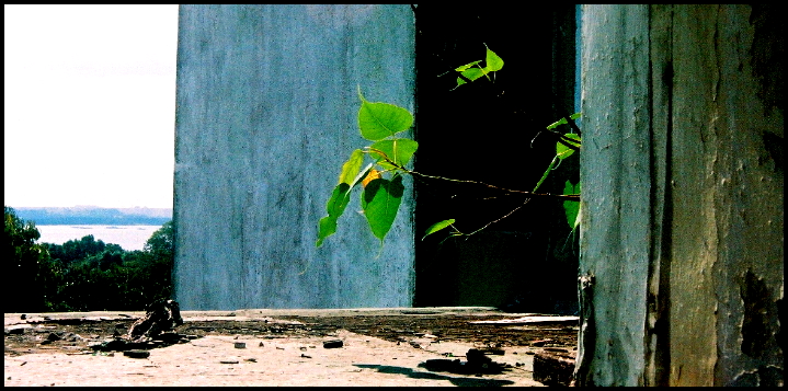
PS - ohhya. also want to ask abt something. is there such thing as too much pp?
thanks!
went to Old Changi Hospital recently and snapped a few shots. think i took this on the second floor. anyway, got the photo and did some pp on it. adjusted the contrast, brightness and saturation, thats all. personally, i quite like this photo. Its actually a much bigger photo with more leaves, but because theres a flare on top so i cropped it away. just want to get some comments on the picture, whether the composition is good? whether the pp is too much or too little? or is there anything i can add into the photo to make it better? please comment!
PS - ohhya. also want to ask abt something. is there such thing as too much pp?
thanks!