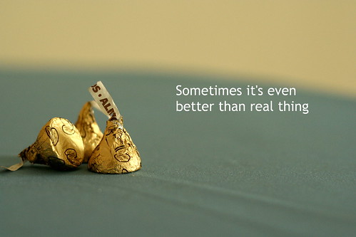
Jaredflo, nice touch. I love the idea. However, you may wish to improve the typographic treatment. It seems a little too large now. It should be subtle and not vie for attention with what is a nice image.
There should be 1 hero and that's the shot, followed by the type, so perhaps a lighter weight and smaller point size would help.
I'd also bring the text down to the bottom right and have it in 1 line instead of 2. It can be done when the text is smaller than it is now.
Still really nice work. :thumbsup: :thumbsup:

") Nice work...
Nice work...