Isolation


Status
Not open for further replies.

lil_princess

New Member
Do comment on my pictures for I hope to improve. Thanks!
This series is about being alone, away from people, being the odd one out.
I believe many of you have felt that way before...


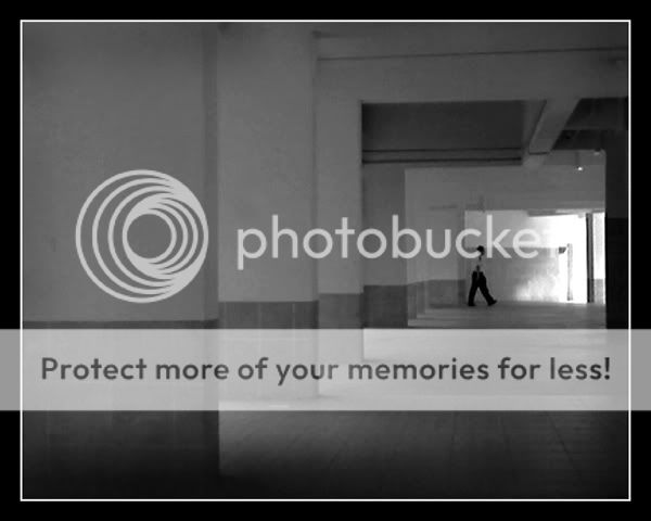
#1 - The Light: A Sign?
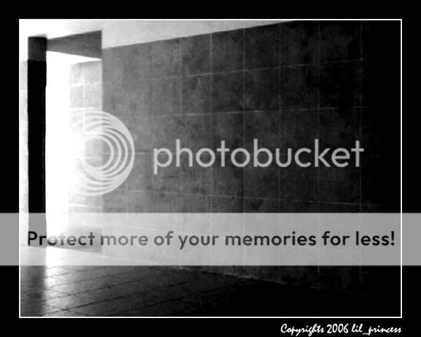
Photo-0791PS.jpg


#2 - Away. . .
Photo-0793.jpg


#3 - Odd Ones Out
Photo-0710PS.jpg
 

#1 lacks a subject to make it interesting
#2 composition is nice, stronger light source from the pillar gaps would enhance it and someone walking away to the top-right would convey the title better (hint: use tripod, set timer, walk)
#3 er... so which are the non odds? ;) better if just one piece stuck out

;)
 

i'm confused
 

An interesting series. In my humble opinion, the passer-by in pic #2 dun really seem to fit into the overall theme "isolation" as he seems to be too coincidental.
I would remove the passer-by and name the series "dimension" as the strong features about this series are the grainy tones and shadows of the walls and space.
:)
 

Love the mood of #1. Play on the light and the graininess works well for me!

#2 again idea is nice but I find the width of pillars on the left a little too wide for my liking.

#3 doesn't really work for me as it seems there's too many elements to focus the thought
 

i really like all your pictures..they seem to convey the mood so well..upz!
 

Trigger Happy said:
#1 lacks a subject to make it interesting
#2 composition is nice, stronger light source from the pillar gaps would enhance it and someone walking away to the top-right would convey the title better (hint: use tripod, set timer, walk)
#3 er... so which are the non odds? ;) better if just one piece stuck out

;)
Thanks for ur comments...
#1 is the light as the subject. Im trying to convey that perhaps when everything seems bleak and darl, is the light the sign???

#2... no tripod leh... :cry:
#3.... the odd ones are those that sticking out.. thats why, instead i named that pic 'odd one out', i named it as 'odd oneS out'...
 

clicko said:
An interesting series. In my humble opinion, the passer-by in pic #2 dun really seem to fit into the overall theme "isolation" as he seems to be too coincidental.
I would remove the passer-by and name the series "dimension" as the strong features about this series are the grainy tones and shadows of the walls and space.
:)

But dun u feel that the man is like isolated? All by himself? Its like he's trying to walk away from the isolation???

but thanks for your suggestions. ^_^
 

#1 lack composition n detail. the point of interest on the right n left, either too dark if not bright. u try first glance. some may put off by it.

#2 got potential. nice composition with the nicely figure in for the scale comparison, but may not work for us. we see this everyday here, different angle, or tighter crop may do the trick.

#3 don't know what is this. suppose u want to get some uniform or repeat patterns, not enough of it yet.


good effort at abstract n B&W. but the pics seem all lacking in detail. not sharp enuff.
 

bwilly said:
#1 lack composition n detail. the point of interest on the right n left, either too dark if not bright. u try first glance. some may put off by it.

#2 got potential. nice composition with the nicely figure in for the scale comparison, but may not work for us. we see this everyday here, different angle, or tighter crop may do the trick.

#3 don't know what is this. suppose u want to get some uniform or repeat patterns, not enough of it yet.


good effort at abstract n B&W. but the pics seem all lacking in detail. not sharp enuff.
Thanks for your comments. I will try to improve... Thanks! :p
 

i actually think they are not too bad..
but maybe jus play around wif burning n dodging more.. to make it more contrasty..
 

I kinda like pic #1 and #2 (though a tighter crop would be better =D)

#3 -- Dun really show the lonliness got tt tile got other "kaki"

Nice theme though
 

Will03 said:
i actually think they are not too bad..
but maybe jus play around wif burning n dodging more.. to make it more contrasty..

Hullo! So nice of you to drop by my thread and comment! :lovegrin:
For #1 and #2, I got play with the burning tool actually. Maybe I didnt used enough of it... :think:
 

stupidbear said:
I kinda like pic #1 and #2 (though a tighter crop would be better =D)

#3 -- Dun really show the lonliness got tt tile got other "kaki"

Nice theme though
Thanks for your comment! :)

#3 - A few has already commented on it... But the caption for #3 is "odd one(S) out".
 

nice pics! i prefer if in the 2nd pic the guy actually gotten nearer to the end of the frame..or fade out effect like a slow shutter speed..something like that...

overall, neat pics :)
 

lil_princess said:
Hullo! So nice of you to drop by my thread and comment! :lovegrin:
For #1 and #2, I got play with the burning tool actually. Maybe I didnt used enough of it... :think:
;) have always liked your creativity in your photos...........
carry on shooting.... i m sure u will have more n better pics in time to come..
anyway.. still owe u something.. will contact u..
 

Status
Not open for further replies.