Inscriptions for future historians


Neurospark

New Member
Oct 4, 2010
126
0
0
Singapore
Hi guys,

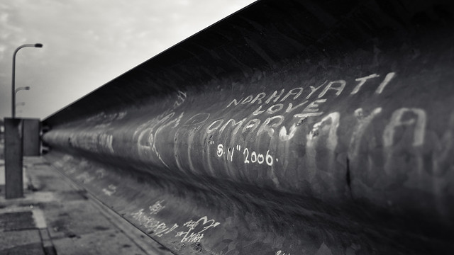
I'm new to DSLR photography. So please pardon me if my shots are not technically up to standard. Shot this at lower seletar reservoir where there is a 1km long road over a dyke that separates the reservoir from the sea. Happened to notice numerous such love scribbles all over the aluminium / zinc railings. Just my view of love and its immortality.

5074796770_ac6636de6b_z.jpg


1. in what area is critique to be sought?
Composition, mood, technicalities

2. what one hopes to achieve with the piece of work?
Learn more about B&W photography, esp those which aim to capture moods

3. under what circumstance is the picture taken? (physical conditions/emotions)
the usual morning 7-8 O clock-ish. using my nikon D5000. Later PPed with lightroom.

4. what the critique seeker personally thinks of the picture
love scribbles today would be valuable inscriptions for future historians, say a thousand years from now, to study and recognise the beauty of everlasting love


Please feel free to comment... I'm very keen on learning. Thank you guys!
 

technically I think its well executed with the nice lines leading into and out of the image, nice balance with the lamp posts and not cluttered

I like the messages left behind ..... imho they DO speak not just about bf/gf and love.... its a good candid capture of how men and women socialized and got together during this era (if u get to see bf/gf pics from the 50s, 70s and 90s.... from an anthropological perspective, that man/woman ritual has constantly evolved and will continue to evolve)

So ha ha, yes, love the image

Just wished you were nearer to the messages for a little more 'punch'

:thumbsup:

hey i see u just joined CS.... welcome ! :)
 

Last edited:
To be honest, this photo is pretty decent, but it doesn't seem to pack as much punch as it should, and I don't know why.

Colour-wise, you can afford to up the contrast quite a bit more I think.
 

I think it doesn't have so much punch cos the 'love message' you focused on was in words? if there had been a similarly-placed 'heart' diagram style love message it would have had more kick. you seem to have a bit of halo-ing around the edge of the concrete and the sky, did you play with the contrast or something already?

composition wise quite good. keep shooting :)
 

technically I think its well executed with the nice lines leading into and out of the image, nice balance with the lamp posts and not cluttered

I like the messages left behind ..... imho they DO speak not just about bf/gf and love.... its a good candid capture of how men and women socialized and got together during this era (if u get to see bf/gf pics from the 50s, 70s and 90s.... from an anthropological perspective, that man/woman ritual has constantly evolved and will continue to evolve)

So ha ha, yes, love the image

Just wished you were nearer to the messages for a little more 'punch'

:thumbsup:

hey i see u just joined CS.... welcome ! :)

Thats one of the better critiques i've read, well round evaluation covering the technical, compositional and contextual aspects. More of such critiques will be useful, particularly where sociological and anthropological nuances are acknowledged. Not forgetting that Neurospark did a great job with this picture :thumbsup:
 

I like the picture. But I think a little more contrast could have helped the picture a little more.
 

Thats one of the better critiques i've read, well round evaluation covering the technical, compositional and contextual aspects. More of such critiques will be useful, particularly where sociological and anthropological nuances are acknowledged. Not forgetting that Neurospark did a great job with this picture :thumbsup:

Ha ha ha !!! a crtique getting critiqued ???!!! thank you Silas!

Still like the image....but if REALLY have to put a finger on something it would be this: everything in the image looks .... uhmmm.... a tad too evenly spread out. I'm just a great believer in using 'anchors' (aka main subject, message) when trying to speak through your images...... like a kind brother has suggested above, one way is to get CLOSER to ONE of those message that is more meaningful to you and to let it dominate.

There seems to be at least 3 messages that are quite clear in your image that may be fighting for viewers' attention ?

p/s DD's advise of kicking up the contrast will similarly draw attention to the brightest exposed message
 

Last edited:
i like the composition , but it would be nice if you make the font more contrast , create an art feeling ;-)
 

IMHO I like the way the patterns on the zinc rail adds to the graffiti text to create a gritty look on the image. If you desire a gritty look like what i would, playing around with the tonal contrast can make it more apparant. You might want to adjust the levels to bring out the contrast of the text. I would prefer a slighly more shallow DOF to blur out the background and irrelevant inscriptions a little more. :)
 

i can't say i like this, and i don't understand the accolades given to it.

why? to me, it is graffiti on a zinc railing. i can't see how this might be interesting to me, to be honest.

yes, there are diagonals - but where do these lines take you? to a bunch of clumped lampposts. i also fail to see how the use of leading lines help here - lines have to lead to something interesting, else they would be just lines.

anyways, photography is subjective - i guess if i'm the odd one out here, you can always choose to ignore my critique, as i have pretty skewed tastes.
 

Thank you so much for all your positive criticism and comments! Feel great to know that my work is being critiqued by top notch photographers in Singapore... I'll learn and try my best to better my skills the next time. As for the creativity bit, I guess I'll have to trust my mind and soul. Thanks again everyone. Cheers!