Infrastructure


Kleonn

New Member
Dec 3, 2009
78
0
0
29
Roll1_C010469-R1-08-7Agrayscaled.jpg


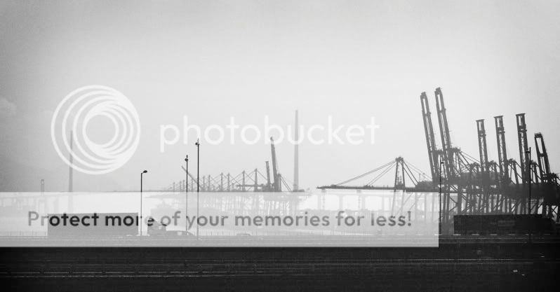
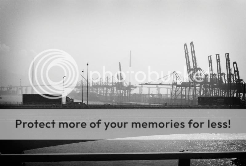
1.in what area is critique to be sought?

Composition. Post processing.


2.what one hopes to achieve with the piece of work?

Perhaps how infrastructure is rapidly filling up the Earth.


3.under what circumstance is the picture taken? (physical conditions/emotions)

Zilch.


4.what the critique seeker personally thinks of the picture

I like this picture. To me, it is decently balanced (although a bit tilted) and is probably one of the best i've taken... but I really haven't taken anything great in my opinion. But my opinion doesn't matter, so please provide constructive feedback on which I can work on. Thanks!@!@!@


Sorry, I'm horrible at write-ups.
 

hello!
well, IMHO, i feel that the sea/water in the foreground makes it feel rather empty. Perhaps you can try cropping such that the bridge fills the bottom of the frame and isnt hanging somewhere along the middle?

And did you take this recently? The bg is.. so hazy. :p
 

hello!
well, IMHO, i feel that the sea/water in the foreground makes it feel rather empty. Perhaps you can try cropping such that the bridge fills the bottom of the frame and isnt hanging somewhere along the middle?

And did you take this recently? The bg is.. so hazy. :p

Haha, this is actually quite a long time ago in Hong Kong, not in Singapore.

Do you mean like this?

Roll1_C010469-R1-08-7Agrayscaledtil.jpg
 

oops. thought it looked a bit like keppel habour. ;p

yup, just like that. :D
 

Under what circumstances the picture is being taken.

And the answer is... " nothing " . ( after checking thro 5 online dictionary for the meaning of " zilch ". )

I'd been dotting thro the picture trying to search for the main element of attention, but found none.

Tonality wise, this resemble to my early stage of learning how to print my first b/w photograph.

Entry level learning stage....acceptable.

Room for improvement....plenty.

Any chance to improve this picture.....very little, or most unlikely.

Why ? Subject matter are scattered all over the place.

A technically perfect picture without any subject matter is only a technically perfect picture.
 

I suggest zoom in more to focus on a subject? and Mayb a filter is needed not to wash out the sky...actually, i think the hazy backgrnd serves abit of contrast to the front elements...just tt, it's too empty on tophalf...
 

i personally like the miniature feel to the whole composition and the haze adds as a clue to where this place might be. Composition wise can be improve. the top left feels too empty while the right seems too heavy. i actually like the horizontal line (the railing of the bridge), although there is a bit of distortion because of lens error but this is normal. u can edit it using photoshop under lens correction.

your photo reminds me of german style photography which is great!

if u are interested in landscape photography, u can google edward burtynsky's awesome works.

hope this helps! :)