industrial monoliths


shawn207

New Member
Feb 18, 2009
227
0
0
Central
1. in what area is critique to be sought?
PP result and editing, picture composition

2. what one hopes to achieve with the piece of work?
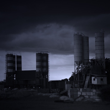
dark clouds loomed over the area, making the industrial factories in the distance foreboding. trying to bring out that effect

3. under what circumstance is the picture taken? (physical conditions/emotions)
taken around 430pm, dark clouds looming overhead, taken with an olympus EP-1

4. what the critique seeker personally thinks of the picture
i think the factories may be too small to convey the imposing effect, and it might not be a good balance between the shadows and the light

P5180451edited-Copy.jpg


Thank you for C & Cs/ Viewing. :D
 

Hi. just my humble comments....
the sky is too dark.... i dont really see the details of the cloud... esp the top left hand side...
i can imagine a HDR effect on the clouds to give some dramatic sky..
 

I agree with Ferderico. Picture is a bit too dark.

I also don't find the picture foreboding or anything since that's what you're trying to convey. It's just not here, not there :dunno:
 

I'm all for dark photos but in this instance, darkness took over and the essence of the photo is kind lost in it. The subject has so much potential. I would actually opt for a simpler composition by concentrating on a single structure but that's me. I do see some issues with compositonal design and control. The photo is off balanced and for some reason, your subjects were placed off centred and cut off abruptly on the right. The space on the left is essentially blank. Any reason for that?
 

Hi there.. composition wise, personally think a square crop would look better coz there's too much negative space in the picture. I'd also burn (darken) a bit of the boxes and cabin on lower right.
Here's the cropped version (didn't burn coz don't have PS in office).. Let me know if you mind and I'll take it down.

4625823621_8c42b8ba56_o.jpg
 

thanks everyone for the comments. composition wise i agree it was a bit off.

this pic was taken at kallang at the cement manufacturing plant, and there was a new condo to the right of the pic, which spoils the photo, so i cut it off, thats why it looks unbalanced.

my 14-42mm couldnt zoom far enough in on the structures, unless i climb over the fencing into the field, but there was a 60000V high voltage sign there :p

but i think i have to improve on my lighting. do you guys think it would be better darker and seen as a silhoutte?

or would some increase in brightness be better?

thanks so much! :)
 

Hi there.. composition wise, personally think a square crop would look better coz there's too much negative space in the picture. I'd also burn (darken) a bit of the boxes and cabin on lower right.
Here's the cropped version (didn't burn coz don't have PS in office).. Let me know if you mind and I'll take it down.

4625823621_8c42b8ba56_o.jpg

er...i prefer the original.
 

i kinda like the gloom and doom. sets the mood about how industrial revolution is killing earth. i agree with kit it will be better if it is not lop-sided. use your wide angle and capture the building across with 2/3 sky for more dramatic effect.
 

I think the concept was a pretty good except that I would prefer a cleaner composition for the "factories".... Clean, industrial lines would probably look better than the messily arranged structures on the right.
 

I agree with PrimePhotog , the concept is nice . I assume you're giving a 'evil' industrial feel . But i think the picture look abit too dark . It should be brighter . I could even barely see the factories . You can take the factories brighter , then vignette the edges . Might turn out better i guess .
 

thanks everyone :)

will take all your advice for future photos...

glad that compostion wise it wasnt so bad.

need some work on my pp-skills though