I Really Really Drop Dead!


Status
Not open for further replies.

Rafael

Deregistered
Jul 5, 2007
346
0
0
426029_10150589199003351_704248350_8853386_570863194_n.jpg


Tell me what you think on its composition and story.
Lighting and color is not so critical here.
It was captured using P&S camera which I always carry with me wherever I go.
I saw this bird ‘resting’ on the ground when I was on my way for dinner.
With the title ‘I Really Drop Dead’, I am trying to include some humor here literally, because there are plenty birds on the tree top at the scene, and it’s kind of a common phrase we use every now and then.
Technically speaking, it must really have drop from the treetop while dying.
On the other hand, its’ still wide-open eye was trying to say “Hey, I’m not dead, just lazing around.”
But hey! you are free to make honest opinion here, just stay focus what we are talking about, that is this picture.
Thanks.
 

you're right its an almost candid-like capture in a morbid sort of way
like the near-far and way down low to the ground perspective that you employed
 

Great shot.
 

The Grey borders are very ugly and takes up too much of the overall picture.
 

The Grey borders are very ugly and takes up too much of the overall picture.


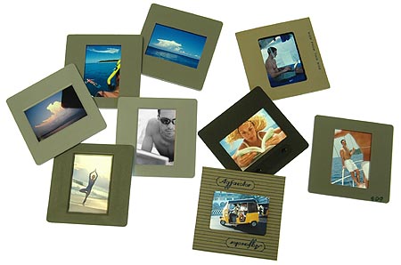
I have been using reversal film in the past 3 decades before digital, always looking through a slide frame against a light source.
I find it nostalgic and more importantly, it represents the glory past of photographers practising professionally.
Perhaps and/or probably you have not gotten used to viewing images in such a manner (through a slide frame, see image below).


slides.jpg


An appropriately well made border actually helps viewer focus on the image.
Well of cause, I'll take note on the 'GREY', probably and/or maybe I'll make it white instead.
I appreciate your comment, thanks.
 

Last edited:
seconds with the border...
same idea with frames actually. they can make/break a picture one
 

on the point re: the border, I agree that a border appropriately applied helps focus the viewer's eyes. However, perhaps the issue is that it is a digitally applied "realistic" border than an actual physical border like those used with your slide film. perhaps a way around this would be to use plain borders instead of textured borders, or actually take a picture of the borders you use with your slides and apply it to your image. just imho.
 

.. I find it nostalgic and more importantly, it represents the glory past of photographers practising professionally.
Perhaps and/or probably you have not gotten used to viewing images in such a manner (through a slide frame, see image below).

An appropriately well made border actually helps viewer focus on the image.
Well of cause, I'll take note on the 'GREY', probably and/or maybe I'll make it white instead.
I appreciate your comment, thanks.
hi there. your "frame" is just a very simple noised-embossed-around the edges photoshop job that has gone out of fashion about 10 years ago. It distracts the eye from the image. Plus the fonts you use, additional emboss on the fonts.. it's too much. This is really the case of less is more.
just focus on the photo.

when you say "I really drop dead", are you expecting the user to not believe the bird? Then maybe some contrast with living, standing, flapping birds (same type) in the background would provide some good contrast.
 

I have been using reversal film in the past 3 decades before digital, always looking through a slide frame against a light source.
I find it nostalgic and more importantly, it represents the glory past of photographers practising professionally.
Perhaps and/or probably you have not gotten used to viewing images in such a manner (through a slide frame, see image below).

An appropriately well made border actually helps viewer focus on the image.
Well of cause, I'll take note on the 'GREY', probably and/or maybe I'll make it white instead.
I appreciate your comment, thanks.

I would not say a slide frame is a good border. Slides were meant to be projected. The frame is used to hold the transparency in place. I personally do not find them to be aesthetically pleasing.

When you think of borders, you should think of printed and mounted pictures.
 

Last edited:
Forget the frame, focus on the picture within, and you'll find yourself walking in the light. :)
 

Forget the frame, focus on the picture within, and you'll find yourself walking in the light. :)

OK. forgetting the frame.

I am not very attracted to your picture. Yes I see a dead or dying bird on the ground and it is shot upclose. The background is less than pleasing and the dark blur silhouette of the tree is very distracting. So what kind of story am I supposed to form from this? What kind of light am I supposed to feel that I am walking in?

I am sorry, the picture does not work for me. It failed to connect me emotionally. If you do this in B&W, it might be much better. Because I find the colors to be very distracting, and does nothing to put forth the message.
 

Last edited:
It's yucky. Sorry.
 

To all posting in Critique Corner

Please take note that any comments not related to or not contributing to the critique of the pictures will be removed without notice.

That includes oneliners like 'nice' '
thumbsup.gif
' 'good' etc.

It's important to communicate effectively, so please refrain from writing in broken English or making too many spelling errors. Do a quick check on your sentences before making the post.

Attached below are some guides to making critique, taken from the Posting Guidelines thread.
quote_icon.png
Originally Posted by Zaren
1. critiques will not merely be "crap shot!", "nice shot!" or
thumbsup.gif

2. the critique will include constructive comments/suggestions on how to improve the photo.
3. reasons will be given why the critique giver thinks the shot is good, or why the shot is weak/bad.
4. ppl who post photos for critique must not take offence at any negative comments/critique even if the comments are as brutal as simon cowell's.
5. unless otherwise stated, everyone giving a photo critique here is NOT a pro, NOT an expert, and does NOT have to show anyone their own portfolio to justify that they are worthy of critiquing photos. however, they are interested in learning how to critique better and more constructively, through practice.

some guidelines for those giving photo critiques;
- Framing/Composition (e.g. how appealing/interesting is the pic?)
- Exposure/Tones (e.g. over blown highlights)
- Color/WB
- sharpness
- Post-Process Workflow
- artistic merit

Thread closed.
 

Status
Not open for further replies.