Help me Critique and Pick.


Status
Not open for further replies.

Stoned

Senior Member
May 7, 2004
4,378
0
0
36
Changi
www.photo.net
Dear all, I'm currently deciding on photos to send in for the SYPA competition and I've decided firmly on five shots, but am still on the fence for the last one. I've narrowed it down to two, because both have their good points and bad points. I would like your opinion on the two photos below, both of which i have posted before. I have already posted one of them under critique corner but would like serious critique on the second one. If you like it, please tell me why you like it. If you hate it, please give similar reasons. Please do not write something like "cute shot", as it doesn't help me at all. What matters to me is which shot you think is more original, has a better feel and is technically stronger. Thank you for taking the time to help.
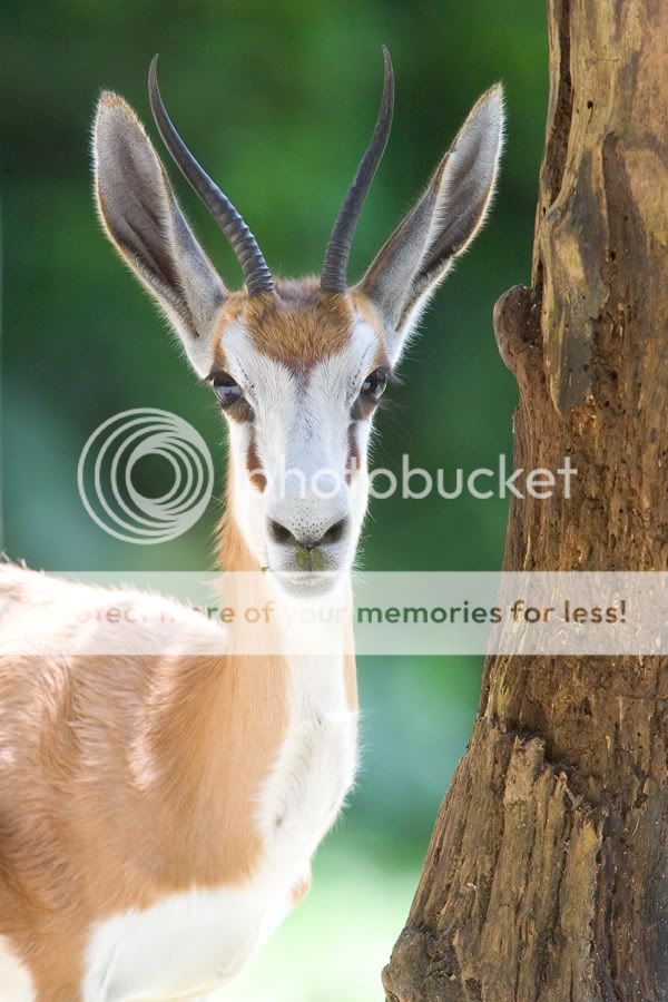
Category: Nature
BatsBnW.jpg


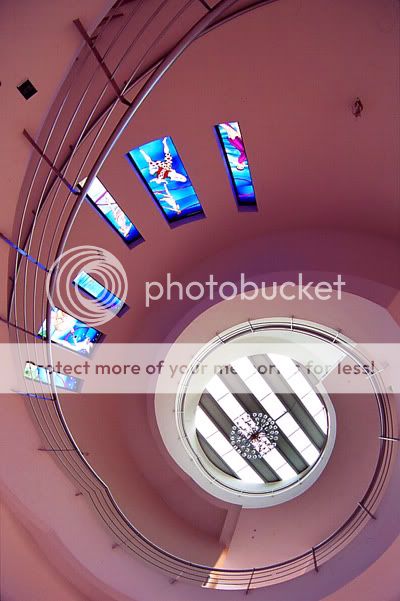
Category: Architecture
VJspiralvariant.jpg


Some notes about my other selections. Which would fit better into an overall presentation?
Nature(landscape) - 1 (colour)
Portrait(studio) - 1 (colour)
People at work(street) - 1 (monochrome)
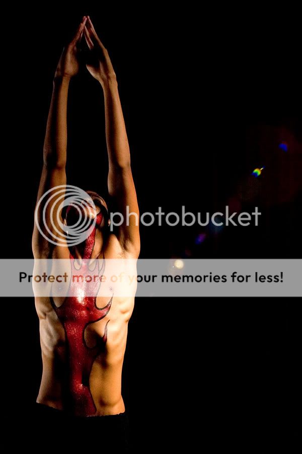
Abstract(studio) - 1 (monochrome)
Children at play(street) - 1 (colour)
 

I like the 2nd better cause i think it sort of leads the eye but i think it will be better if can show more of the curve thing. the first on i feel like too cluttered...

just my 2 cents worth... good luck!
 

Autumnite said:
I like the 2nd better cause i think it sort of leads the eye but i think it will be better if can show more of the curve thing. the first on i feel like too cluttered...

just my 2 cents worth... good luck!

i also agree!!
 

I like the first one better, because 1) The bats are cute and they somehow form a pattern (2 faces seen, 2 faces hidden, in same direction some more! Great capture!), 2) the diagonal lines as background seems very apt as the bats are "in line" with them. Though I do agree it's a bit cluttered.

For the 2nd pic, I find the kink in the spiral staircase a bit distracting (if u dunno what I'm referring to, then it's probably just me & nothing to worry abt :) ), it spoils the curve. The stained glass windows seem to scream for attention also. Maybe can consider converting to sepia or something.

Another 2 cents from me. All the best! :D
 

Thanks all for your well-wishes and comments. I appreciate all of it.
I'll let this run for a while more to get more critique so I can then make my own final decision. Thanks.
 

Seriously, I'll choose neither.
Both are easy to shoot. The phrase "my grandma can take that pic too" comes to my mind.
Choose something that really stands out.
 

Hmm, perhaps that's why I can't decide on either. I'll toss up another 2 more. I fancy these are even more normal though :(

Monkey1.jpg


Gazelle1.jpg


I could alternatively stick with two submissions for portraits, but is that a wise decision?

If I were to submit another for portraits, it would be this one.

Matt1.jpg
 

i don't think putting pictures here for people to help you pick is a good idea. be confident and decisive on your own. end of the day what makes your works stand out is what you perceive as good, not what others agree as being good.
 

After a night of deliberation, I've decided to go with what I originally wanted. Thanks all for your valuable input.
 

Status
Not open for further replies.