
[Help] How to my sky looks blue?
- Thread starter HVB88
- Start date
You are using an out of date browser. It may not display this or other websites correctly.
You should upgrade or use an alternative browser.
You should upgrade or use an alternative browser.
- Status
- Not open for further replies.

mutilply the blue channel by 1.5x, increase the saturation of blue by 50, hue 5, lightness -20.
*but do watch out for other areas of blue eg. the man in blue shirt.")
*but do watch out for other areas of blue eg. the man in blue shirt.
jnet6 said:mutilply the blue channel by 1.5x, increase the saturation of blue by 50, hue 5, lightness -20.
*but do watch out for other areas of blue eg. the man in blue shirt.
Thanks a lot for the tips. :thumbsup:
You may wanna to try using Channels or change your image from RGB to LABS, done your editing then convert back to RBG.
Hope that's help
Hope that's help
use select/color range. then use lasso +magic to select the trees area, and then a gradient after that use channel mixer(blues), add extra saturation
imouyang said:U can use curves and do a "S" shape curve adjustment to increase contrast. I think that it will bring up quite some blue in the sky.
I tried something like that on it, didnt really have that significant an effect, maybe i just did it wrong but the other gradient method looked much better.

find it difficult to pp this photo. as usual jpeg file will have a high level of color noise from pp.
this is my best to give a rich bright sky blue which some people may like but i personally does not like. i find that light blue and green (whether dark or light or limey green) all makes the color temperature too moderate and bland, lacks in the mood and color contrast ......
if you can avoid, avoid those bad days. i find that shooting is not just all about equipments, however neither is it all about the photographer. no matter how xu chun mei look, no amt of gd photographic skills is going to make xu chun mei look like xu ruo xuan.
first of all, the topic must be of interest. that constitutes various things such as the meaning of the subject, the aesthetic of the subject and the composition, space & line. you must have someone who looks at least pleasant to make a good model.
lighting is like a facial expression. the same face looks different when it gives a different expression. it can either gives a bland feeling or evokes a feeling. and i find that good days give me a lot of good photo, and bad days give me a lot of work to do on pp and some cannot be salvaged if the details are too much in shadow or already blown by the highlights.
coming to shooting gd scenaries is abt gd luck or gd preparation/anticipation/waiting/planning.
i guess most singaporeans who dun work for national geographics dun find that kind of time to wait for a week for a gd sunset on a building or a river. so make do with what you come across and dun feel too bad if you can't have the best photos out of the majestic view you have in harsh lighting or difficult lighting and just thank god whenever the kelvins are right.
of cos, if you are serious in getting your photos in the best viewable state to you fellow mates, do consider joining in the raw format at a higher megapixel rate. tossing a bad jpeg file around to get the best effects can be very frustrating and helpless..... that's when i'm doing my own jpeg files from my old pns....and i know it very well.....

my steps are fairly haphazard, so i doubt it is of any useful knowledge to anyone
DH 30%
select above horizon
blue sat +50
cyan sat +50 hue-10
yel hue -20 sat +40
reduce noise strength 10 preserve details 40 reduce color noise 100%
LRGBI 40-230
LredI 40-255
green sat-100
large area gaussian blur 20 pixels small area 5 pixels
select below horizon
LRGBI 30-160
contrast -10
yellow hue sat+30
this is my best to give a rich bright sky blue which some people may like but i personally does not like. i find that light blue and green (whether dark or light or limey green) all makes the color temperature too moderate and bland, lacks in the mood and color contrast ......
if you can avoid, avoid those bad days. i find that shooting is not just all about equipments, however neither is it all about the photographer. no matter how xu chun mei look, no amt of gd photographic skills is going to make xu chun mei look like xu ruo xuan.
first of all, the topic must be of interest. that constitutes various things such as the meaning of the subject, the aesthetic of the subject and the composition, space & line. you must have someone who looks at least pleasant to make a good model.
lighting is like a facial expression. the same face looks different when it gives a different expression. it can either gives a bland feeling or evokes a feeling. and i find that good days give me a lot of good photo, and bad days give me a lot of work to do on pp and some cannot be salvaged if the details are too much in shadow or already blown by the highlights.
coming to shooting gd scenaries is abt gd luck or gd preparation/anticipation/waiting/planning.
i guess most singaporeans who dun work for national geographics dun find that kind of time to wait for a week for a gd sunset on a building or a river. so make do with what you come across and dun feel too bad if you can't have the best photos out of the majestic view you have in harsh lighting or difficult lighting and just thank god whenever the kelvins are right.
of cos, if you are serious in getting your photos in the best viewable state to you fellow mates, do consider joining in the raw format at a higher megapixel rate. tossing a bad jpeg file around to get the best effects can be very frustrating and helpless..... that's when i'm doing my own jpeg files from my old pns....and i know it very well.....
my steps are fairly haphazard, so i doubt it is of any useful knowledge to anyone
DH 30%
select above horizon
blue sat +50
cyan sat +50 hue-10
yel hue -20 sat +40
reduce noise strength 10 preserve details 40 reduce color noise 100%
LRGBI 40-230
LredI 40-255
green sat-100
large area gaussian blur 20 pixels small area 5 pixels
select below horizon
LRGBI 30-160
contrast -10
yellow hue sat+30
my own version without caring for a blue sky.
it is a quicker fix. i didn't bother to smoothen out the color noise

high pass
LRGBI 40-255 BS 0.75
select below horizon
LRGBI 20-150
select above horizon
LRGBI 30-230
blues hue+100
shirt select sat-100
it is a quicker fix. i didn't bother to smoothen out the color noise
high pass
LRGBI 40-255 BS 0.75
select below horizon
LRGBI 20-150
select above horizon
LRGBI 30-230
blues hue+100
shirt select sat-100

HVB88 said:Thanks for the reply.
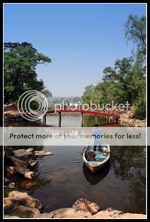
As requested, this is the original pic:

Here's my version.
create new layer > photo filter > choose color or preset filter ex. deep blue> slide density to your hearts content> uncheck preserve luminosity> check preview> click ok> pick your gradient tool> click & drag to point where you want to start & end your gradient> click your brush tool to brush off the image where you dont want your blue filter over those trees
hth
hth
Use Selective Colours from your PSCS adjustment tools.
Simply increase the saturational level of the colour you're focusing on.
Simple, Easy, Beautiful.
Try to work it on a dubbed layer, den decrease the opacity to fuse the colours correctly, it'll help retaining the original resolution of your original image.
I'm not the best out here, but this is what I do, that work
- Status
- Not open for further replies.
Similar threads
- Replies
- 0
- Views
- 223
- Replies
- 0
- Views
- 297
- Replies
- 0
- Views
- 255
- Replies
- 0
- Views
- 236
- Replies
- 0
- Views
- 329