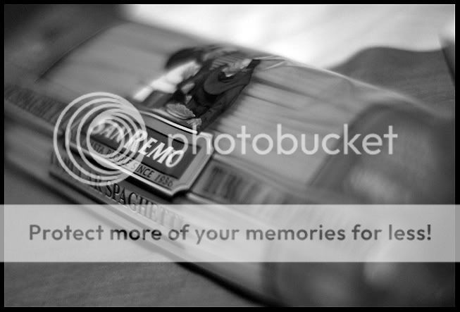
haven't done any similar shots before, but just looking at it, personally I feel some of the DOF is too shallow, eg only part of the brand name is in focus. just my 2 cents.
Interesting and quirky choice of subjects.
The San Remo image isn't too bad. The soft wavy feel reminds me of how I over-boil my pasta at times. :sweat:
actually the san remo picture, together with the rest was an experiment in my composition studies/analyses, except that there are many viewers but many people did not say anything.
apparently the human eye's thought to first see/notice anything that is placed in the mid-left before sweeping around the rest of the picture.
would also appreciate the b/w tones cuz it was more or less adjusted by feel.. photoshop has just too many ways and basic conversion gives a "grey scale image" than a b/w.

")