Glass at Chijmes


Status
Not open for further replies.

vividpixels

New Member
May 20, 2007
100
0
0
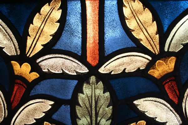
C & C most welcome. A closeup shot of the glass panel at Chijmes. The only post-processing I did for this photo was saturation cos I thought it would bring out the vibrant colours more effectively.

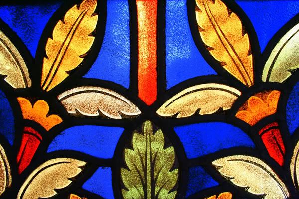
18mm, 1/60s, f/6.3, ISO800

chijmessmall.jpg
 

nice colors. but maybe slightly over saturated. can see the grains. IMHO


Thanks! Those are not grains leh. Original photo is this. Its the texture and dirt on the glass itself. But original photo not that nice anymore. Colours are actually faded. I'm still wondering if it is ok to post-process photos. It'll be great if I can take photos without any need to saturate them. Any tips? :)

Originalchijmessmall.jpg
 

If don't want to raise the saturation, perhaps can make it more contrast. If you have 'better software', make the shadow darker and the highlights lighter. ;-)
 

What's digital photography without post process, that's what I always say.:bsmilie:

Try to duplicate another layer above the original & set it to 50-75% opacity. On the duplicate layer adjust the contrast or saturation. It should make the photo more natural.;)

Here's my color adjustment of your shot. Hope you don't mind.
originalchijmessmallcopfv4.jpg

ooooh....dats really really nice! Such a big difference from mine. Din noe it can be done dat way! Thanks longko! Learnt something new today! :)
 

I'm still wondering if it is ok to post-process photos.

ever since the darkroom period, ppl post process photos.. it's part and parcel of photography..
if one doesn't want to post process photos, then one should just stick to those point and shoot and print kinda routine.

-smiles-

post processing is an art by itself..:lovegrin:

here's mine PP of your original picture..
i've increased the shadows to give the pic more texture..
OriginalchijmessmallPP.jpg
 

Here is my take.

Reduced the amout of most bright and most dark, taking away the whites in the shadows and hiding the blacks from the highlights.

chijmesedited.jpg


:sweatsm:
 

I would prefer not to COLOUR correct as that can deviate the actual colour. Normally the yellow will start to turn red in colour Saturation.
 

post processing is an art by itself..:lovegrin:


I like this theory. haha. Ok. Feels more comfortable with post-processing now with the experts 'go-ahead'. :bsmilie:

This photo looks like a painting now. Interesting how many styles one photo can come up with!
 

I would prefer not to COLOUR correct as that can deviate the actual colour. Normally the yellow will start to turn red in colour Saturation.

What do you mean by colour correct? Is it saturation?
Is it better to 'reduce' than to 'add' colours then? So that original colours will still stay as they are?
 

What do you mean by colour correct? Is it saturation?
Is it better to 'reduce' than to 'add' colours then? So that original colours will still stay as they are?

What programme do you use to edit your photographs? Saturation will not change the colour (that is from red to yellow and the such) and only intensifies the colour, while it is colour adjustment that causes a change in colour. A little colour adjustment will do, as long as all it does is makes the colours more vibrant.
 

Elfaris, I am referring to Longko's version. it has turned the campagne gold into dusk orange.
 

Longko's version is good I would say, though the colour has changed but at least the photograph looks more vibrant in a way.
 

What programme do you use to edit your photographs? Saturation will not change the colour (that is from red to yellow and the such) and only intensifies the colour, while it is colour adjustment that causes a change in colour. A little colour adjustment will do, as long as all it does is makes the colours more vibrant.


Oic...I use Picasa. Very layman right? ;p
Used Adobe Photoshop CS previously but felt that Picasa work just as well & I spend less time post-processing them.
 

Yes, Picassa (2) is very good and definately very very fast. I use them to do 1st preview and organising.
 

Yes, Picassa (2) is very good and definately very very fast. I use them to do 1st preview and organising.

Good to know I'm not the only one who loves using Picasa2 here. ;p
 

Thanks! Those are not grains leh. Original photo is this. Its the texture and dirt on the glass itself. But original photo not that nice anymore. Colours are actually faded. I'm still wondering if it is ok to post-process photos. It'll be great if I can take photos without any need to saturate them. Any tips? :)

Originalchijmessmall.jpg

I actually like this shot the best. Not really a big fan of oversaturated photos. This one looks gorgeous :)
 

Personally I like the feel of the original the best! Sometimes less is more.
 

Status
Not open for further replies.