Frames of Cherry Blossom


Status
Not open for further replies.

boogienight

New Member
Jan 10, 2008
56
0
0
Eastern SG
Hello all. been a long time since i last posted..

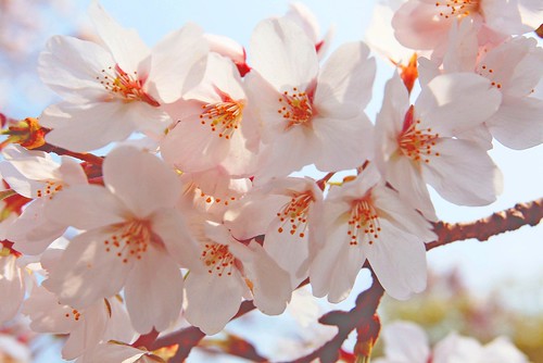
Below is a picture taken in Japan during spring, where beautiful pink cherry blossom trees are lined up along the parks, roads and houses.

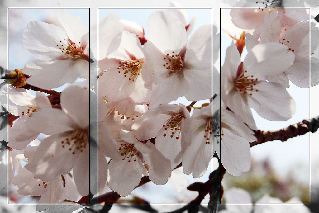
I basically created a triptych in photoshop just for artwork purposes.. hope to know whether...

1. Is it good framing for the triptych effect?
2. Composition
3. Lighting

(do let me know if you would like the original to be uploaded as well =])

2467499330_88c02717c5_b.jpg
 

hi,
very nice framing....very creative indeed!
However, u might want to look out for the overexposed area on the top of the flowers. It is a bit distracting as our eyes tend to draw towards bright parts of the pics first?

U might also consider pushing up the color saturation just a little bit more to show the pink on the petals?

Overall, great framing and great composition of the subject.
 

Hey charmingorion,

Thanks a million for the c&c =]

i've taken note of your suggestions.. and pp the original photo... hopefully it's better? (without the triptych effect first tho) is it too heavily pp?

2467488351_be0f20571f.jpg
 

What influences your decision on where the triptych borders fall?
 

What influences your decision on where the triptych borders fall?

that's a good question.. hmm.. i nvr really thought about why... but i read a magazine and this was how they taught... so i was just following suite to see how it wld look like on my choice of picture.

i guess now that you've brought that up.. i could prolly try making borders one the more prominent flowers that are in focus or sth? or maybe with other pictures of mine. (since it's not a rule that have to stick by it)

I am not very familiar with the triptych method, but from what I gather, it only works in situations where the squares will add definition to an already defined photo, whereby subjects of interest are found within the squares. (I might be wrong about this...)

Since your subject is irregularly arranged, perhaps it is not the best post-processing step.

that would make sense... hmmm thanks for the note! would try to look into that and prolly try to perfect my triptych artworks.

thanks calebk!
 

Hey charmingorion,

Thanks a million for the c&c =]

i've taken note of your suggestions.. and pp the original photo... hopefully it's better? (without the triptych effect first tho) is it too heavily pp?

2467488351_be0f20571f.jpg

hi,
ok. color saturation is just right, how about underexposing the overexposed area at the top using the burn tool, using the softest brush and highlight set at 9%? That will take care of the overexposed region at the top.

Well, i dun know about what calebk has mentioned, i find using what u did originally is rather creative. It made my eyes focus on the colors of the flowers as the greyed out frame made a contrast in color difference.....just my opinion....nothing against calebk...ok?:p

oh cool... im pretty new to pp tho. hahaha will figure it out.. thanks for the comments! =]
 

hi,
ok. color saturation is just right, how about underexposing the overexposed area at the top using the burn tool, using the softest brush and highlight set at 9%? That will take care of the overexposed region at the top.

Well, i dun know about what calebk has mentioned, i find using what u did originally is rather creative. It made my eyes focus on the colors of the flowers as the greyed out frame made a contrast in color difference.....just my opinion....nothing against calebk...ok?:p

Reason why I didn't like the original is because the squares actually cut some flowers in half. Thus, it seems as though the squares are put there for the sake of them being there, rather than calling attention to organised elements within themselves.
 

I am not very familiar with the triptych method, but from what I gather, it only works in situations where the squares will add definition to an already defined photo, whereby subjects of interest are found within the squares. (I might be wrong about this...)

Since your subject is irregularly arranged, perhaps it is not the best post-processing step.

i don't really understand it either, most triptychs i see are actually of disjoint scenes. motion, angles of the same thing. mainly to denote a change, or alternative viewpoints.

that said, while the triptych here does ADD to the photograph, i think no one can deny that, it is mainly because it is not usual to do such a thing. whatever it is, i find the result still rather boring, although slightly more interesting than the original.

i did a quick search for triptychs on flickr, and the general idea that i got from triptychs that worked for me was that the genre works well for 3 separate frames where they work well TOGETHER, and apart (though not as well as together). it is probably not easy though;

some examples:
(1)
(2) (not a real triptych, i think)
(3) - really like this one, should view large
(4)

on another note though, for those interested in triptychs, a relatively well-known artist's works that stuck in my mind after i visited the tate modern was francis bacon. he does a lot of these. very surreal, very beautiful, very dark. can look at them via the web via quick searches on image google, nothing as great as the original work on display though. :)
 

that's a good question.. hmm.. i nvr really thought about why... but i read a magazine and this was how they taught... so i was just following suite to see how it wld look like on my choice of picture.

i guess now that you've brought that up.. i could prolly try making borders one the more prominent flowers that are in focus or sth? or maybe with other pictures of mine. (since it's not a rule that have to stick by it)

:bsmilie: I read that magazine too. PP or DP?
 

Status
Not open for further replies.