A TFCD collaboration with Nec Hezner. My concept was "Urban Tarzan", an urban wild man. This photo was achieved by layering and blending, like a faux HDR. Shot in RAW and converted.
Please ignore the watermark.
I really like the approach, the idea, and the mood. The technical aspect involved is also quite commendable.
Ok, back to the image. These are generally my observation on what works and what not.
When I first looked at the image, couple impressions hit me.
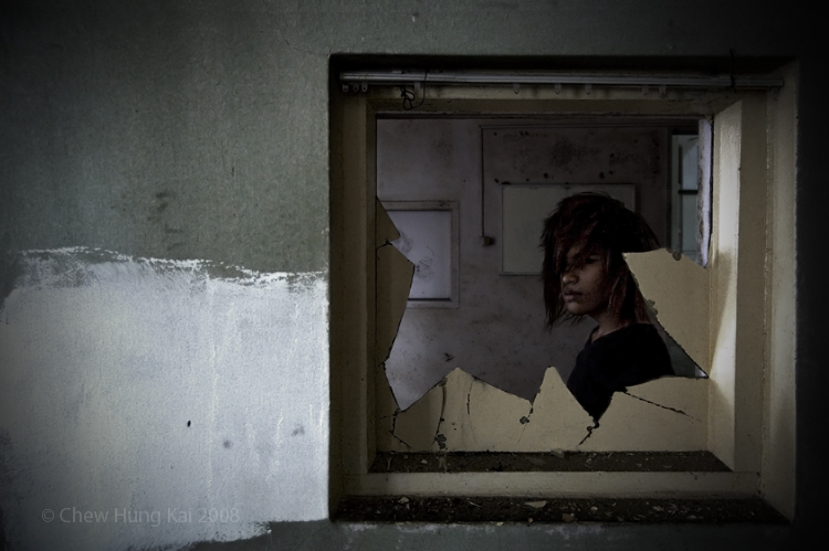
I see 4 distinctive layers, the window frame, the subject and the wall behind. I also see 3 distinctive groupings, the wall to the left (foreground), a man within the windown frame and the wall in the back through the window (backround). I also noticed one very dominating freature, the broken glass. And last, I saw the subject again.
Here lies the overall problem, the subject, our "urban tarzan", is the last thing that registered.
The subject needs to stand out a lot more. The broken window pane is also creating a problem. It is obstructing the subject. It hid the subject. If we get the feeling that the subject is hiding behind the glass, it might work, but I dont see it now. It is also serving as another frame for the subject, which is a duplicating effort, we have the window already. The paint on the glass is also a problem. I would preferred plain dirty glass to this.
The white paint on the way is a good touch, but it's too much and too bright, too distracting. So are the picture frames in the back, a good touch but too much and too bright. The light falling onto the background wall, throught the window frame from the left and from the shadow casted by the broken glass on the right side of the window frame, it has great potential. However, right now, it's jsut there doing nothing.
Overall, the contrast is a first looks good, but after looking at the image awhile, flattens out.
I think what you can do is work on those 4 layers, making each layer stand on it's own, will give a it a more 3D look.