Forbidden - for critiques


Status
Not open for further replies.

slardar

Member
Jan 8, 2006
335
0
16
Bukit Batok!
Hi all,

took the below photo recently

played around with hues in photoshop.
would like to get comment regarding composition and what you thought of when you see this photo.

does it gives you guys a feeling of dread, a feeling of eerieness? Does the shadowed background works?

how can i improve on the composition? are the twigs out of place?

all comments greatly welcomed. Thanks
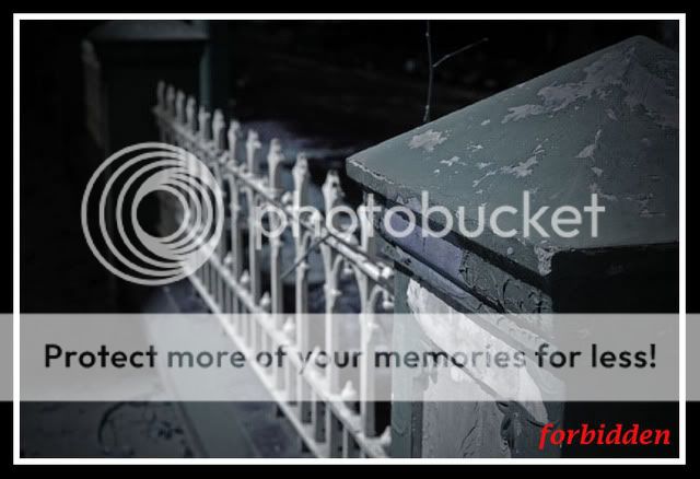
DSC_2516e.jpg
 

It looks like a good technical shot to me but it leaves my eyes wondering.What were you trying to tell with this picture? You needed a spot for viewers to focus on,maybe a word or a interesting detail..thats my opinion :)
 

hey bro,

i like this mystery eerie feeling.

so u only played with the hues in photoshop to get this end result ?
 

Not gloomy enough in my personal opinion, try taking from a different perspective say from bottom up to include a cloudy sky. From there you might be able to replicate dark skies and achieve gloomier effect I think.

This was taken near peninsula plaza?
 

thanks for all comments.

haha yeah. came out from SMU and saw this fence
 

It doesnt feel "forbidden" but rather neglected or haunted if u ask me.. :p
 

hey bro,

i like this mystery eerie feeling.

so u only played with the hues in photoshop to get this end result ?

hi, played with hues and a little on saturation and added slight vignetting. Is it possible to achieve vignett effect in camera? using nikon d50

well since u're there so oftenly u can always recompose and shoot again!

im not there often, just happened to go there for work purpose, just 1 day. haha..
i love shooting old and haunted-looking places. any recommendations?
 

played around with hues in photoshop.
would like to get comment regarding composition and what you thought of when you see this photo.
I'm not sure what to look at, my eyes are only trained on the block of a thing in the foreground right (because of it being in focus) but i can't fanthom it's significance especially in relation to your title. The lighting seem to isolate the fence pretty well but oblique lines seem to suggest more dynamic expressions while horizontal ones might to better for your title unless you have a strong subject for the title of Forbidden.

Technically good picture but you just blurred out your subject i.e. fence? If there was the word Forbidden on that slab of cement then it would be a great picture perhaps.

how can i improve on the composition? are the twigs out of place??
If you wanted the gates then maybe shooting from the opposite could be better but overall i think of Forbidden as one of restrain thus, maybe something behind the gates would be vaguely inviting but the fence then fills up the entire frame (on frontal view), to give a complete restrain of getting to that something. Forbiden.
 

Status
Not open for further replies.