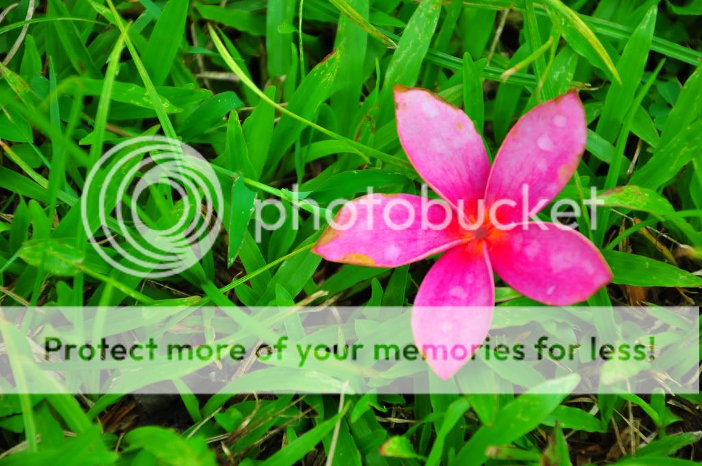
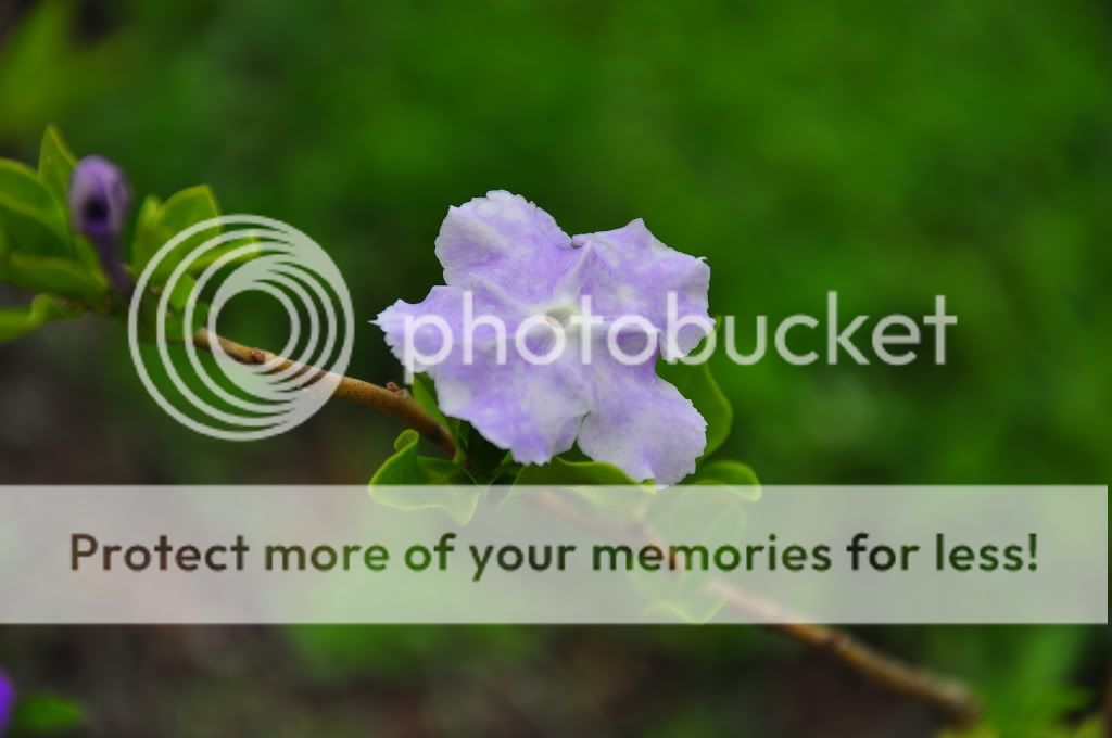
This is my school assignment shoot.. I am to choose a specialisation and i chose nature.. i am posting all pics that i took inclusive of those bad shots/over/under-exposed/repetitive shots..
my other assignment is panoramic shoot, here: Panoramic cLubSnap
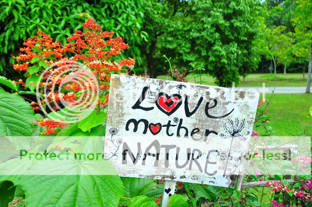
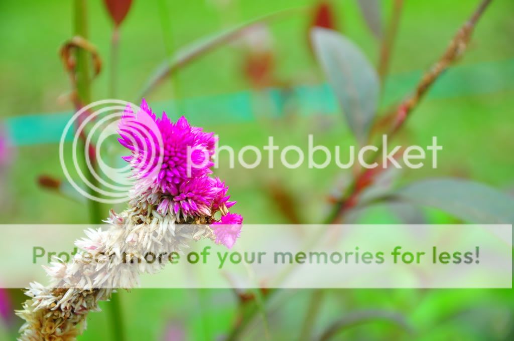
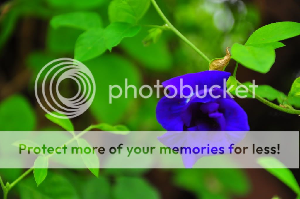
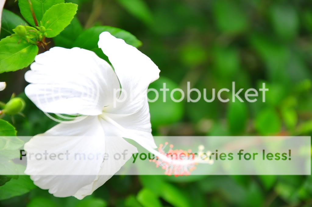
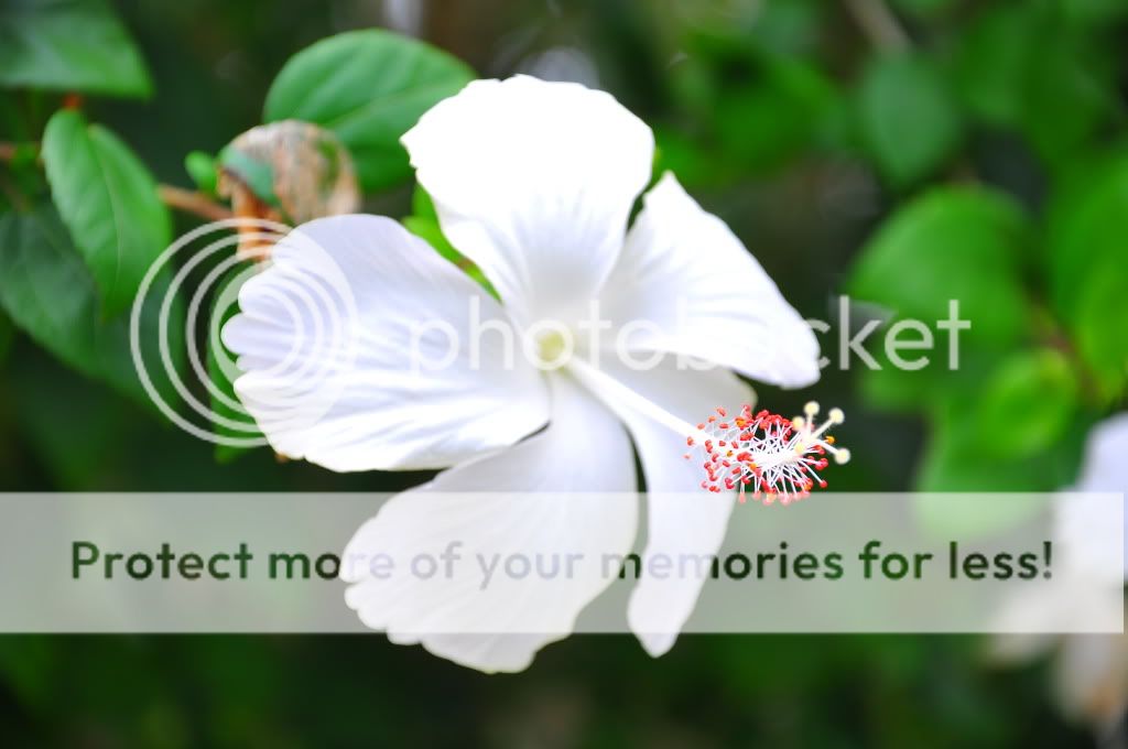
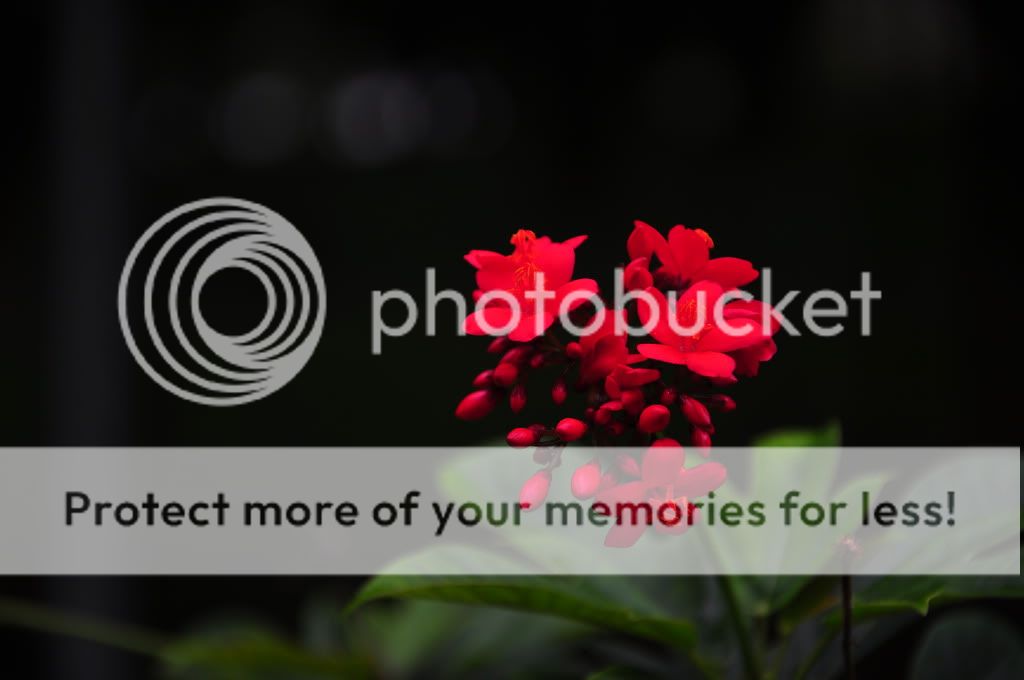
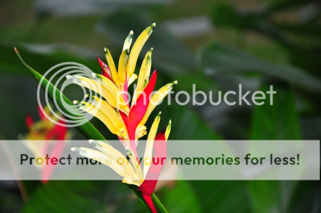
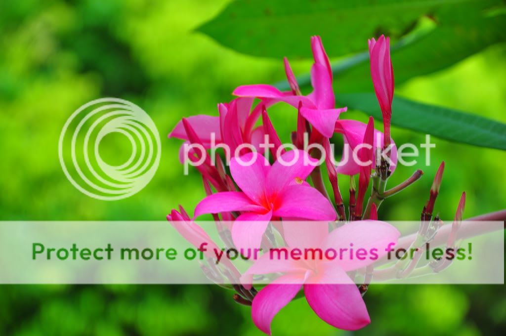
#1
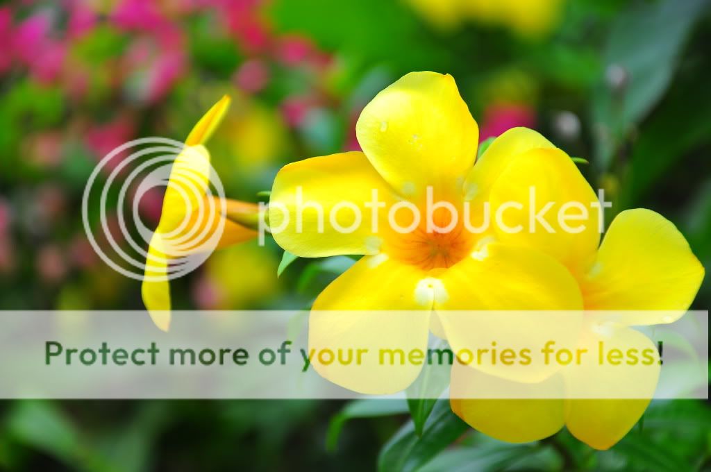
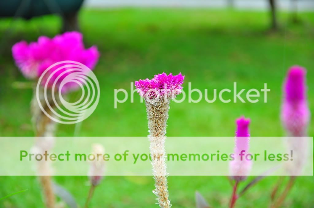
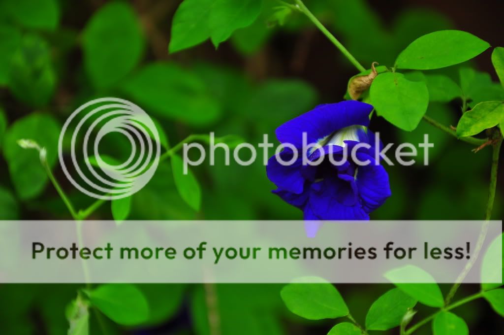
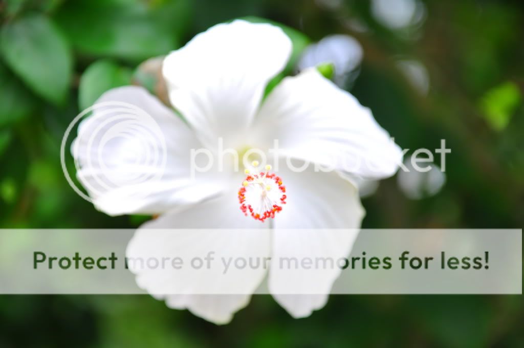
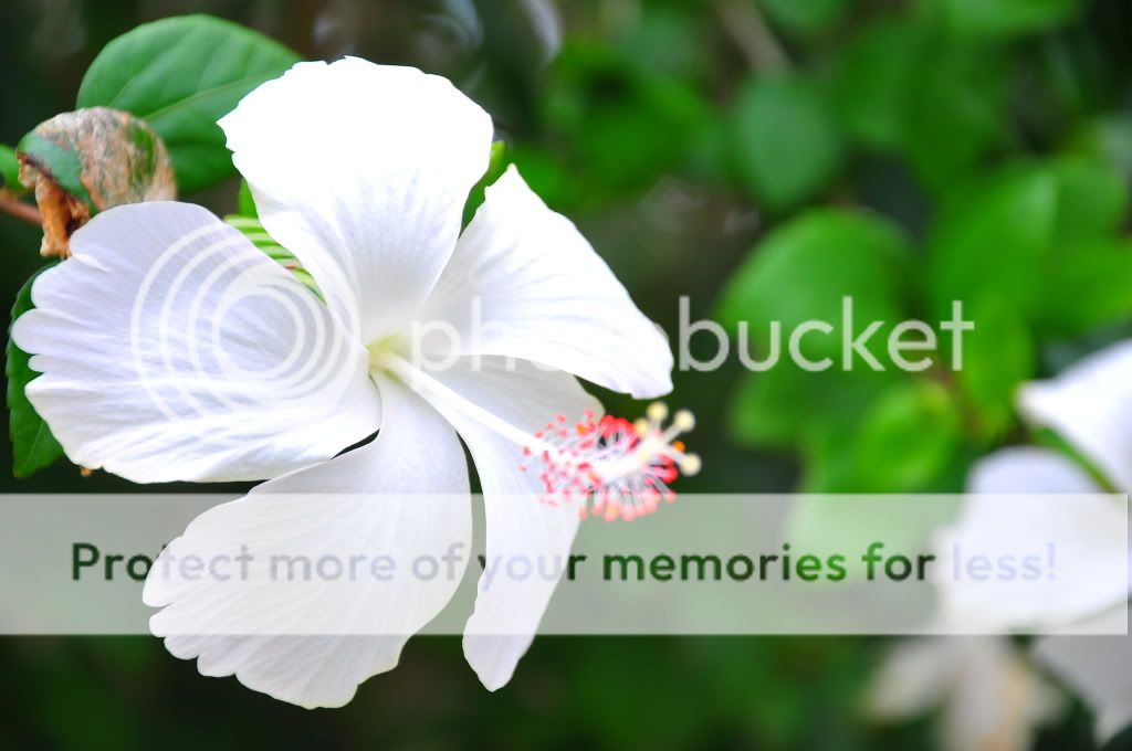
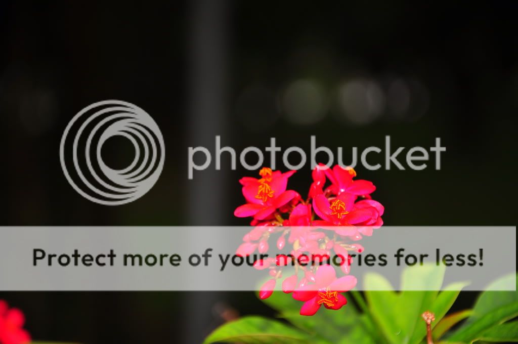
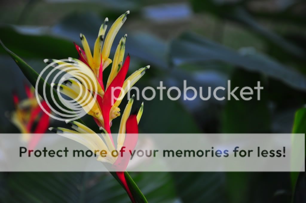
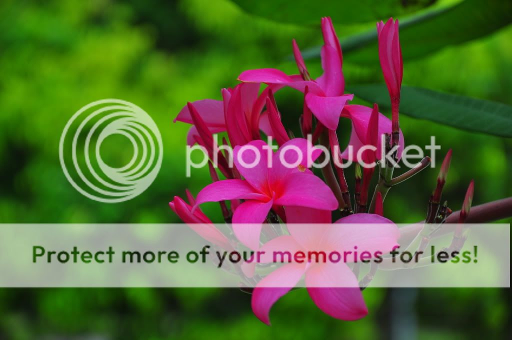
#2
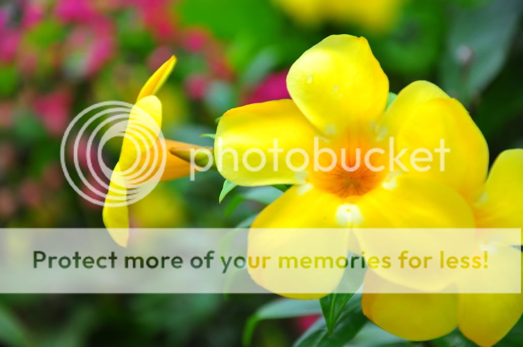
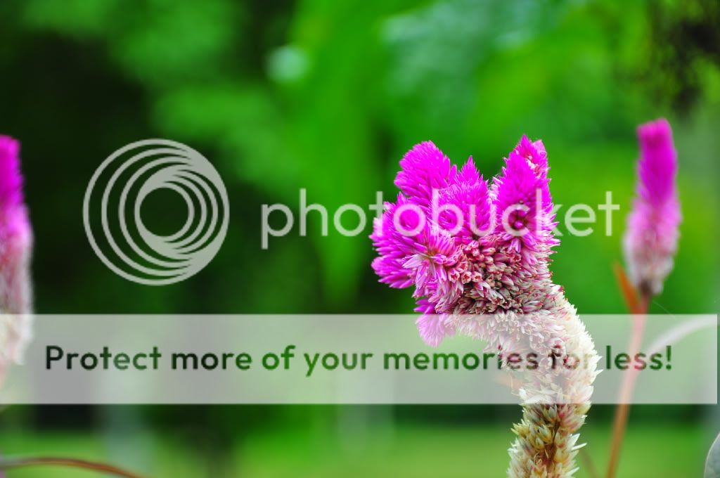
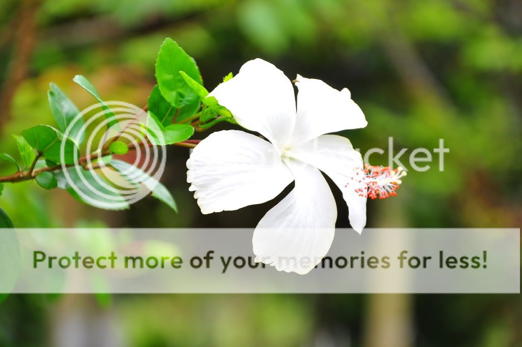
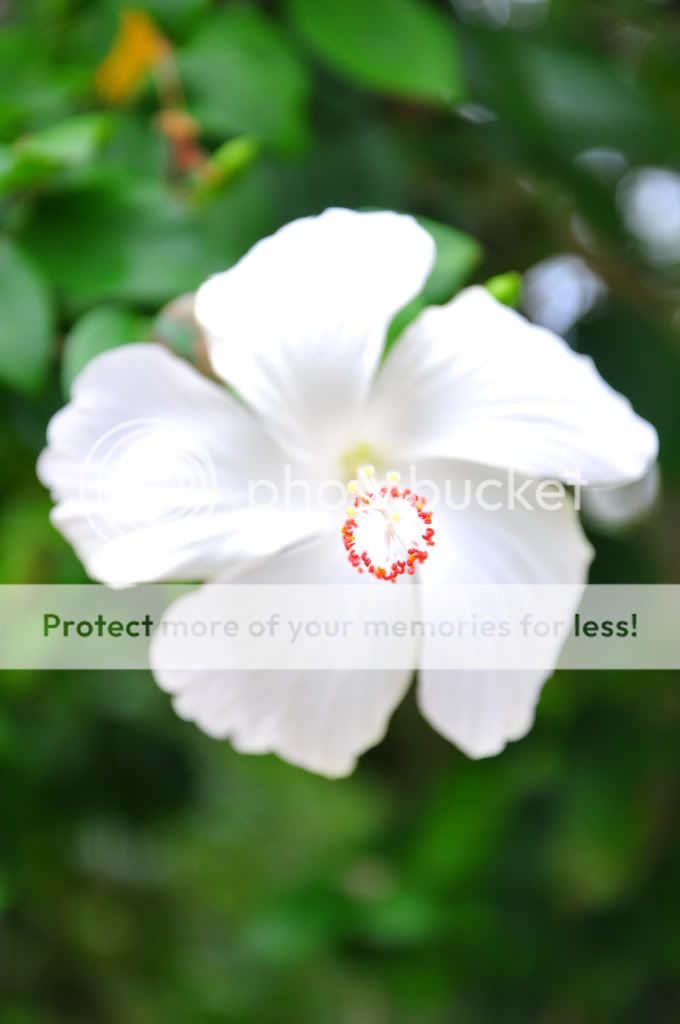
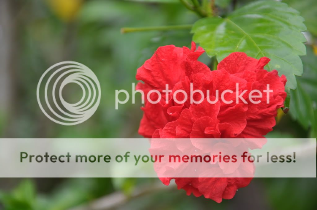
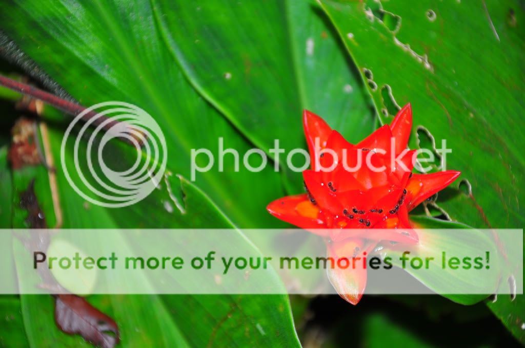
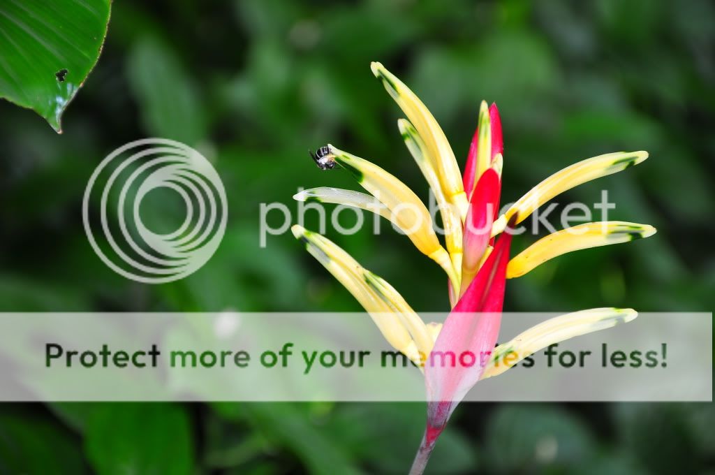
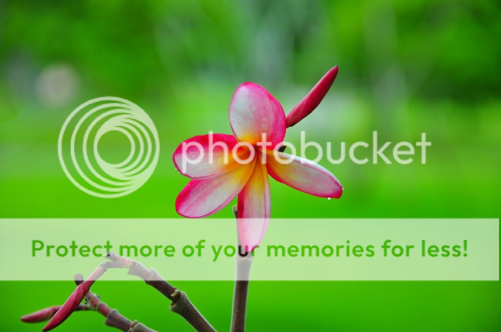
#3

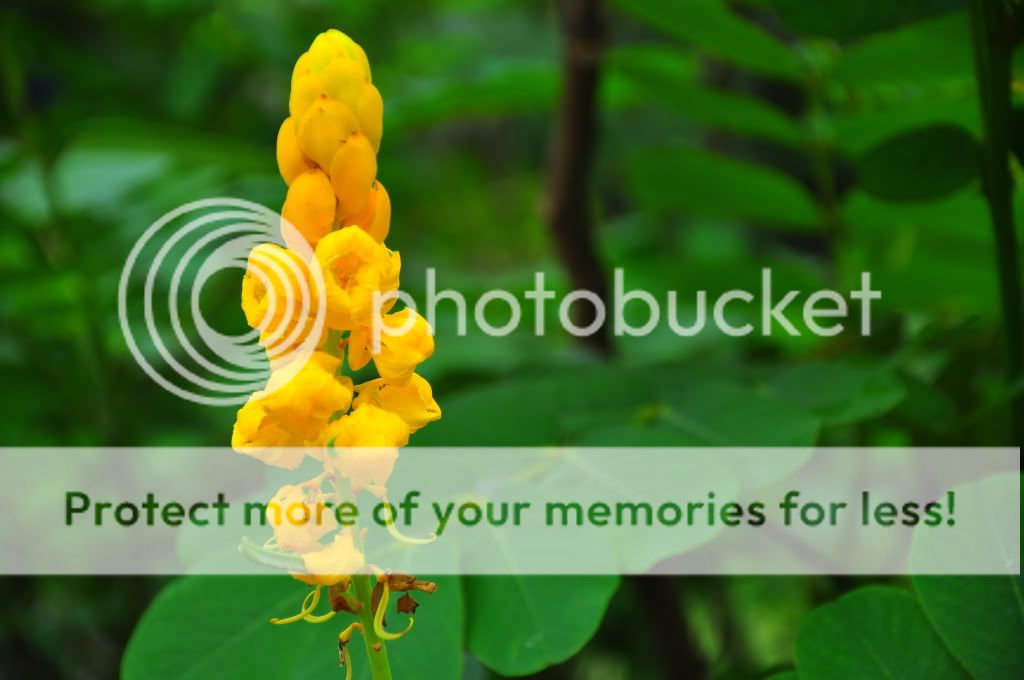
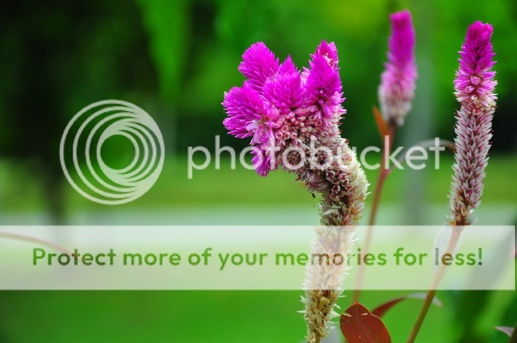
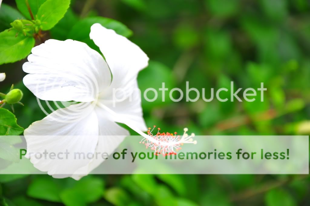
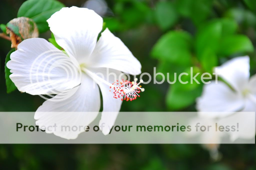
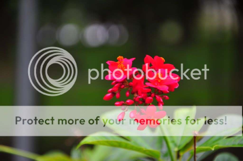
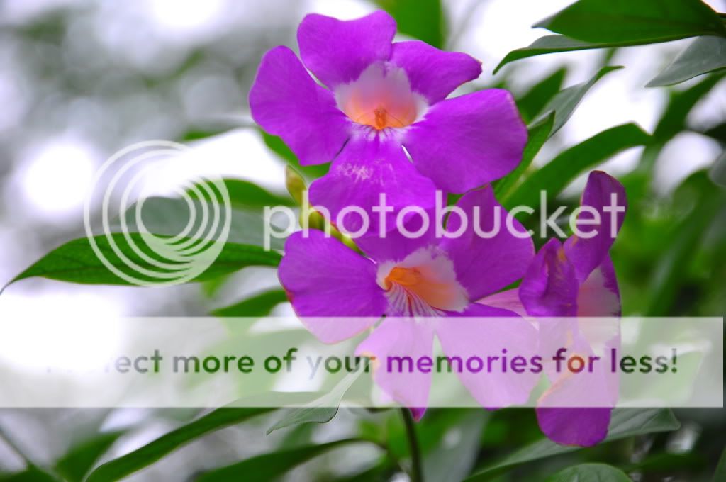
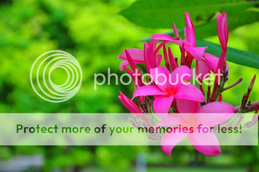
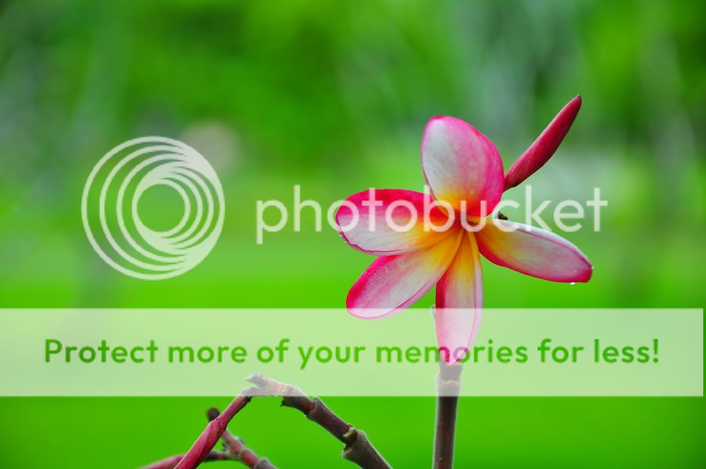
#4
#5
my other assignment is panoramic shoot, here: Panoramic cLubSnap
#1
#2
#3
#4
#5

")