First HDR attempt for Chevron House - CBD


mikeyjayy

Member
Sep 21, 2010
173
0
16
080311_RAFFLESUWA-018-4_-5_-3_-2__tonemapped-Edit2.jpg


1. in what area is critique to be sought?
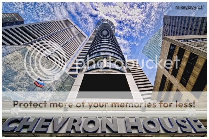
This is my first attempt on HDR and would like some feedback on the processing aspect. i tried my best to avoid the dreaded halos and color fringing but it seems to keep creeping up on me. i think it's because it's a pseudo HDR attempt?

2. what one hopes to achieve with the piece of work?
Well, as mentioned earlier, this is a HDR attempt. my intentions were to bring out the details in the clouds above the building and the walls of the surrounding buildings and at the same time, opening up some shadows hidden at the bottom of the words.

3. under what circumstance is the picture taken? (physical conditions/emotions)
Mmm.. I think nothing much can be said about this point except that it was obviously taken mid-day. right in the middle of the raffles CBD district. i was also looking for unique angles to photograph this building right here. nothing much except i was like a nut trying to get as low as possible trying to make the picture. ha-ha.
4. what the critique seeker personally thinks of the picture
Well, personally i feel that the surrounding buildings serve more as a compliment to the main subject rather than being a distraction. i could clone out all the surrounding building but it turned out weird and stuff. and i think the HDR effect could be better. but no idea how.

So, after that all being said.. All comments and critiques are very welcome and please feel free to give your opinions!

Cheers all.

-M.
 

Just my $0.02 (I'm not a pro myself)

My eyes are first attracted to the Chevron House wordings which I personally think it's very tight on the sides which also "leads" my eye to wander sideways and downwards out of the frame, maybe give it alittle more space.

The next thing that caught my eye is the clouds.....To a certain extend, I can't say that it's a cloud in the middle of the top frame. It just feels alittle bit too fake (sorry, can't find the word to describe it), just feels too 3D and hard. I though clouds are supposed to be alittle more fluffy (I would assume it's the clarity slider at max, try to be alittle less harsh on it)...

Can't comment on the composition since I sucks at it.
 

i think the effect is over done, until it becomes one look already know very unnatural... try to keep HDR subtle?
 

hey guys, thanks for your comments! i think the clouds are a little overcooked eh? hahaha.. but i suppose it was the effect i was going for, because before the processing, the clouds were a little too bland for my liking.. it needed a tad-bit of drama installed..

hmm.. and regarding what skystrike said about the words at the bottom being too tight and it led the eyes wandering sideways and down.. i was trying out a somewhat symmetrical composition where there's equal weightage on both sides of the frame. i think the main leading line going upwards into the frame was the main chevron tower itself..

anyway, a quick question on photomatix for you HDR guys out there.. why is it at the tone-compressor tab and details enhancer tab i see 2 different styles of the image? how do i know what is the final outcome when i click the process button?

thanks in advance and for the previous feedback guys!

cheers!
 

i like that you don't overdo it like other HDR photos, but yeah, the cloud is the problem.. i think in terms of processing, that's all.. the dynamic range is okay, not too much..
 

My personal feel and thoughts -

Composition - I would have put more emphasis on the building leading up to the sky. That is what that captures my attention more (take out the "Chevron house")

HDR - Some like it over-done (chao ta), some like it medium (just nice), and a few other like it raw (no HDR)... it is often hard to tell "right-or-wrong" in my case... but for me, I generally prefer it medium. Your skies are overdone (chao ta), that is a big minus to me, if not, the building leading up to the skies will be a very nice photo indeed.

This is how I will normally do my HDR (not too little, not too much, just enough to bring out all the details):
yushan.jpg
welll...

i dunno. i'll show u a sample of what i done and think is less strong hmmm.

5671339156_c36dd72bcf.jpg


there are other better examples thats for sure though...
 

thanks again for your contributions guys.. i think one thing for sure for HDR images, there is no one definite style or approach to process your picture.

but of course, there's always a wrong way and a right way.

@allenleonhart: nice example that you've put up here. is this image made up of one raw file or did you bracket your exposures? i assume that it's made from one raw file as there's no movement of the soccer players in the field.. and when you use one raw file to form your HDR image, do you have alot of color fringing issues on the edges of the buildings in the background? i don't know if it's my eyes playing tricks on me but i see a tad of fringing on the right side of the right-most building.

can someone here give me a quickie on how to remove fringing on photoshop?

and @wxzhuo: hello there! thanks for putting up one of your images here to share on your HDR processing. you are definitely right on the point about there's many preferences on how one could process their HDR images, and of course not forgetting the hate-group out there who is anti-HDR all the way. hahaha.. well, i was just trying it out for the fun of it. no serious intentions meant.

anyway, if i might add on something to your photo posted.. i believe it can afford a tad more drama in the skies and saturation can be boosted just slightly to make it slightly more vibrant. not that my comments mean anything since i'm a HDR noobie. haha..

cheers guys!
 

thanks again for your contributions guys.. i think one thing for sure for HDR images, there is no one definite style or approach to process your picture.

but of course, there's always a wrong way and a right way.

@allenleonhart: nice example that you've put up here. is this image made up of one raw file or did you bracket your exposures? i assume that it's made from one raw file as there's no movement of the soccer players in the field.. and when you use one raw file to form your HDR image, do you have alot of color fringing issues on the edges of the buildings in the background? i don't know if it's my eyes playing tricks on me but i see a tad of fringing on the right side of the right-most building.


actually.... it was a 5 raw file, each one 1 stop difference:) photomatix hdr allows me to correct for ghosting actually:)

the right side... dun think its fringing. more likely is due to compression from a 4000+ pixel to become a 500++ on the longest side. it looks ok to me when viewed full size.

yep. so now u know, u can correct ghosting through photomatix and still use a 5 stop difference worth of images:)
 

and @wxzhuo: hello there! thanks for putting up one of your images here to share on your HDR processing. you are definitely right on the point about there's many preferences on how one could process their HDR images, and of course not forgetting the hate-group out there who is anti-HDR all the way. hahaha.. well, i was just trying it out for the fun of it. no serious intentions meant.

anyway, if i might add on something to your photo posted.. i believe it can afford a tad more drama in the skies and saturation can be boosted just slightly to make it slightly more vibrant. not that my comments mean anything since i'm a HDR noobie. haha..

cheers guys!

No worries, I'm no HDR expert either. :) Sadly, there are no fixed scale to tell how "well-done" your HDR picture is... everyone has their own preference, you make your own judgement call. But HDR does produce many interesting results... keep shooting. :)
 

nice attempt on your HDR, i find it much better then those overdone ones i seen. keep on trying!
 

another of my recent attempts. i tried to keep it subtle:)

try looking at various styles and pick ur fav?

5707351166_ebee268e1b_z.jpg
 

Shadows' a little too bright for my taste. I like HDRs that, if you don't tell me it's HDR, I wouldn't think it is. In this case, I can tell right away it's HDR.
 

For HDR I think its very subjected to personal liking .. to me, I thot it was very well done and the cloud was very dynamic to me .. well done
 

HDR is never natural to me... but that doen't mean that the photos are bad. You just have to appreciate them in a "HDR fashion".

Chevron House - CBD example is not too bad. Just make sure the the sky are of the same blue.

Bay shot too colourful... doesn't look HDRish.
 

I like it the way it is now. People can say the cloud's overcooked but I think it's quite dramatic. :)
With the strong lead lines from buildings leading to the center top of the frame with the clouds, I think it's a great composition.
 

I like it the way it is now. People can say the cloud's overcooked but I think it's quite dramatic. :)
With the strong lead lines from buildings leading to the center top of the frame with the clouds, I think it's a great composition.

why thank you very much cowseye, i try my best. i agree that the clouds add a little drama to the overall feel of the image. but i also agree that the clouds are just a little overcooked to the point where it starts to form patches of pastel-like shapes and texture. which to me is just a little undesirable. well, but still there's much to be improved on i guess!

HDR is never natural to me... but that doen't mean that the photos are bad. You just have to appreciate them in a "HDR fashion".
Chevron House - CBD example is not too bad. Just make sure the the sky are of the same blue.
Bay shot too colourful... doesn't look HDRish.

thank you for your comments too kineticworks. i agree with you that HDR is never natural. the images given HDR treatment and images that are captured straight on the sensor is always never the same. personally, i feel that there isn't any fine line between HDR and traditional images. it is simply HDR, or not. of course, there are always purists out there that think otherwise.


For HDR I think its very subjected to personal liking .. to me, I thot it was very well done and the cloud was very dynamic to me .. well done

well, thank you too teckhua!

Shadows' a little too bright for my taste. I like HDRs that, if you don't tell me it's HDR, I wouldn't think it is. In this case, I can tell right away it's HDR.

i see. i have learnt that some shadows are not meant to be opened up otherwise the image would end up just looking flat and lacking depth. i guess the prominent shadow in this image right here is the space right below the words, chevron house. i was just trying out for fun seeing what would the effect be like and personally, i liked the one with the shadows brightened up. still, i appreciate your comments nevertheless! thanks neech7!
 

Sometimes, HDR need not be presented in colour, esp if forms and shapes are the essence. To me, this pic belongs to this category. TS, in your efforts to bring out the details of the buildings via HDR, the resulting colour vibrancy becomes a distracting by-product. I thought a monochrome version will draw attention back to what you wanna present. Dun mind me meddling with your pic though.

080311_RAFFLESUWA-018-4_-5_-3_-2_tonemapped-Edit2-1.jpg


Compo wise, I would choose to lose the Chevron House wordings. Doesn't add value to the pic and take up precious real estate within the frame.
 

Well Done Mikeyjayy!!! First I like you eye spot on ground to sky, something big to small (in fact is tiny to huge...) very impressive to me, secondly the HDR well done for whole photo is perfect exposed.
Photo like painting, get the theme/title/subject/emotion/moment/soul...you want then draw it out (snap it) and paint it (PP/HDR/). It might be turn out unlike or unplease to the others but it should be yours success but do receive other ppl comments (sometime need to reject also lah), just return with smile.
GREAT PHOTO, two thumbs up!!!!

Guy from borneo....
 

Hi mikeyjayy,

Great picture! Love the colours, texture, framing and composition. :)

You can sell it to Chevron House! :D