First Critique...


martellkr

New Member
Jul 11, 2010
86
0
0
5213115421_145634a2e1_z.jpg


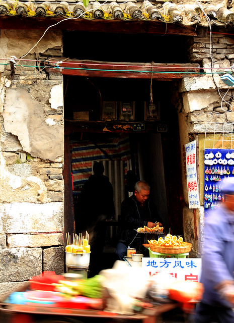
1.in what area is critique to be sought?
Composition, how to better portray effectively the wall textures, man sitting in the small alleyway, and the passing cyclist (i know i missed his head :()... and the overall feeling of a old town.


2.what one hopes to achieve with the piece of work?
I hoped to capture the beauty of the old town... together with the cracked walls, and all. Actually wanted to capture the smoky steam coming from his food, but obviously didn't get that.


3.under what circumstance is the picture taken? (physical conditions/emotions)
It was a crowded street, had to wait for quite some time for passing crowds to clear at least enough to take a quick shot. The seller actually had pretty good business, had to wait for at least 3 groups of buyers to clear off before I could get a clear shot of him.


4.what the critique seeker personally thinks of the picture
Personally, I like the idea behind the shot, but I was looking for more from this shot... don't know how to go about it tho... need C&Cs please.
I feel I should have placed more emphasis on the seller, and captured at least the passing cyclist's head with just a bit of motion blur.

Thanks guys! First post in critique corner... :sweat:
 

Last edited:
IMO, the table, food and cyclist are distraction, also they are badly OOF.
I would prefer this photo to be taken wider and in frame in landscape format to get better feel of the house if this is your objective.
 

IMO, the table, food and cyclist are distraction, also they are badly OOF.
I would prefer this photo to be taken wider and in frame in landscape format to get better feel of the house if this is your objective.

thanks for your comments. ;)

allow me to explain some aspects:

the table and food are actually part of the bicycle... kinda like those ice-cream sellers along orchard type. so the motion blur from them was intended to show the slow pace of life the seller is living.

the seller was sitting in a narrow alleyway between rows of like "shophouses"... so taking it wider would only make him seem more unimportant? haha...

sorry if i sound like i'm defending myself... just sharing my thoughts. will definitely take note of your pointers next time i'm shooting. cheers!
 

IMO our eyes are not used to foreground blur esp in pictures. It will look better if the seller is focus on the foreground with the motion blur of cyclist in the background to portray the slow pace of life against the busy street. Given the picture above, it is not possible due to wrong subject chosen to show your intended idea.

Another issue is that the saturation is set too high and the skin tones look like red lobster
 

the blur part is very distracting. ..

ok noted, thanks!

IMO our eyes are not used to foreground blur esp in pictures. It will look better if the seller is focus on the foreground with the motion blur of cyclist in the background to portray the slow pace of life against the busy street. Given the picture above, it is not possible due to wrong subject chosen to show your intended idea.

Another issue is that the saturation is set too high and the skin tones look like red lobster

yea i get your point... thanks for the pointers!
as for the saturation... it was over-zealous PP-ing on my part :bsmilie: