Faithfulness


biskandar

Senior Member
May 11, 2010
751
0
16
Singapore
www.about.me
5845434880_99000c219f_b.jpg


1. in what area is critique to be sought?
Composition and Lighting

2. what one hopes to achieve with the piece of work?
The feeling of faithfulness

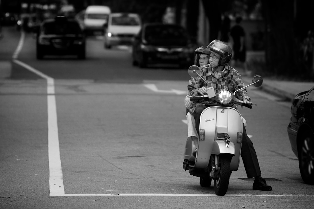
3. under what circumstance is the picture taken? (physical conditions/emotions)
Sunday morning , the weather was nice, found this old couple just went out from the church .

4. what the critique seeker personally thinks of the picture
Old feeling with black and white colour
 

Nice, but don't think the title is appropriate.
 

seems abit out of focused/abit soft..

the theme seems ok, maybe need to include more of both their faces, showing some sort of quiet conversation/thought to really show that it's faithfulness.

can crop out the right side so the car doesn't cut into the picture. there's also a little bit too much negative space on the left with the stop line.

personally I prefer it like this.. hope you don't mind. :)

pic-1.jpg
 

Last edited:
Your composition instincts are good, should definitely keep the vertical road marking in frame but can crop away the car on the right as bonrya suggests.

Learn to judge B&W tonality correctly, easiest way I think for you to learn: in your image ensure you have parts where 1) pure whites with little to no detail (eg, the road markings) and 2) pure blacks with little to no detail (eg, trouser pants & front vespa tyre). If you're using Photoshop, use the Levels Adjustment, use the 2 droppers in the little pop-up window. For setting black point I use the dropper on the inside of the pants and for white point I used the road marking. Finish up with sharpening for clarity.

Once you've learnt to judge as well as increased your knowledge on post processing techniques, you can use better methods in controlling your work. For example instead of solely relying on Levels but to include Curves, Dodge & Burn. Good B&Ws need a fair amount of work.
 

Thanks bonrya for the sample picture ,

Yup there is too much negative space on it , ok understand now , it need to be contrast especially in the face to show faithfulness .

seems abit out of focused/abit soft..
the theme seems ok, maybe need to include more of both their faces, showing some sort of quiet conversation/thought to really show that it's faithfulness.
can crop out the right side so the car doesn't cut into the picture. there's also a little bit too much negative space on the left with the stop line.
personally I prefer it like this.. hope you don't mind. :)
 

Thanks foxtwo for the complements and comments ,

About the tonal , because i use the aperture , do you know to how perform levels adjustment on it ?

Your composition instincts are good, should definitely keep the vertical road marking in frame but can crop away the car on the right as bonrya suggests.

Learn to judge B&W tonality correctly, easiest way I think for you to learn: in your image ensure you have parts where 1) pure whites with little to no detail (eg, the road markings) and 2) pure blacks with little to no detail (eg, trouser pants & front vespa tyre). If you're using Photoshop, use the Levels Adjustment, use the 2 droppers in the little pop-up window. For setting black point I use the dropper on the inside of the pants and for white point I used the road marking. Finish up with sharpening for clarity.

Once you've learnt to judge as well as increased your knowledge on post processing techniques, you can use better methods in controlling your work. For example instead of solely relying on Levels but to include Curves, Dodge & Burn. Good B&Ws need a fair amount of work.
 

I think u just need to crop away the car on the right and hv sone vignetting to focus on the subject, maybe some grain to give it a little impact. Change the name, I would personally called it "Life Journey Together..." or something like that. :)
 

Thanks Ripley5 for the tips and title suggestion :)

I think u just need to crop away the car on the right and hv sone vignetting to focus on the subject, maybe some grain to give it a little impact. Change the name, I would personally called it "Life Journey Together..." or something like that. :)
 

I wud prefer that the shot was taken with the oncoming car closer behind (but not close though). The negative space on the left could then be cropped off but leaving more out-of-focus elements behind.

Agree that it is possible to further improve the contrast, especially on the couples' face. The facial tones seem a bit too similar to the surrounding areas. In LR, i would play with the orange tone to make the faces brighter.

Just my two cents opinion.
 

I too agree to crop that car on the right side. I would prefer the blackness of the photo darker! Oh and I love the photo. They look cute! :)
 

the main object is a bit dark.