Face to Face


Status
Not open for further replies.

Fla Zee

New Member
Sep 30, 2008
5
0
0
39
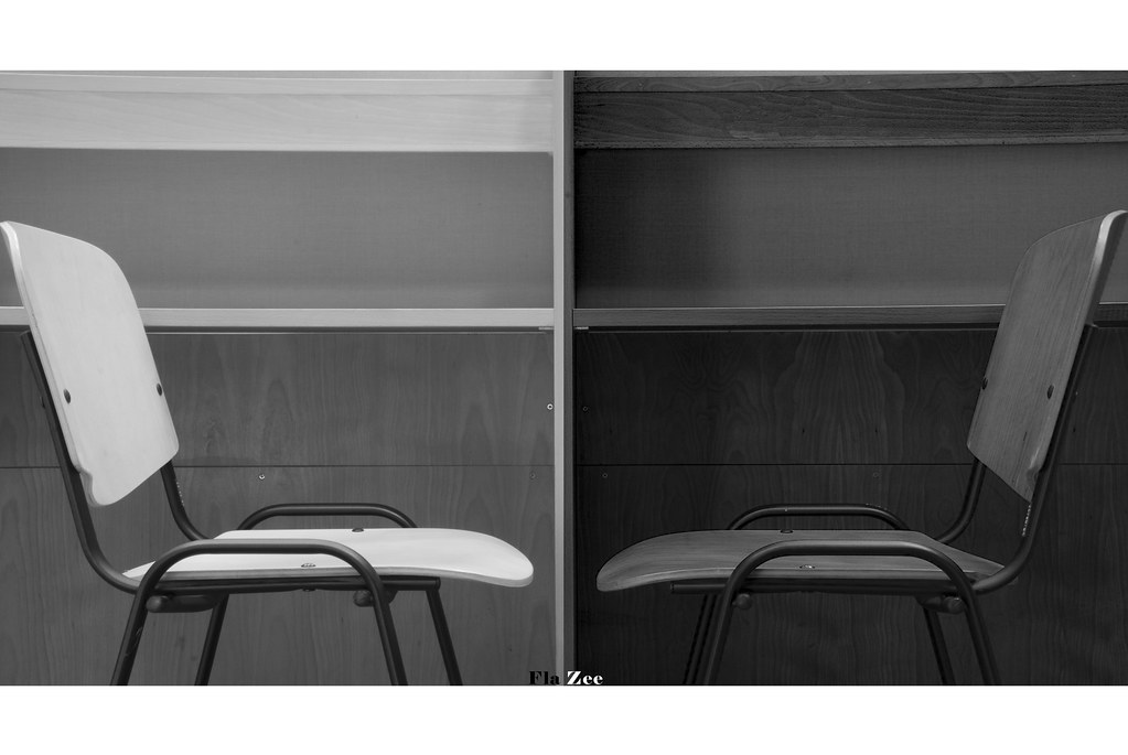
This picture was taken in the library. With the available materials, i would like to show the different perspective of each individual, using the different contrast in black & white. Apart from that, the subjects are place in a manner of an reflective image.
Hope to receive honest c&c in order to improve.
Enjoy
2900259979_75cbdec63d_b.jpg
 

interesting,
since you have post process it into B&W, would it be nice you increase the contrast of the "black" and "white"?
btw, the "white" chair has turn a little bit more than the "black" chair.
 

I feel this is a good attempt at achieving a balanced composition. However, the black and white lack contrast. There could be a stronger white and a stronger black for this.

theres potential for storytelling.
but this photo looks bland and washed out.
the appeal is not there i suppose. :/

Washed out is the wrong usage of the term. Washed out means to say that the highlights are undesirably blown out.
 

Washed out is the wrong usage of the term. Washed out means to say that the highlights are undesirably blown out.

washed-out (wshtout, wôsht-)
adj.
1. Lacking color or intensity; faded.
2. Exhausted or tired-looking.


Adj.
1. washed-out - drained of energy or effectiveness;

2. washed-out - having lost freshness or brilliance of color; "sun-bleached deck chairs"; "faded jeans"; "a very pale washed-out blue"; "washy colors"


exactly what i meant :):thumbsup:
 

interesting
I find the crop too tight, maybe zooming out and getting 2 complete chairs may look better :dunno:
 

nice attempt.:)

Besides what the rest of the guys mentioned, note the tilt. Can see it quite obviously from the center right.

Also, nitpick a bit, the balance of the gap from the center. :)
 

washed-out (wshtout, wôsht-)
adj.
1. Lacking color or intensity; faded.
2. Exhausted or tired-looking.


Adj.
1. washed-out - drained of energy or effectiveness;

2. washed-out - having lost freshness or brilliance of color; "sun-bleached deck chairs"; "faded jeans"; "a very pale washed-out blue"; "washy colors"


exactly what i meant :):thumbsup:

By the way, I noticed you got your definition from Dictionary.com, where they actually cite examples of washed out jeans and a washed out carpet, not so much a washed out photograph.

Just thought you might want to have a look at something more photography-specific:

From: http://www.webopedia.com/TERM/O/overexposure.html
In traditional photography, overexposure is a term used to describe the process of exposing film to too much light, which results in the photograph being too bright. In digital photography, where there is no film, overexposure refers to a white-looking or washed-out image (overexposed image).

From: http://www.silverlight.co.uk/tutorials/compose_expose/exposure2.html
Giving your film more exposure than necessary will result in overexposure. Pictures will be pale or light with poor washed out colours.

Generally speaking, washed out is used in correlation with overexposure, or you would simply say that there is a lack in contrast or saturation. Washed out generally refers to the highlights.

However, it is not wrong to say that this image is washed out, though perhaps a little misleading, as there are no cases of very bright spots or overexposure. It is lacking a contrast punch.

---

Now that grumpy has mentioned, a wider crop may indeed give a bit more breathing space to both subjects. At the moment, both chairs' backrests are against the edge of the frame.
 

Now that grumpy has mentioned, a wider crop may indeed give a bit more breathing space to both subjects. At the moment, both chairs' backrests are against the edge of the frame.

I agree to this, its like a human model cut at its limbs?
Wonder what if it has been taken at a wider angle, perhaps against the wall with a little room on the floor even? Did you have any wider shots than this one?
 

I agree to this, its like a human model cut at its limbs?
Wonder what if it has been taken at a wider angle, perhaps against the wall with a little room on the floor even? Did you have any wider shots than this one?

Not exactly that. I would say it's like having a medium close-up shot of a model but her shoulders are touching the edges of the frame. Very uncomfortable to look at, because the subject does not have a lot of breathing space around it (in this case, her).
 

good idea

but like what has been mentioned, much too tight.

also, i feel that the picture will do well with a high contrast pp approach
 

The chairs, being the subject, shows more similarity than there is contrast.. maybe that's why the differentiation isn't obvious, adding the fact that the background is similar.

Maybe a different placement, where the blacker chair is in the white environment and vice versa, with minor differences that adds some anomaly and details to enhance the subject matter, for eg. wear and tear or some play of shadows..
 

Hello guys,

First of all, thanks for viewing and having to find this picture interesting...;)

Base on overall comments, there are 2 "problems" thats in this picture.. Not having enough breathing space and contrast base problem... Thanks for highlighting them...

Well, thanks Viix for looking at my point of view,due to the contrast issue...


Cheers everyone!!
 

Status
Not open for further replies.