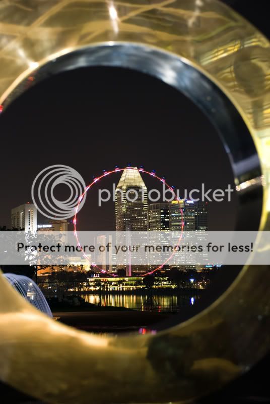
Hi All
I was at the Marina Barrage recently, shooting some sunset & night landscapes. Tried for a fresh approach on the oft-photographed icon, the Flyer and found this sculpture to frame it.
Settings:
ISO 100, f13 and 25secs.
PP:
Upped the contrast using Curves and cropped.
Area for C&C:
Composition.
Does the deliberately aligned framing work? Or does it feel too contrived?
I have another shot where the Flyer is offset and shot in vertical orientation. Would that work better?
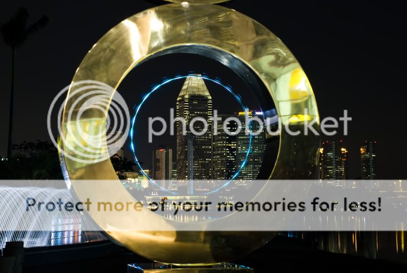
")