Examples from Critique Corner


Status
Not open for further replies.
posted by: Manda

title: Take a Seat

posting date: 29-11-2006

Take-a-Seat.jpg


critique

the star of your picture is the broken chair. aim the centre focus point at the seat. the colors here are not vivid. jack up the greens for the grass, but the chair's color must be stronger. for this type of shot, you need a background to give it a sense of time. it is an old chair. any modern building at the back will do the trick. to emphasize the timeline between old and new, you need to give it distance (i.e. space). make sure the chair's position is far from the building. distance also gives it a sense of being forgotten. turn off the autofocus. the modern camera is still not very intelligent in handling such a messy situation.

the tint seems to orginate from the rust and discolouration of the chair, for that i think this is an excellent colour scheme.

however, the framing is undecisive. the framing has a tendency of 'trapping' the viewers' attention as it's not close enough to uncover interesting details nor wide enough for comprehension of the chair's environment. a wider framing will give viewers some 'breathing' space for imagination beyond the chair.
 

posted by: joeypctan

title: Prague B&W

posting date: 09-01-2007

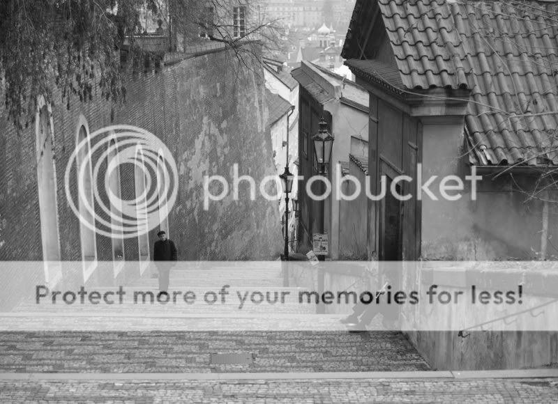
PB272756-bw2.jpg


short writeup

this pic is taken in prague during the autumn. was hoping to create a melancholy effect. critics and comments please. thanks

critique

I did a simple workshop on your very nice pic.
Removed the man on the left to give the feeling the musician is playing music to a deserted flight of stairs ... enhance the mood of melancholy.

PM me if you mind me doing a workshop on your pic - I'll remove the below pic asap.

PB272756-bw2.jpg

PB272756-bw2.jpg


no, it wouldn't work here,

viewers can follow the eyesight of the man to lead to the man sit on the door way, without him, the man with flute is lost in the whole picture.

My suggestion is to increase the contrast a little.

How much contrast is of course rather subjective. But it looks rather "flat" to me.

If the flatness is due to something like haze, it is different. Here it is just dull.

And yes, I would prefer to leave the man there.
 

posted by: farhanium

title: untitled

posting date: 10-02-2007

lomo22.jpg


critique

1. guess u have seen many such pictures b4, so you need to make it different if you want it to be uniquely yours.

2. lamp post is an obvious out of place object: either take two steps to the left, or crop or patch/clone it out.

3. too much empty space on left, does not add anything to the picture. I suggest a square crop.

4. but most importantly not enuff tonal range in the main objectis itself - you can verify this by looking at its histogram - which are the windows, cracks on the walls and the greeny growing from it. The lighting is flat. I do not know what time you took the picture, but it needs some directional light such as those available in the first or last quarter of the day. But the facade orientation must be compatible. If not then you have try/think something else. PS shadow/highlight may help.

in summary, the key element in this picture is textures, and so unless this is emphatically stated, it is just a bland picture.

I think this is a fantastic first try.

I commend the great effort put into the processing.

I blatantly disagree with what espion says. A picture like this is solely up to the viewer to discern whatever textures, whatever elements and whatever meanings the picture holds to his/her interpretation.

As I quote Ansel Adams, "there are always 2 people in the image: the photographer and the viewer". Both play an equally important role into gauging the context of the picture, and for one, the use of 'symbolic' photography here is to allow the viewer to intepret what he/her sees in the picture. By simply dismissing it as "bland" does not reflect well on you as a viewer who is critical of the photographic image.

As he has put it, the key element in this picture is textures

and I think, your picture certainly has the elements of the strong contrast of tones, emphasizing the quality of the rugged textures in the picture, through the cracks and the worn walls of the house. There is also repetition and consistency in the photo, through the subjects of the windows.

Whether intended or not, there is a contrast between the two windows as well (open and close). This is indeed a fine use of what I deem to be "symoblic" photography, where subjects are subjected to the viewer's intepretation, not our powers of deduction. It says alot and very little at the same time, depending on how one looks at it.

However, there is the element of distortion. (solved and corrected easily through Lens Correction filter in Photoshop) I do concur with espion though, that the lamp post is irelevant to the picture unless stated so.

Sharpness-wise, it also can be further improved. (Unsharp Mask)
 

posted by: chewraisins

title: Some purple flowers

posting date: 26-02-2007

PurpleFlower2.jpg


short writeup

Spotted this pot of small purple flowers planted by my gran.. so decided to take a couple pics of it.. somehow can't get much detail from the top part of the flower that's in focus.. what settings (lighting / camera settings / shading / PP) would probably bring out the most details from the flower?

I did darken the picture a tad bit, if not the top would look like a blob of purple.

critique

first of all you need to identify what's 'useful' elements
inside the frame, which obviously are the purple flowers.

PurpleFlower2_edit01.jpg


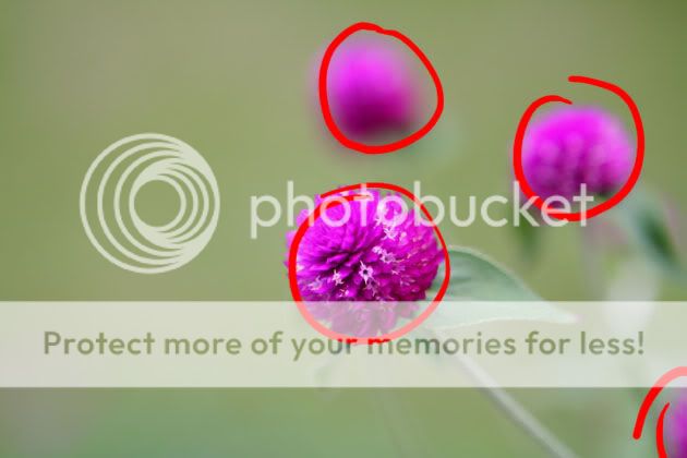
as shown above, the purple flower at the bottom right edge
seems like an offending element that upsets the balance of
the picture. as such, an initial consideration will be to remove
it 1. via cloning tool or 2. via cropping

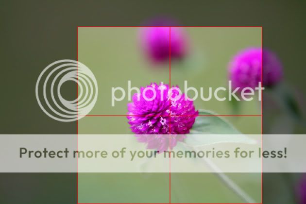
with such an empty frame, it's convenient to place your subject
at the centre at times, like above. however the composition is
still lopsided due to the fact that the left side is simply too empty.
as mentioned by espion a square crop may suit the subjects. it
is easier to balance the visual weight of the elements in this frame
in a square crop because it effectively increase the
object:space proportion here

PurpleFlower2_edit04.jpg


cutting into the out of focus flowers effectively reduce their visual
weight as well.

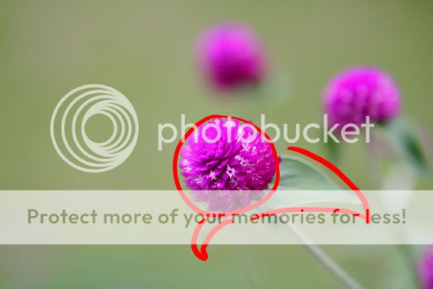
looking back at the picture, there are actually more ways to treat
the picture. personally i would like to express the flower in focus
together with the leaves.

PurpleFlower2_edit02.jpg


and i might want to make use of a panoramic frame to emphasis that abit

PurpleFlower2_edit05.jpg


the long frame will take advantage of the space on the left as extended space
of the subject's environment. pressing down on the top and bottom of the frame
together with the central placement of the main subject pushes viewer's first
impression onto the main subject itself before visually wandering off to the sides.

there are many ways to compose this, do try out and have fun.
 

posted by: Bcool

title: A sunday morning at the park

posting date: 13-04-2007

A-sunday-morning-at-the-par.jpg


short writeup

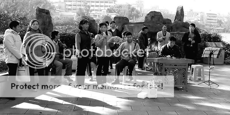
I'm posting an image converted to b/w and was taken in a park at Guilin, China last December.

setting as follows:
Time: 1056am
1/50sec
F9
EV@ -0.7
iso100
focal length 27mm
Lens: Canon 17 - 40mm
Handheld

What I like about this image is that the two women are putting a lot of gusto into their singing and the second woman on the left listening intently. I also like the shadows cast and the tonal range of this image.

What I would like to know is...

1. Is this image better in B/W or in colors?
2. Is the cropped or original version better?
3. Is the tones overdone?
4. Do the background, ie the buildings behind washout and do they degrade the image as a whole?

Thank you.

critique

As a documentary shot, ie a record of events, people and places, it is ok as the details are all there, eg the portable amplifier, but as a picture, there are too many details.

for the main focus is the singers - their gusto and the effort.

so you could have move in close - if possible - and just focused on the two singers and the erhu player, or if it is very important to the visual statement you are making, the intent listening woman too, but on the extreme left edge. But the other erhu player is looking away. For that maybe another moment is more appropriate. Photography is about capture of a moment - that comes - if it does - and may never returns.

Alternatively you can include the "piano" player instead - whats the name of that instrument? - but then the men in the background are a distraction as they are obviously not engaged in the performance, so I do not prefer this moment. The next however may be another matter altogether.

Of course details give context, eg the HDB-like flats in the background. But the question here is whether this context is relevant and adds to the gusto of the singers, ie if I take it away would it make their expressions any less gusty? I think not, and so off it goes. Unless, of course, you are saying something else and not the singers' gusto.

Regarding tones and lighting they are really secondary to the statement. They are merely "hygiene" factors. In any case they are OK technically in this instance, in that it reveals details, but merely detailed dont make a good picture.

In short:

1. keep it focused and have no extraneous elements, but only those necessary to make that visual statement.

2. wait for the "right" moment, ie when it happens - sometimes it don't but that's photography.

3. this is a "snap shot", ie shoot, look, then think there is a picture ... :)

Hi Espion….. I can see where you are coming from and your suggestion about moving in closer holds merit. But the fact of the matter is that this image is not about the two women singing or the woman listening intently.

As the title suggests….‘A Sunday morning at the park’ is about the pleasures of the masses in Guilin enjoying a sunday morning doing the things they like. Playing stringed instruments, singing and listening to songs are some of the simple enjoyment they derived. This is what I’m trying to portrayed. The singers and the woman listening are just part of the whole context of the image.

If I had wanted to focus on the singers, the erhu player and the yangqin player(you named it the ’piano player'), I would as you suggest, moved in closer and captured that essence and aptly titled it ‘Singing with gusto’ or ‘The quartet.’

As to the buildings in the background….I have my reservations and that is why I wanted it critique.

And I had always thought that one of the fundamental basis for good b/w photography are tones and lighting. I maybe wrong but can you also elaborate on this too?

I do agree with your last statement that this is a ’snap shot.’ I don’t deny it. But can I just add that I was waiting for some of the characters to move out of the frame before pressing the shutter.

Some great photographic works are ‘mere snapshots.’

I thank you for your time to look thru my image and the points you had raised.
I appreciate them.

regards

what i think works

i think you have an effective title to the picture. it tells us that this is a scene in a park on a sunday morning. your little caption also tells us more about the picture, that this is in Guilin, and the ladies are having an enjoyable time singing their heart out. these are important information which, if missing, the average viewer will not know what's going on. kudos for the effort in explaining :thumbsup:

the panoramic crop emphasized the human subjects very well. it puts the attention across the frame horizontally, allowing viewers to examine each character across the frame. converting the picture to black and white effectively removed excessive colour information like the lush greeneries, and return the attention back unto the facial and bodily expressions of the human subjects. placing the 2 singing ladies right at the centre of this little gathering of people in a simple and effective manner provide both an accent and a natural point of focus amidst the activities. it's enjoyable how the scene has the ladies as the main drama going on but is filled with rich secondary details across the scene, but not overwhelming the former.

there's no problem in including those building in the background, they are part of the information that forms the reality of this scene. the slight haze that seems to be in the air helps reduce the opacity of the buildings, so that's to your advantage.

what could be changed

as much as the title is an effective one, it's a neutral one. it's a descriptive title without interpretation. if you can have a more 'personal' title like 'Sunday Morning's Indulgence' it'll help give a richer layer to the picture.

i would also think that moving to the right more to get the flutist behind the erhu player would have been better, instead of having him hidden behind. you should be able to get the lady at the back into the frame as well. blockages create a sense of cultter. this scene is about people doing their little something they enjoy, so fill up the frame with as much people as possible without cluttering it up.

First of all, I must say I am type of person don't like photo have many objects but this is an exception..each of person in the photo make me feel the mood. Ok so I must say I like it.

Yeah, I often read the title first because the title gives me so much information. It make be prepared for the photo. The title is excellent. Sunday I suppose to get some "rest" or "relaxing" feeling. And this photo does give me that feeling..This photo emphasis on every each person inside it..:D..Wow great technique..

Let' me state some more my thinking..

There are many people in the photo but look at them..Do you feel that they have all different facial expressions..Hmm..It is like a story has many characteres, many actors and actress but it is still a story. It is because they have a link, a plot..Yeah this picture with is title give me a plot:some thing about chinese people do when they have free time. Each of them might enjoy differently, but it is only the method not the purpose..:D..So I can feel it..the mood of people inside the photo. Nah..It makes me imagine a little bit also..Looking back at the culture activities..Hmm..I don't like tradditional Chinese Music but personally I know I lost my Chinese Root some how...

What to do to improve the photo: I dont know lah..but I don't like the background..The HDB building..

Yeah..My opinion only..But really thanks to Bcool..Really Cool bah..the photo..
 

posted by: night86mare

title: But Not Forgotten

posting date: 18-04-2007

458445627_057f02dfb6.jpg


short writeup

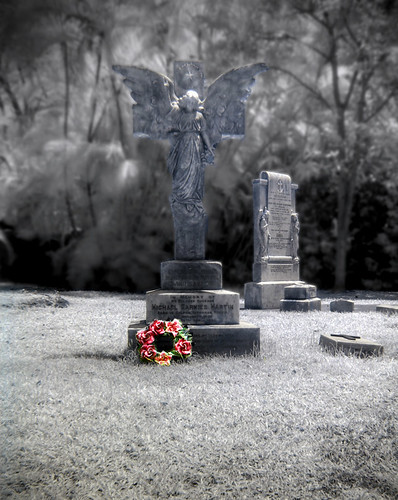
The subject is obviously, the big grave, and the wreath at the bottom (took a normal shot and a HDR IR shot, before erasing everything except the wreath in colour in Layers, etc, I'm sure most here would know what I'm talking about).

I think I should have gone closer (but I didn't at that time, because there appeared to be flare or some hotspot thing when I tried framing it tighter) so this is a crop of the original picture which has way too much foreground imho.

That aside, what I'm trying to achieve is the idea that despite the fact that yes, this is actually a grave (or at least its marker), everything else is faded. Everything else is gone. But there are still people who remember when one passes on.

I'll be honest, I did quite a lot of photo-editing for the background because it was far too distracting for comfort, despite the use of f/4.0 (I can't use a too small aperture for my H2, else IR will have hotspot), it was still too prominent due to the short distance between the grave and the trees behind it. If you go to the chuch courtyard you'd get what I mean. And after that I did some dodging and burning on the statue, too many shadows on it for my liking.

critique

would it be possible to frame it in such a way that the other tomb would not be shown? ... coz i think the pic would be even better without the other tomb in the background..
its trying to fight for attention

and yes, it would hav been better if you'd gone closer.

Well, if I had gone closer, then the other tomb would not be shown. But if I move the frame to the left, then another not-so-nice tomb would be shown (headless statue).. =D But yes, I agree that the other tomb is a little distracting..

was wondering if u cropped in a little and make the marker and wreath bigger would be any difference?
mayb can also explain why u include the marker in the bg? would a desolute field have more impact?

Mmm, tighter crop would definitely work, but this is already a crop from the original, so I guess I'll have to go back again. =D Hopefully the wreath is still there next time!

Ah, I know the answer to that question. It is to.. Provide a basis for comparison. The other graves have no wreath! =D

I think the basic concept works, however my two nitpicks are:

> crop: not tight enough.

> angle/cross and background: too similar, too busy. The angle and cross is next to the wrath the main focus point but squint your eyes a bit and they disappear in the background....

i guess going in closer during the shot would have increased the ratio between camera-background and camera-object distance hence helping to blur the background.
Further, i notice that the statue has a blue tint while the background has more of a redish(?) tint. i think the colour difference could be increased to let the statue stand out more.

Yes, I agree about the crop. Maybe I should have cropped it for the web version. Because when I keep it on my computer there is no way I would want to crop it any further, was cropped quite badly already. But I've said that already.

I get your idea about the contrast, was wondering if it'd be too overly dramatic, because the mood I wish to convey is a solemn one. =/ The statue's blue tint is due to it being in IR.. And the wreath is of course, a colour picture.. =D
 

Status
Not open for further replies.