
we're currently doing some maintenance on the threads in Critique Corner. i'm taking the opportunity to also start this thread to pick out some examples from Critique Corner, hopefully this will be of help to those new to this section of CS.
Examples from Critique Corner
- Thread starter eikin
- Start date
You are using an out of date browser. It may not display this or other websites correctly.
You should upgrade or use an alternative browser.
You should upgrade or use an alternative browser.
- Status
- Not open for further replies.
posted by: JimmyH
title: Lotus
posting date: 07-07-2005

critique
title: Lotus
posting date: 07-07-2005
critique
i think this shot would be more effective if you had exploited the beautiful symmetry of the flower more, instead of the asymmetrical framing/crop that you have now. the green background at the right is also distracting. i would suggest going closer, shooting more from the top to capture the central details of the flower (which also eliminates the distracting green background). capturing some dew droplets on the petals would also be a bonus.
posted by: Larry
title: Dock workers in old Jarkarta
posting date: 06-07-2005

critique
title: Dock workers in old Jarkarta
posting date: 06-07-2005
critique
very clever, the worker behind is picking up the plank of wood and the shadow infront shows another worker bringing it somewhere. the scene also tells the viewer something about the heat of the day. will like to know if the lack of details in the shadow and highlight areas are intentional?
in a way, yes. I deliberately played up the curves to punch up the contrast, to show the glaring heat that these workers were labouring under. details were lost but i think it was worth it.
thanks for the comment eikin
it does tell a story nicely, but i would have preferred it if the man carrying the plank wasn't cropped off.
or else, a tighter crop, where the top and left boundary stays, but the right boundary ends just after the man behind, somewhere in the middle of the pile of planks, and the bottom boundary wherever the 3:2 ratio gets u, probably past the head of the shadow of the man carrying the plank.
ahah sounds complicated but i think u got wat i mean. how would that look u think?")
nice!
I'd say chop some more, until the hat of the other worker.
and ps away the top right hand corner
thanks for the comments, all. I actually cropped off the head of the worker deliberately when I was taking the shot. Cos i wanted to capture the shadow in the bright sunlight and infer to the work they were doing with the worker behind. I'm more inclined to take ortega's suggestion to crop some more off and really tighten on the shadow portion.
:thumbsup: : The shadow is definitely interesting! Makes me wonder why the shadow is formed as such. The brick stones on the ground also forms a pleasing pattern.
:thumbsd: The elements at the top seem unnecessary. I would have cropped it such that only the legs and the shadow is seen, making it a bit more abstract.
posted by: 29tim05
title: happy thoughts
posting date: 13-07-2005

critique
title: happy thoughts
posting date: 13-07-2005
critique
:thumbsup: A very candid shot, seems that the boy did not notice the photographer at all. Very natural potrait.
:thumbsd: The 2 boys in the foreground (blurred) are quite distracting. They should be cropped off.
- A tighter crop of the OOF boy on the left may make draw less attention from the subject. A little bit of the blurred boys should still be left to frame the subject.
- I like the candid expression of the subject. Good try! :thumbsup:
agree with all of the above,
1 thing to add is the background must also be taken into consideration
good moment but let down by the situation.
try again, maybe from a different angle/viewpoint
LolliPoP, ccube78, Ah Pao and ortega,
thanks for the inputs, really set me to rethink about is shot.
at first I thought, OOF subjects will bring out the main subject. I guess this don't work
posted by: varf
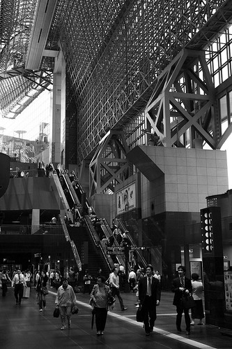
title: kyoto station
posting date: 17-07-2005
short writeup
critique
title: kyoto station
posting date: 17-07-2005
short writeup
in this photo i attempted to capture an impression of the scale of the Kyoto JR Station, the buzz of commuter traffic, and its modern-style design which has attracted its fair share of supporters and detractors for its bold contrast to the traditional image of Kyoto.
i took a series of shots with black and white in mind, and this was the one that i liked most. apart from using channel mixer to convert the colour photo to b/w, resizing and usm, no further adjustments were done.
please view the larger image for better detail, it was a little too big (683x1024) to post directly as according to the CC guidelines.
critique
consider dramatising the space by going lower (so that you include even more of the spatial truss above) or wider. i see space as the subject in the picture rather than the people and activities, make the people smaller in proportion, they are there to enhance the visual scale of the space.
i also felt that the picture is rather dark (not underexpose, just dark)
I like this kind of photo, although I don't see the modern design in it - metal struts remind me more of the late 19th/early 20th century industrial age, so to me the picture has more of a nostalgic atmosphere.
One thing I noticed is that three prominently placed people in the foreground seem to be looking in the same direction, as if there is something interesting to see. I wonder what it may be, as if part of the story is missing, and this uncertainty distracts me a bit from the architecture.
thanks for the comments guys, interesting points to ponder!
eikin: i hadn't thought about including so much more space, will consider that in future. good tip! as for the picture being dark, i'll try to play around with the curves and see if some lightening will help.
LittleWolf: i'm not too sure what the three people were looking at either, but there is an escalator heading downwards to the basement in that direction. i guess the glass part of the glass-and-steel design doesn't really show up in this image.
posted by: ndroo
title: Tofu
posting date: 14-07-2005

critique
title: Tofu
posting date: 14-07-2005
critique
ndroo,
from the layout of ur tofu...
the orientation of this foto to me, is wrong. it should be taken in a portrait format instead of landscape. with the rice placed further behond the tofu and the plate of greens further too. i believe this is Japanese food? if so, the bowl of rice cannot be that messy as they are very peculiar about their rice. besides the messy rice looked as if some hungry man had taken a spoonful of it.
the angle taken is not good, it made the food look very flat. suggest u bring ur camera lower to the level of the tofu or the bowl, to give it a more 3D feel and look. more like a 45degree instead of shooting-from-the-top which is out-dated.
it would be good if u can direct some light into the bowl of tofu. it looks dark. the tofu can do with some oil finish. the spring onions should be sprinkled much less generously.
the photo is too high on contrast. the depth of field can be slightly lesser.
just my thoughts! hohoho!
Honestly, I don't think there's anything wrong with the composition. It would look kinda boring if you'd removed the ricebowl, especially since the clipped ricebowl as well as the clipped tofu bowl seems to infer to just a part of the meal, or infinity. It's something like rugs, where designs usually don't end up in its whole at the edge; rather it's clipped right at the edge to induce the feeling that its not the end.
The things that are irritating to me though are really minor aspects. (1) The light green spring onion on the top left hand corner seems like a stray element. (2) The stray sesame seeds on the rice. Cluster of sesame seed is nice, loose seeds ain't.
Anyway, I feel that this is a superb picture.
posted by: saifulbahar
title: Portrait - Old Man
posting date: 14-07-2005

critique
title: Portrait - Old Man
posting date: 14-07-2005
critique
A nice simple portrait, much much better than many so-called "portraits" I have seen for a long time in this forum.
Engaging. Hint of mischievousness.
But did you sharpen this image? I might reduce the contrast a little.
tack sharp with good details, nice cheeky expression. i like this
only a small nit pick, there is not enough dof
the back of his neck is oof
but still a good portrait
it's a nice portrait, however i feel there's no meaning to it because:
1. it is extremely cliched. old man posed, lighting is there, camera on tripod etc, a little kid comes over n press the shutter and he can achieve this image too. i've seen it so many times. a seasoned photographer can take the same pic because its arranged, so can an orang utan.
2. fake smile. because it's a studio shot, there is no real natural or cultural communication that is often what makes photography fulfilling. the more interesting the smile and expression is, the worse it is in this context because it shows how "hypocritical" it is. probably he is smiling because he is making money.
wait, technically this is a very good shot, but it ends there -abruptly-
im sorry if i sounded a little too harsh but i really seen too much of these type of shots of this guy plus those arranged light-streaming-through-the-window shots. doesn't prove anything because anybody can do those with money. its a bit frustrating becos some pple include them in portfolios and yet it really does not reflect much.
posted by: wormz777
title: summer
posting date: 17-07-2005

critique
title: summer
posting date: 17-07-2005
critique
colours are good, i believe it's taken on film?
overall seems slightly under, not sure what mood you are trying to achieve. given the tilted horizon line i believe something more on the 'dreamy summer?' in that case perhaps a little overexposure and slightly softer would fit nicely.
I'm a little out of touch with photography, so some comments I'm gonna make will not make sense. So, please bare with me...
Anyway, I really feel that the picture is a bit too flat. Reasons for the picture being too flat may be many, and one of which is the focal plane. It seems as if the only focus area you'd had in the whole picture is on just one part of the lalang. Sadly, due to lack of depth of field, the rest of the lalang, which is supposed to be in close-proximity relative to the background, became just as out-of focus, making the whole feel of depth missing, hence flat. Try using a much smaller aperture next time. The increased depth of field would not bring the background into focus since the background shouldn't fall into the same focal plane.
Another reason for the picture being flat could be due to the timing. I'd no way of judging what was the timing when you took the picture, for the colour are too saturated. But my guess would be around mid-day, where the lighting seems to be uniform, and no hint of rays projecting from one way or another. Not to say that it's a no-no to take pictures during mid-day, but just that the objects you're trying to take here is perhaps not contrasty enough. The results I think could be much better if actual rays of light fall onto the lalang patch to give it more contrast, and making the whole picture less flat.
Having said that however, I do like your framing, and your effort in going down so-low. It's really a pity that lalang don't grow too tall these days. The effect would of course be much much more optimum if the lalang are much taller.
Hi, thanks all for your comments.
Yup, this is taken on film, velvia 50 to be exact. This explains the rich colour, but still, I would have like the sky to be a bit bluer.
Noted the picture is a little under, should have push it up a bit.
As for The Cheat's observation about the depth of field, it was my intention to throw the rest OOF to focus on the sole lalang. Its interesting to note that you prefer to have all in focus instead
if shallow DOV is your intend to make the sole lalang stands out from the rest, than the short lalang on the left had reduce the effect.
summer, would a clear blue sky have better effect? :think:
i dont get the feel of summer as the rest says, its underexposed. would using a reflector (not that we have it, i assume this is taken during our trip to punggol?) to brighten the lower portion do? :think:
posted by: Rev
title: Car in Motion, Extreme Perspective...
posting date: 10-07-2005

critique
title: Car in Motion, Extreme Perspective...
posting date: 10-07-2005
critique
this looks like an interesting abstraction of a car.
i feel that in order to make it a successful car picture that will make people feel more impressed of the car itself, you need to include more information about the car, like the menacing curves, fierce headlamps, or etc, complemented with a background, maybe lightning or something.
the lighting n blurred wheels helps to create a sense of coolness and speed, but dun u think at this perspective most cars will look the same? the lines are very distorted due to wide angle lens, which can be artistic, but they look similar for all cars. at this view, a honda civic or mitsubitshi evo may look similar, and it would be hard to differentiate them.
when a buyer sees the ad he might be more interested in the car as a whole, not isolated lines. moreover, the horizon is tilted a little too much in my opinion, which may again be artistic, but having too much of that deprives the picture of reality. i have seen a car (was it hyundai?) website posting similar pictures, abstract pictures under its gallery. and i thought "what's the point?" because i feel like they are hiding things from me, only abstract parts of the vehicle are shown, yes, artistic, but individual parts composed by an artist does not tell me anything about the vehicle overall. which makes me think that maybe the vehicle probably is quite ugly overall to be advertised in photos.
perhaps you can include more of the vehicle, and i think this is where it is more challenging to produce a powerful image. it is much easier to exclude than include because there are more elements that are out of our control when composing, and there will be more "distractions" to the theme.
i agree with what toggy said. as an abstract image, it looks interesting with cool silver colours and strong curves, but personally, not a good car advertisement. can see effort was made into controlling the shutter speed to get the blurred spinning yet sharp features, and the background was simple too.
comments r free for flak...
I don't really agree with this
no one buys a car based on an advertisement alone. the advertisement's job is to entice a person and to create a sense of what the brand of the car is about, rather than just that model of the car.
most importantly, you shouldn't be making images based on what you think an advertisement should look like
rather, you should be making images of whatever it is you like in the style you like it, and leave it to the advertisers to decide whether it's too "arty" or whether it's brilliant.
I find it absolutely brilliant and I hope you post up more!
posted by: freefall7
title: Mood for Celebration
posting date: 21-07-2005

short writeup
critique
title: Mood for Celebration
posting date: 21-07-2005
short writeup
Took this photo in front of Esplanade about 2 years ago during the Art Festival.
Photo was taken with my 300D with the kit lens, handheld.
Understand the sharpness and contrast are rather out.
This photo is one of the least planned...almost instantaneous snapshot.
But also feel somehow one of the least common that I have taken.
Appreciate any comments from all. Thanks.
critique
i like the way it captures the movement, the celebration, feels like im there!
its spontaneous and unplanned, hence its more priceless and meaningful, imho.
i think you have managed to capture the atmosphere of the celebration, the flying streamers lend a dynamic feel to the pic and the slight motion blur due to a slower shutter speed is well executed. however, the dominant subject, the lady on the right, seems rather too passive in relation to the more energetic displays by people at the bottom of the picture. i feel that the pic will have greater impact if she was captured in a stronger act of celebration, with more eye contact, and being a little farther from the right hand edge of the photo.
Apart from the sharpness issue
I like it! you have captured that moment really well, nice composition too.
Thanks to Ziedrich, Zaren & Ortega for the comments.
Agree with Zaren that the lady in red should be more "energetic" to complement those at the background. I personally prefer more hand movement from the lady. That way, at least
she can blend into the picture with her hands blur motion yet maintaining a rather more focus/sharp for the rest of her body.
Thanks again for the comment.
posted by: nemesis32
title: Paris in winter
posting date: 12-07-2005

short writeup
critique
title: Paris in winter
posting date: 12-07-2005
short writeup
My aim is to capture the beauty of paris during winter. I have selected Effiel Tower as it's a symbol of Paris and used the arching leaves and branches as frame.
Minimum PS is used except for desaturation and cropping.
For your kind comments and critique. In particular, i would like to hear if anyone thinks the framing is effective and the mood is correct. Thanks in advance for the critique and comments.
critique
I showed the picture to someone else, and her comment was "Paris in winter". So I'd say you achieved your goal.
I don't think there is a "correct" mood. I'm not sure about the carpark in the picture, but then, that's also part of Paris.
I also think the picture would look much more impressive as a large-scale print, compared to the small online version.
i agree with little wolf that the pic would look more impressive as a large scale print..
i personally think that the composition is not that bad too.. there are actually shapes that reappear or seems to reappear, which of cos, make the whole picture more interesting... and i cant agree more that this pic is best in B/W.. this reminds me of some shots of this particular building that had been shot 3 times by 3 different masters of photography... juz that it lacks some human interest to add more life and also, indirectly, strengthen your title...
im glad to be able to see and critique this photo...
:think: i've been looking at this piece since many hours back and not really knowing what to say. the exposure looks great and the framing rather well done ... but somehow i just couldn't feel anything beyond 'winter in Paris' ... probably because i have never been to Paris. i thought the picture could be portraying the emptiness of the winter, but i do spot some human activities in the background.
some minor things to look out for, the tower is slightly tilted, and i don't quite like the way the tree trunk blocks the nearer bench.
to be brutal...(you can take it right?)...
I don't think you've brought anything new to the subject
show a Parisian this image and to him it'll be like an image of the merlion to a singaporean
:thumbsup: Nice use of the tree branches to add a frame to the picture. Exposure seems to be just nice.
The ground at the bottom seems unnecessary. I would have lower the camera to remove more ground and have more separation between tower and branches. The small tree at bottom left is also a bit distracting.
For me, I would crop off the tree trunk and the bottom patch of lawn (I think that what it is), because to my eyes, they do not add to the composition. The dark patch of the tree trunk "unbalances" the left and the right. It has little details in it self to be interesting. While the lower portion appears to lead to the tower, there is too much of it.
If you have one with out the tree as a frame it may be better. The frame competes for my attention and it does not help that the effying tower is so desat that it looks dreamy while the branches looks etched out and so solid by comparison. But this what strikes me as I look at this. For you it may be different.
:thumbsup: Framing is nice and gives a different perspective of the eiffel tower. Exposure is is very nice and captures the mist just right.
:thumbsd: IThe shot doesnt make me feel like this is what Paris would appear like in winter. It lacks some tell tale signs of winter season.The desaturated colours dont work for me in context of the theme. For me it is like Paris during the days of the black plague. Desolate, deserted, lifeless.
just my .02$
posted by: clicknick
title: Clifford Pier B&W
posting date: 14-10-2005

critique
title: Clifford Pier B&W
posting date: 14-10-2005
critique
nice tones & composition
small nitpick: bottom centre, there are some black tones just above the rim, can ps away
I am not talking about the gray square, that is fine
this might be a personal preference, but i think the picture could be a bit darker. i am not only talking of it from a technical point of view of exposure, but the whole idea of an enclosure and protection would look much better if the space were much darker.
kashi
I think what vkashi meant was to make the exposure darker for a more dramatic efx on its atmosphere/climax.
Symetrically and graphically the exposure was well composed and it shows lotsa of different tonal efx. But one thing you have to be careful when converting to B&W in PS i.e. if you converted by changing the color mode to Grayscale or worst of all, Desaturate, the latter will cast a red tinted tone on yr image. Once in Grayscale mode, lotsa of tonal details are lost.
One technique you can use is playing with layers and layer-masking to retouch or tonal-correct certain areas. Techniques like doging & burning are essential in B&W traditional darkroom and therefore the same technique applies to digital darkroom too.
You can burn-in the bottom part of the exposure, probably half of it. At the same time keep the whole appearance as natural as possible. I presume you converted this exposure using Channel Mixer, in which you have more controls and get accurate conversion. Based on yr case, after studying individual color channel (RGB) for its mid-tones, highlights & shadow details I'll convert to B&W in Channel Mixer, then study its Histograms and adjust its Level. Followed by dodging and/or burning to yr desired result.
Well you might think this take a longer time than you expect. In B&W photography & post-processing (or the traditional darkroom phrase, printing), you gotta have discipline & patience and being critical in detials, in order to produce a great B&W photograph.
Hope these advices help you in anyway. Cheers mate!
posted by: r32
title: If this car was a Singaporean, it'd qualify for NC-16 movies already
posting date: 17-10-2005

short writeup
critique
title: If this car was a Singaporean, it'd qualify for NC-16 movies already
posting date: 17-10-2005
short writeup
As summer comes in Brisbane, these Jacaranda trees begin to flower en masse such that all you can see on the tree canopy is their flowers, without a hint of its leaves. There are avenues of such trees on some streets. However I chose one single tree with a near perfect carpet to park my car under. I intentionally shot on an overcast day so that the light is diffused and the colours are saturated.
The car is my own, so I do not care about hiding the number plates. It has been shot a little looser than this final result, pretty much keeping to the rules of thirds, before I decided to crop the car down to just essentially the bottom right quarter and give more emphasis on the tree canopy and purple colour. The red on the car is strong enough that I felt that I didn't need it to dominate a full third of the frame.
How would you improve this shot?
critique
What your main pt of focus??
Maybe a diffused filter will bring abt a more punch to the Pic.
The car is the main point of focus but I am experimenting by avoiding having it dominate the frame by the amount of space it takes up. As I explained, I let its colour balance the composition with the rest of the frame's elements - which would be the dashes of mostly purple flowers, and some green foliage.
imho it would be nice if you shot from further afar so that the car occupies only one third of the frame in such a way that the you can see the trunk of the tree meeting the ground. in this case, the prominence of the tree would increase and the car would just be an object that adds colour and a counterbalance to the photo.
the other way of going about it could be to let the car occupy most of the frame, shoot from lower down and side on so that the car dominates the frame vertically as well and as a result not see the main trunk of the tree as it would be hidden behind the car. this way you will get a play of the red against the canopy of the tree without the dark trunk meeting the car at odd places.
btw, nice colours
kashi
posted by: wong1979
title: The lazy cat
posting date: 02-11-2005
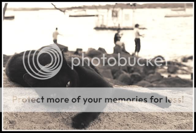
short writeup
critique
title: The lazy cat
posting date: 02-11-2005
short writeup
This cat, although ordinary, is so nice. Allowed me to put him on the boulder for a shoot
Did some digital work on it with PSP, is this considered B/W photography?
Cheers..
critique
i think the subject is really good
maybe you should have bumped up the iso to get a faster shutter speed. due to the 1/15sec exposure camera shake becomes evident, as does subject movement. you could also have chosen f3.5 or thereabouts rather than f8 to get a shallower dof. that would have thrown the background oof and emphasized only the cat.
Nope this picture is clearly not B&W nor sepia. Its an attempt at toning.
About the picture -
1. I won't caption it "lazy". The cat is obviously trying to move or stretch.
2. The numerous distractions in the background do not help. Burn them out or blulr them away (since you used PSP to post-process).
3. Do correct your focus point, please, as it looks like your camera had focused on the cat's fur and paw. Ask yourself - is that what you want to draw attention to, or is it some other part of the cat.
Just some brutal comments.
If too harsh, please ignore.
As mentioned, this picture was actually ruined by over-exposure or something. Tried my best to salvage it. I did something like making the hue and saturation to 0 (whatever these are) and added 10% Sepia to it. I thought B/W simply means no colour other than shades of b/w :embrass: Thanks azure for pointing it out. Will go and experiment somemore.
Regarding the caption 'Lazy Cat', isn't stretching out on a sun-filled boulder appear lazying around? If not, what then?
Yup, focussing seems to be on it's paw rather than his face. But the reason I go f/8 is to enable the cat to be sharp throughout. Looks like it didn't work due to handshake or something. Still a newbie but not an excuse. Practise!
Regarding the background, well, I kinda like the fact with something visible, but not so distinct. I think those people fishing behind serves some purpose in the depiction of this picture/caption. As if the cat is waiting for them to catch fish for him. But the people there weren't part of the plan,of course, they just happened to be there fatefully and hence the whole picture.
Cheers..
posted by: SLee
title: Beach
posting date: 19-12-2005

short writeup
critique
title: Beach
posting date: 19-12-2005
short writeup
The sun is rising from left rear side of me when taking this picture
Wish to hear something on the exposure. Is it under exposed around the right bottom region?
If yes, any way to solve this?
Having some difficulty aligning the horizon as well.
critique
Hi Bro, this is quite a good attempt considering this is your first serious shot. Composition is not bad, and I see you have applied the rule of thirds. ha ha.
One thing to note is that detail is important. Though the boat is in darkness, a well exposed image will show detail upon close inspection. Here it looks like the boat's backside is in darkness.
Firstly, it looks like you metered off the wrong area. Looking at it, you probably metered off an area near the left where the sun was rising. This will make the bright area properly exposed but underexpose the shadows. I would have metered off the front of the boat, as this would allow the bright area to over expose and the dark area to underexpose while still maintaining detail in the boat. It is of course advisable to bracket in situations like this
Some people may use a graduated filter to make the shor more evenly lit. But you wouldn't want that cos that will steal away the depth of the shot and make it very flat.
You have a high subject brightness range (SBR) from the reflection/sky to the boat end. In such cases, there is no right or wrong metering. It all depends on the photographer's intentions.
1) correct exposure on boat but overexposure for reflection/sky OR
2) correct exposure on reflection/sky but underexposure for boat
You should understand there is nothing wrong with shadows and darkness. Without these things, pictures would look flat & 2D.
I feel the picture is well done overall. Nothing wrong exposure wise. Looks to me there is enough detail on the boat hull, though the quality of the photo is not very good- grainy, muted colours. There is nothing wrong with enhancing it through PS before posting, even lab prints from film undergo colour corrections unless specifically ordered by customer.
Only problem is the shadowy area at the extreme right, looks like vignet but could also be natural shadow, maybe a mountain behind you. Either way, a bit of it can be cropped away as well as a bit of the foreground too.
When you're shooting negatives, experiment bracket shooting to max +1 stop above correct. If slides, -1/3 stop below correct does the trick for me.
edit: most pictures would look flat & 2d
Thank you for ur comment.
Is it advisable avoid such scenario? Or is up to personal taste? :dunno:
Regarding the noise, will it be caused by the film that I'm using? Because I'm using a very old (almost expire) ISO200 film (carrefour brand).;p
Regarding the vignetting problem, it it if vignet occurs, it will occur exactly the same at every single picture taken at the same focal length?
well, it's unavoidable when that's how mother nature gives it to us. I suppose if you're resourceful enough you could do some creative gradual neutral density right-left positioning. It's personal taste, personal compositional idea- if SBR is too great you could frame it differently.
grain-> film. noise-> digital. Yes, poor quality is usually inherent in almost expired (assuming not fridged), dubious branded films. As well as scanning & post-process matters.
I'm not versed in the technicals of vignet. I think your lense is producing a very slight vignet in the picture, but light falloff is also caused by size of aperture.
denniskee posted a link in his thread on vignetting.
I think its a good pic and I would have not do anything more or less to the pic.
Many valid points are mentioned, and the most important being what is it you are trying to say with this pic.
Most get carried away with technicalities and forgot about the picture.
The picture comes first, and foremost, everything else is secondary.
So for example if what impressed you at that moment was the pinks of the sky, then that is what you should be shooting for, and the darkness and shadows on the boat, and the lack of details thereof, unimportant.
However if it is the glint of the boat that caught your eye, then the metering and framing and so on must be orchestrated to evoke the same mood and feel as you felt then and there.
As it is your picture evokes a cosy calm quiet and peaceful sunrise with latent promise of very good and maybe loving day. And to be able to say that is very good for a picture.
A good shot. Instills a feeling of calm and serenity. Nothing wrong with your metering... a properly exposed sky with the boat as a silhouette is perfectly alright.
In your case the sky helps set the mood and atmosphere of the shot. Its hint of fuchsia adds to the drama and makes it attractive.
Blowing it out would trash the shot. People allow the sky to blow out only if they want to emphasize on the subject's details, and the sky is uninteresting and unimportant. In my opinion there's nothing special about the boat... it merely serves as foreground interest to anchor your shot. But it is an important element nonetheless, so don't exclude it just because its a silhouette.
Understanding what makes a shot work is important to knowing what to focus on. Your shot hinges on shape and colour. Intricate detail is secondary.
Well Done for a 1st attempt!
posted by: kiat
title: My BB
posting date: 17-01-2006

short writeup
critique
title: My BB
posting date: 17-01-2006
short writeup
Model: Bon Bon (3.5 years old and I think she is very cute)
Shot with a 50mm prime lens @ f1.8, ISO1000 (I think). Handheld as I find that shooting at home with tripod with poor lighting and animals with lightning reflexes do not work.
Light source: Natural afternoon light from the window supplemented by normal room light. No flash
Background: 2 pieces of coloured paper from Popular
No cropping, no PS except for resizing for uploading.
critique
With the constraints you have listed, i understand why the shot is pretty underexposed. With some retouching with PS, contrast and colours would be improved... It seems that it lacks sharpness, which i guess was from a slow shutter speed.
For subjects such as pets, where i can't have total control, i prefer obtaining lighting that would give me the fastest shutter speed without opening up the apreture too big; this is so that when i got my focus locked on, especially for close-ups, slight movements won't screw up the exact spot i'm focussing on. (Many times i have done portraits where i got the eyebrows in focus rather than the eyes). I would say the same would apply for pets/animals, due to their unpredictable nature.
You could try bounce flash, as i have made some 'studio' looking shots in my own room. Experiment and try different combinations that would work for you.
All the best with those pets...
It would have worked better with a closer crop to help the composition
posted by: redstone
title: Stairs, Black, White And Square
posting date: 11-02-2006

critique
title: Stairs, Black, White And Square
posting date: 11-02-2006
critique
Good lines and nice capture that have portrayed a rather clean, futuristic look on things we'd otherwise taken for granted.
However to me, the picture is more of a disappointment than success. The geometric shapes (squares formed by the stairs) have a rather tunnel effect, which tend to automatically lead a viewer to see what's at the end of the "tunnel". And yet, in this case, the "tunnel" led to just a florescent lamp that:
(1) isn't interestingly portrayed (not enough contrast to "pop out"; not distinguished enough in the colour scheme; can't hold and substain attention)
(2) didn't fill up the frame (objects and lines at the bottom at the end of the "tunnel" simply ain't big enough, giving effectively an "empty" subject).
Do excuse me for not all that thrilled with "futuristic" and clean look. It's just me and perhaps you may find someone who could appreciate what you're trying to achieve with this almost mathematical image. And apologies if my remarks are a bit harsh.
I looked at the picture last night, and my thoughts were pretty much the same.
It's really a great perspective, but the fluroscent lamp at top is an absolute eye sore.
Sad case, great shots like these are ruined everyday thanks to the imprefections of reality.
Errr....and thus God embeded us with the power of Photoshop! hey man dont despair about the lamp, take it onto photshop and clone it away. I'm sure it'll be a pretty clean job. All the best
I was tempted to comment on the greatness of PS as well. But then my subconscious was telling me that it's just as correct to leave things as it is unaltered. Reality ain't "perfect", and that may work into a good picture in some cases, and ruin in others. By realising and coming to terms with that "imperfection" may ultimately bring great things in visual excellence.
Hi there,
Very nice framing. Eyesight is kept within the framing of the stairs which is good to help people to focus. The fluroscent lamp causes the slight distraction unless it serve as the main subject. But like what others have commented, the fluroscent lamp somehow manage to tell people that it is the ceiling.
In some sense, if this is an old building, it may be even better if the ceiling had a leakage which can cause some algae to grow and can give a touch of green within the black and white.
posted by: Rev
title: Downtown
posting date: 13-04-2006

critique
title: Downtown
posting date: 13-04-2006
critique
might not work for many people, coz people's eyes got used to b/w only on colonial or old buildings...
do you agree there are too many distractions in the pic? btw.. why did to make b/w?
my 2 cents worth.. probably a night shot (colorful) could bring in the "metro" thing
Picture doesn't work for me. Nothing holds my interest in the picture for more than 1 second. Seems to me just a snap of a scene, with no particular intention or subject per se.
The foreground is a bit stifling as well, especially with nothing right in front of the traffic light to give the photo depth. The sudden crop off of the bushes on the bottom left hand corner, as well as the lamp-post that hang dangerously close to the right side of the frame, seems to emphasis on the unnatural crop.
For me, I would either take the shot at a wider setting, so that the buildings would be the subject of the photo, or take it tighter (read: crop) to emphasis on the road and the cars (portrait format to show how the road stretches along "downtown", preferably with a high vantage point). KISS lah! :bsmilie:
thanks guys... any feedback bad or good is appreciated...
Lenzz,
I dont really agree that there's too many distractions because I see only the buildings, the imaginary lines the buildings draw, the road & cars, and yet I dont disagree either, mind elaborating on what was distracting?
no offense but I'm a little surprised b&w is only for colonial/old buildings... wonder where you got that from, I thought anything could be shot in b&w
anyway, wasnt going for a 'metro' feel... and night shots with light trails are repetitive, to be honest. The shot is in b&w because this junction reminded me of New York with the high-rise corporate buildings constricting both sides of the road and wanted it to look similar to a certain period of New York's b&w architechure photography... interestingly with capitaland's golden tower is in the background...it was also a white sky that day but I wanted to challenge myself to just take some photos...
Cheat,
Thanks... but if everyone KISS, then we'd all shoot like you... then how to capture a busy scene/city.... If I'd shot any wider, I'd have more road, a road divider, more sky.... more distractions... and dont really understand how to define 'unnatural cropping'... care to enlighten us?
Shoot like me?? Don't understand what you mean...
Keeping things simple doesn't mean that you can't capture a busy cityscape. Conversely, a picture with very little elements could be very complex as well. It's not fair to pre-visualise per se on what is simple or complex. Most of the time, simple/complex is a reaction on hindsight. In this case, I personally felt that you'd tried to be too greedy, in wanting to capture everything, from the complete background building, to the cars in the front... By focusing more on one aspect or another, the picture may potentially be much more powerful as it is.
While it's true that wide angle will present a different set of challenges, with more elements, a picture with a lot of small elements could be potentially simple as well. If you don't agree, would you care explain then why no one ever complain of wideangle landscape shots of being overly complex?
I'm playing with some cliche here, cos I'd never successfully taken any wideangle shots before (I don't shoot with SLR fyi)... but if memory didn't fail me, Berenice Abbott did a wonderful set of New York shots in the 1930s with wideangles (like duh! large format, standard lens! hahhah!), where the downtown cityscape buildings looked very very majestic. You may want to take a look at her work to get some inspiration.
Now comes the hard part. How am I ever gonna explain what I meant by unnatural cropping? It's really hard for me to put it in exact words, cos it's just funny! Okay, don't mind some very horrible knowledge here hor, cos no one ever taught me any proper knowledge in photography... If you were to place your eye on the road at the foreground, and move gradually straight into the background, what would it feel like? To me, the effect on a long and winding road is just lost from the picture, partly because there's no extra foreground (dead space) before the traffic light to enhance the triangular projection of a long road to the background.
I think the unnatural crop of the bushes on the left is pretty straightforward. It seems totally awkward for the rubbish bin to seemingly float off something, and the bushes growing up from nothing... The crop on the right is just stifling. Again, I don't know how to put them in words...
Don't be too mindful about the crop though... that's just technical nonsense, and is not critical. Instead, focus more on how to enhance the concept of an overall cityscape, i.e. shoot more!
Cheat...
Thanks for sharing... I just find KISS & "Potentially more powerful pictures by focusing more on one aspect or another" to be a restriction on photography. Maybe it's a personal choice or style, some people can survive on their single personal style but I'd rather just take all kinds of interesting, simple, complex, blurred, sharp photos... The reason I said we'd all shoot like you if we KISS is because I percieve your definition of KISS to hold no more than 3 or 4 subjects from your OTG series... not saying that it's bad but it would be 'non-out-of-the-box' thinking for me to accept & adopt your favorite advice.
Incidentally, I thought the *imaginary lines* of this photo from berenice abbott looked kinda similar to my wide-angle shot... just no capitaland, winding road but with distracting horses, people, rubble. Not tryign to be arrogant, just looking to discuss more...

Interestingly, I wasnt going for a winding road, I wonder why you saw that.... but I do agree a portrait format would be better (now I understand how Eel saw it) and the wierd cropped bush is a minor nitpick... as for 'shoot more', you meant 'shoot better' right?
Abbott's image is different. There was a focus, the stark contrast between the unkept street and the gleaming new bridge(at that time). Then there is the emaphasis on the scale of the bridge and that anchored the whole image. It wasn't only about a street scene.
I don't think your image is distracting (your are picturing a busy street anyway) but back to Abbot's image....... notice that he was standing at an off centered position? That means he can show the facades on the left more clearly and that made the eyes wonder. The windows, the balconies then in the background, the bridge. For your image, you positioned right in the centre of the road and that gave a really unfront perspective (can't really appreciate the details of the buildings) that was leading to nothing interesting in particular. Of course, the uniform facades doesn't help a bit at all too. You might want to move to the left and capture the reflections on the glass claddings on the right. Captial building isn't really an architectural gem so I think you can afford to loose it.
To think that B&Ws are only for certain subjects is truly self-limiting though.
posted by: elfvin
title: Looking Out
posting date: 27-06-2006
critique
title: Looking Out
posting date: 27-06-2006
critique
i believe your highlights are a little blown. otherwise you've done a capable job of keeping the background clean. It's an ok photo.
other than problems with overexposure, you might want to consider a tighter crop to shift the centreline of the frame to the eye of your subject, this is to remove excessive space on the right side and naturally lead the viewer to the main point in your frame.
posted by: loudhailer
title: lightpath
posting date: 29-06-2006

critique
title: lightpath
posting date: 29-06-2006
critique
I think it's a good effort on your part to capture something that most won't bother to take a second glance at. However, light paths are normal occurrences. So, unless the overall image have the ability to bring the light path out in a more dramatic fashion or a more attention grabbing manner, there will be a tendency for people to dismiss the subject as just another "snap-shot" of something "boring".
In photography nothing is or ought to be boring. Everything has its own appeal value, and the challenge to the photographer is to bring certain subjects out to the attention of viewer. Some subjects are obviously easier to capture hold of attention than others. However, quite a number of outstanding photographs ain't really based on these easy subjects; they are based on subjects that are otherwise mundane or "boring" day-to-day occurrences.
For the picture you'd shown, the obvious problem is that the light path is not attention grabbing or dramatic. Moreover, the paths make the light path even more diminished: the paths and the circular floor pattern (from a playground?) which criss crossed the light path inappropriately, are much more attention grabbing than the light path.
There's really nothing much that can be done to improve the picture into an extraordinary one. However, you may wanna play around with photoshop to improve on some ideas to dramatise the light path. For instance, you may wanna crop away the background that is as bright as the light paths. You may also want to play around with brightness and curves or colour saturation, to dull the whole scene generally, but making the light path brighter and more dramatic by putting in another colour or whatnot.
- Status
- Not open for further replies.
Similar threads
- Replies
- 0
- Views
- 117
- Replies
- 0
- Views
- 236
- Replies
- 0
- Views
- 237
- Replies
- 0
- Views
- 320