Ever lasting Love.


Jin80s

New Member
Feb 10, 2010
128
0
0
43
IMGP1970.jpg


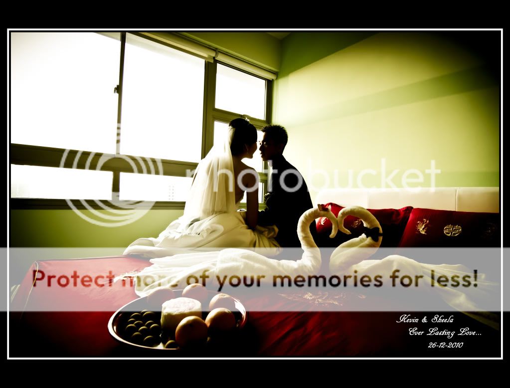
1. In what area is critique to be sought?

the compo & PP.

2. What one hopes to achieve with the piece of work?

a ever lasting love feel n romantic.

3. Under what circumstance is the picture taken? (physical conditions/emotions)

was done in a actual wedding day shoot. ard 8+am in their room.

4. What the critique seeker personally thinks of the picture?

the compo not tat good n oso dont really know how to PP it to give a better feel to it.

im still very new in photography n hope the seniors here can help me improve. thank u for ur time & ur advice.
 

I really love how the swan-looking thing in the foreground adds interest and helps juxtapose against the background couple.
Well done!

Cheers and happy new year bro! ^^
 

like the "feel" of the shot.

just one thing to note. the face of the groom, half of it's overexposed and blends in with the light. same goes with the bride's left shoulder and part of her veil.

one more thing is that there are too many "subjects" in the frame. what do you want to draw the viewers to? you have the plate, the "swans" and the couple.

for me, i was drawn more to the swans than the couple itself. this i feel has something to do with the composition, as following the rule of thirds.
 

too many subjects in the photo......what is TS trying to focus on ? swan or couple, composition matters in taking subject into consideration ........ e post processing does not work for me here.
 

Last edited:
-derrickder- thanks n happy new year to u too.

-kei1309- will take note on the expo n compo. thanks for ur adv.

-aaSKaa- i oso find like theres too much of subjects. will note on tat. thanks for the adv.

happy new year to u all. :)
 

like the "feel" of the shot.

just one thing to note. the face of the groom, half of it's overexposed and blends in with the light. same goes with the bride's left shoulder and part of her veil.

one more thing is that there are too many "subjects" in the frame. what do you want to draw the viewers to? you have the plate, the "swans" and the couple.

for me, i was drawn more to the swans than the couple itself. this i feel has something to do with the composition, as following the rule of thirds.

Thanks for sharing with us your photo for critique review.

I think there is a lack of shadows details and the other side similarly- overexposed highlights. I dunno if thats your intention to create a mood, but i rather save the details.
Same as what kei quoted, i think that i am more attracted to the swan because it seems to be placed at the rule of thirds corner. Mayb shifting the camera to the right side abit helps.

The white balance is also kinda off abit but i think it doesnt really matter anyways.
 

i think that the lighting was a tad too harsh resulting in blown highlights.
perphaps a thin curtain could have diffused the window light?
also there are too many disctracting elements in the picture like most have already mentioned.
however, i could sense what you were trying to acheive and it is a very good effort and has a good feel about it.