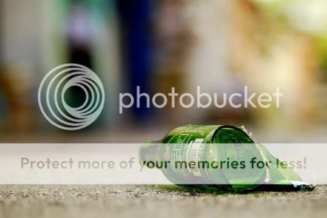
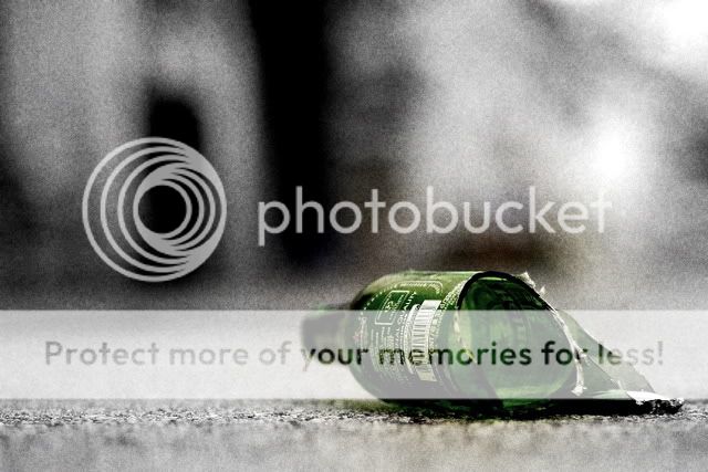
The bottle is at an awkward angle, it took a while for me to realise the right end is the bottom half peeking out from behind. You are right not to pose it too blatant, it's not a beer ad.
However it has to attract the viewer, so add some sizzle (my teacher liked to say). The common/typical aspects of a 'drunk': dirty, scruffy, vomit, etc. The picture above is very clean, compositionally and technically. Concept not taken to the fullest, just adding traces of beer would bring out 'drunk' a little more. You are also missing the 'drunk fella' mentioned. Viewers would be most interested in seeing the human element. Standard ways to add grit would be to use noise/large grain. Clean images always look sterile, together with thin dof, anything else that can add to the image is lost.
You do need more elements in the image to bring out your concept. Bring on the supporting cast.
Poor background. Confusing colours, blur images, does not add to the concept. Alley ways, neon lights, large angry men, bar ladies, etc -> drinking/drunk. It's fine to be different and do something else, the key of course is that it must work.