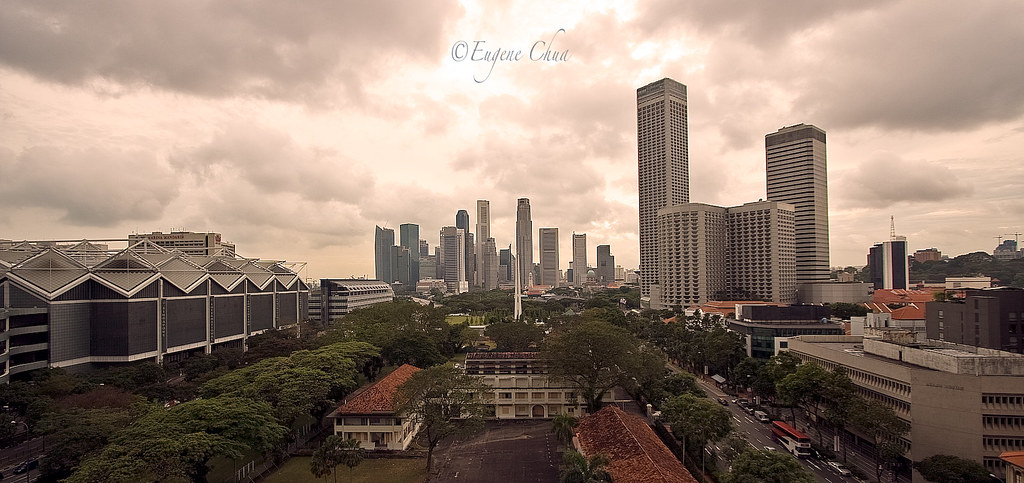
A fresh viewpoint of the city, is it a single image? I think toning works in the image but I'm not sure this toning works. It's a shame the foreground doesn't hold a little more interest rather than just empty car park spaces, but great use of the road and tree line as lead-ins to the CBD skyline. I realise that the sky is important to the image but I would also consider a slight crop just a few mm below the bottom edge of the letter g in your watermark.
ah taken from the shaw building carpark open space, yes?
the composition here is fine - it is the processing which lets down the picture. first off, the seemingly overdone recovery of highlights has caused some form of posterisation in the skies above. it is the first thing that one notices right away and the attention is entirely grabbed at the less-than-glamorous part of the image.
there is also tilt in the picture - note that when using wide views, you should try to ensure that the objects IN THE DISTANCE, not nearest to you are vertical due to lens distortion.
lastly, the overall color of the picture is just plain weird - the mood generated here is to me, neither here nor there.. if you're going for the post-apocalyptic look (generally tobacco toned).. it's not quite done enough. what you end up with is something which looked like you threw an orange toned digital filter on top of your final image.. which doesn't quite work here.
wonderful shot, i love it. though i like the contrast to be of just a wee bit more.
you should try this shot again with fisheye lenses!
i think it'll be totally cool! hah.
wonderful shot, i love it. though i like the contrast to be of just a wee bit more.
you should try this shot again with fisheye lenses!
i think it'll be totally cool! hah.
Don't let age be a factor. Please also do refer to the guidelines for posting in Critique Corner, located here.
Anyway, TS, the first, and only thing that struck me, really, was the tone of the image. It's aged-looking, but not really full done. As what night86mare said, it's "not here not there", and I can't understand why you would go for such a tonal approach. Maybe you would explain it a bit here.
Composition-wise, there is an imbalance of the shorter Singapore Convention Centre on the left, compared to Swissotel on the right. However, I believe the center background makes up for that. I'm just wondering whether a tighter crop, of just the city area would work better, where you do not show so much of the buildings in the foreground, which look a little older and not so "downtown-ish".
Just nitpicking, but your watermark placed right smack at the top is distracting. That's the first thing I saw when I looked at the photo. Would be better if it was placed at the right bottom corner or somewhere less conspicuous.
Just nitpicking, but your watermark placed right smack at the top is distracting. That's the first thing I saw when I looked at the photo. Would be better if it was placed at the right bottom corner or somewhere less conspicuous.