Divided but One


Status
Not open for further replies.

PyeeL

New Member
Sep 3, 2008
606
0
0
32
This is my first post in Critique, I believe I can get more serious comments and feedback as compared to the other galleries in Clubsnap. First and foremost, I would have to apologise in advance for not knowing exactly how to write a good critique thread (and I am referring to the stickies while typing).

2986326522_50edee9e13_o.jpg

Upped the ISO to 400 for a faster shutter speed. Here is a small portion of the EXIF.
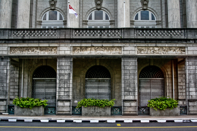
F/3.5, 1/640s, 28mm (was the widest I had with me).

This one was shot yesterday, near evening. It's a building I know not what name, but I'm pretty sure many of you here would be able to recognise it anyway. What I wanted to portray from this shot and especially its post processing is to show how 'neglected' the building was. Uncared for and hence becoming dirt-specked. I heard it is no longer in use? Currently, I use Lightroom to do my post processing.

I composed it in a symmetrical manner with 2 reasons. First of all, the buildings around the area had really similar features on each sides, so I felt it might be a good thing to create the symmetry. Secondly, I thought that since the building was a Court, or something likewise, the symmetry can be used to portray fairness in Law, or Justice.

I am looking for feedback in these areas,
1. Composition.
2. My post processing. (Was it too heavy?)

What I did was to push the Clarity (on Lightroom) almost all the way to the maximum, played with the sliders, mainly Blacks, Fill Light, and Saturation. Probably a little of Recovery too. Didn't want the building to appear too yellowish, so I downed the Saturation a little. I raised the Clarity level to the high end to show more details on the bricks, the walls.

Hope I did my Critique correct, always ready to improve it. I'm trying to make a proper correct one. And lastly, thanks all for your time in viewing, reading, and even more for giving your comments and feedback. I'm prepared for the worst. Hope to hear from all.
 

Last edited:
a simple and good symmetry shot.. though i have my reservations about what you intended it to portray (the neglect.. and justice.. and besides these two themes are quite polar from one another.. dun see how they interrelate)

it's a good "record" shot in that sense.. just a few notes:

do watch the keystone effect though.. and the cropping off the top of the emblems..
would be more perfect with another flag on the other flag pole too but well..

as for the processing.. the colours seems slightly over-processed.. but maybe it's just me..

Hahaha, thanks a lot for taking the time to read and give a reply!
I'll look out for my processing, they probably look unreal because they are too white? I just didn't like yellow, haha. Well I guess I couldn't do anything about the flag can I.

Anyway, hope you don't mind me asking, what does a "record shot" mean? I don't/can't really deep into words sometimes.

And lastly if this might help, the neglect part is for the processing, while the fairness for the composition. I'm supposed to combine these two, am I?
 

as for the processing.. the colours seems slightly over-processed.. but maybe it's just me..

i agree with you. colors look fake.
and also notice sides are unbalanced cos you didn't take the shot from in the center. the right side is 'sticking' out more.
out of curiosity, why did you shoot with f/3.5 with ISO 400 (saw through your EXIF)?
 

i agree with you. colors look fake.
and also notice sides are unbalanced cos you didn't take the shot from in the center. the right side is 'sticking' out more.
out of curiosity, why did you shoot with f/3.5 with ISO 400 (saw through your EXIF)?


Yes, found out it wasn't that centered after moving the shot into the computer. A waste, should had moved more to the left.
About the ISO, I guess I wanted to minimise handshake, hence the higher ISO and bigger aperture. What should I had done?
About the processing, I'll try to stay clear of artificial colours already. Thanks for pointing that out too.

A sidenote, what program do you use to view EXIF data?

but i guess you need not have such a high shutter speed at 4.40pm? around 160 or 200 will do. should have made lower the ISO to around 100, or close aperture to around f/8 for focus.
for EXIF, if you're using Firefox, you can try Tools> Add Ons> Get Add Ons> search for FxIF.
that's the one i'm using. :)

Wow. Hey thanks. I think the ISO 400 was a mistake, because the maximum I would go is 200. I mean, that's what I told my friend. The lights didn't justify any ISO 400 to me. Probably changed then forgot aout it. Thanks again for the tips and the add on.
 

Wow. Hey thanks. I think the ISO 400 was a mistake, because the maximum I would go is 200. I mean, that's what I told my friend. The lights didn't justify any ISO 400 to me. Probably changed then forgot aout it. Thanks again for the tips and the add on.

no problem. glad i could be of help ;)
 

It's not level... from the naked eye, it looks just a tiny bit off. You may wish to try rotating it anticlockwise by 1 degree or less hehe.
 

i agree abt it being slanted abit
 

1) this is the Old Supreme Court

2) with the clean state flag flying and the plants still looks relatively maintained, it is difficult to know you want to show the building is run down, lack maintenance.

3) non Singaporean who do not know the history of this building will not understand the "the symmetry can be used to portray fairness in Law, or Justice".

4) i am ok with the iso setting, only if it is because you dont have tripod. looking at your setting, you could have easily shot at
iso400, f8 (normally best performance of all lens), 1/125sec.

but since you are using wide (28mm is it on ff or crop = 45mm), you can use
iso200, f8, 1/60sec if you want to reduce the noise (cant really tell since the image is small)

5) like others had mentioned, you could have corrected the perspective distortion.

6) would have prefer you exclude the road, may be crop until the black and white curb (law is black and white mah) and include more of the top. as it is now, the flag pole has no breathing space on top, and the "decor" of the 3 windows had been chopped.

7) i feel you can still increase the contrast.

8) since you are using digital, may be can try taking a few shots, try to capture the "full" flag.

9) nick pick (other may not agree) clone away the sign board to the left of the greenery in the middle.
 

Last edited:
I like the balance of the shot, for me the flag adds one of those quirky realities that seperates a staged shot from real life, so I like it. I do think the lower half of the shot looks over processed to the point of looking almost like a HDR shot while the upper have almost looks washed out with the flutes on the columns merging into one.

With the upper story in sunshine and the lower half in shadow maybe a GND filter might have allowed you to use more appropriate settings?

And a "record" shot is one taken, usually of a place that might undergo change, renovation or even demolition. It's a shot that is replicated sometime (usually years) in the future and compared. Think all those old 1970 Singapore photos we all go "WOW" over. Well wander around town take lots of photos from various points and in 30 years do it again and you have the makings of a "then and now" book of "record" shots.
 

It's not level... from the naked eye, it looks just a tiny bit off. You may wish to try rotating it anticlockwise by 1 degree or less hehe.

i agree abt it being slanted abit

Thanks. Actually, I did a rotation already, was using the grids in Lightroom to align. Maybe it was the perspective as I wasn't directly in the middle. Thanks again for pointing that out.
 

1) this is the Old Supreme Court

2) with the clean state flag flying and the plants still looks relatively maintained, it is difficult to know you want to show the building is run down, lack maintenance.

3) non Singaporean who do not know the history of this building will not understand the "the symmetry can be used to portray fairness in Law, or Justice".

4) i am ok with the iso setting, only if it is because you dont have tripod. looking at your setting, you could have easily shot at
iso400, f8 (normally best performance of all lens), 1/125sec.

but since you are using wide (28mm is it on ff or crop = 45mm), you can use
iso200, f8, 1/60sec if you want to reduce the noise (cant really tell since the image is small)

5) like others had mentioned, you could have corrected the perspective distortion.

6) would have prefer you exclude the road, may be crop until the black and white curb (law is black and white mah) and include more of the top. as it is now, the flag pole has no breathing space on top, and the "decor" of the 3 windows had been chopped.

7) i feel you can still increase the contrast.

8) since you are using digital, may be can try taking a few shots, try to capture the "full" flag.

9) nick pick (other may not agree) clone away the sign board to the left of the greenery in the middle.

Thanks a lot for the many comments. Appreciated.
I'm on a 400D, so that makes it 45mm. Because of this I was unable to give much space. Probably should had left out the road and made more space on top? Or make a double image stitch?
I wasn't on a tripod, and yeah, definitely should had made the aperture smaller.
And I'll look out for smaller details like the insignificant signboard behind.
 

I like the balance of the shot, for me the flag adds one of those quirky realities that seperates a staged shot from real life, so I like it. I do think the lower half of the shot looks over processed to the point of looking almost like a HDR shot while the upper have almost looks washed out with the flutes on the columns merging into one.

With the upper story in sunshine and the lower half in shadow maybe a GND filter might have allowed you to use more appropriate settings?

And a "record" shot is one taken, usually of a place that might undergo change, renovation or even demolition. It's a shot that is replicated sometime (usually years) in the future and compared. Think all those old 1970 Singapore photos we all go "WOW" over. Well wander around town take lots of photos from various points and in 30 years do it again and you have the makings of a "then and now" book of "record" shots.

Filters. Hahah. I got to save for them. I'm a student, so photography is a really expensive hobby for me. Thanks for your feedback and for the clarification of the record shot thing.
 

Filters. Hahah. I got to save for them. I'm a student, so photography is a really expensive hobby for me. Thanks for your feedback and for the clarification of the record shot thing.

GND filters can be done via pp one lar.
 

Thanks. Actually, I did a rotation already, was using the grids in Lightroom to align. Maybe it was the perspective as I wasn't directly in the middle. Thanks again for pointing that out.

What we are saying about the perspective distortion (key stoning) happens when you are shooting upwards, ie biottom big top small.

Not the deminishing effect when you shoot the building side way.
 

Okay.. GND, I'll go do a Google. Pardon me, because I'm not proficient in Photoshop.
And a Google for the key stoning too.
 

Hi PyeeL,

It's a great shot!

I find the composition to be too symmetrical though. It kind of gives the buiilding and photo a very strong rigid feel. Is this your intent? Black and white might have worked better with this shot to give it a more gritty feel. It might also be good to try an alternate shot by pulling your camera up, thus scarificing the coverage of the road for more top coverage of the building.
 

Status
Not open for further replies.